photo sharing and upload picture albums photo forums search pictures popular photos photography help login
Phil Douglis | all galleries >> Galleries >> Gallery Thirty Seven: As others see me > Geometry, by Tim May, Guanajuato, Mexico, 2005
previous | next
24-OCT-2005

Geometry, by Tim May, Guanajuato, Mexico, 2005

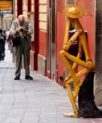
I was drawn to this odd sculpture of Don Quixote because of our similarities. We both are tall, skinny, bearded and often dedicated to lost causes. My friend and fellow pbase photographer Tim May ( http://www.pbase.com/mityam ) finds geometry in my stance: my elbows flare, and my legs form a triangle with the sidewalk. Tim, whose images often show dry wit, incongruously compares my geometric assets with those of my subject. I intensely study my composition, while Quixote, whose arms and legs form numerous triangles, plays hard to get.

Nikon Coolpix 8800
1/80s f/4.7 at 53.3mm iso100 full exif

other sizes: small medium original auto
share
Phil Douglis01-Jan-2007 20:17
Glad to oblige, Erich. I did not know that Don Q. had so many relatives!
Phil Douglis13-Jul-2006 04:44
You know me now, Doria. Tim makes sure of that here.
Doria11-Jul-2006 00:51
This is so great. I don't even know you and I can tell that it's spot-on!
Phil Douglis08-Jul-2006 04:46
Thanks, Tim, for once more returning to this remarkable image of yours. As it turns out, it seems to offer as much food for thought about post-processing as it does the character of your subject. Armin's suggestion that a potential distraction (the now infamous red jacket) actually makes him study the background more closely, and leads him more readily to an important contextual element (the sign) is a concept worth pondering. Likewise your own suggestion of deliberately blurring certain portions of a picture to direct or deflect the viewer's eye might be quite valuable, but only if it sticks to the facts. As you point out, if we create both soft and sharp subjects within the same plane of focus, it does indeed "muck around with the reality of the physics of photography." As far as I'm concerned, the bottom line on post processing alterations comes down to one word: credibility. If our image is factual, we should honor the integrity of the image by not altering significant facts. If our image is fictional, all bets are off. There are no limits to imaginary creativity.
Tim May08-Jul-2006 02:42
Since the discussion is continuing - I will add a few more comments - 1 - in this image for the purposes of the shot - to say something about Phil when he makes images - not to report a street scene from Guanajuato I have no ethical problem with changing the hue of the shirt - but I must admit that the idea that the red pulls one to the sign is something I now would take into consideration - 2: I do though think about, but not actually enough to NOT do it, the fact of the slight blurring of the people in the background. I sometimes use that to lead the viewers eye to where I want it to go - but nagging at my conscience it the fact the the person with the backpack and the sign are almost on the same plane - I have made one part of that plane sharp and one part out of focus - so I am not playing with the "reality" of color, but I am mucking about with the reality of the physics of photography - a more cosmic alteration is you will. Again, my goal supersedes my conscience but in the spirit of this discussion I thought I would let you know part of what I think about as I process an image.
Phil Douglis07-Jul-2006 20:01
It is fascinating how what once was distracting now serves as a reference to the signs, all of which tell us how important the context/subject relationship is. By restoring the full sign to the picture, the people below it act as context for that part of the image, instead of accidental objects in the background. As to your question about where enhancement ends and manipulation begins, for me, it would be when and if you begin to alter significant facts in an image whose meaning is based on fact and not fiction. What is "significant?" A factual change that changes meaning. If you alter the words on the sign, for example. Or put a background into this image from another picture. On the other hand, if Tim decided to just change the hue of the shirt, I don't think that would be significant. Hope this helps.
arminb07-Jul-2006 13:10
It was/is VERY interesting to follow your discussion. plz let me add another thought: with the full polaroid/Kodak signs in the bg as an homage sitting over your bent head/shoulders I am absolutely attracted by the 'distracting' lady because the color of her shirt now helps to study the bg in more detail and to let one find the photog. signs more easily. Post processing, well, what a topic :o) ...the digital darkroom, hm, not sure either when it's too much manipulation - the first one (in my case) alreay starts with the camera itself, since I'm not yet shooting in RAW...cloning out some sensor dust, cropping, adkusting levels, cloning out ...where does manipulation start? :o)
Phil Douglis07-Jul-2006 05:11
That's why I asked those questions, AL. These galleries are teaching galleries, and Tim's suggested modifications give us all important food for thought.
AL07-Jul-2006 01:43
Interesting exchange between you and Tim. Phil, you know you'd hit the nail in your latest comment. Yes, lots of questions to be answered by the photographer, myself... Thanks for the thoughts.
Phil Douglis06-Jul-2006 21:27
An interesting thought, more so because of its ethical implications. It raises an important question: at what point do we slip over the line from enhancement to manipulation in post processing a street photograph, which is based on fact, not fiction? Cropping, softening or sharpening is considered enhancement. But what about altering the facts of the picture by changing the shade of red on the shirt and purse to make it less distracting? Is that manipulation? And when is manipulation OK in an image based on fact? Where do we draw our own line? Each photographer must answer that question for themselves.
Tim May06-Jul-2006 20:06
Not to "gild the lily" but one more possible post-processing subtle change might be to select the red shirt and red purse and change the hue on those items to a goldish tan color - that is a Photoshop skill I have seen demonstrated and never found an actual use for. (We sure are spending a lot of time on those *)_(&&*_ people in the background.
Phil Douglis06-Jul-2006 19:13
Thanks, Tim, for making these points. I have posted your edited version of this image, which sharpens the sign a bit while blurring and desaturating the people in the background. I think it is substantially improved. The photographic history hanging above my shoulder is now a bit more emphatic. I agree wholeheartedly about "distractions" such as Armin mentions here. As I said in my response to him, it often comes down to a trade-off between content and form. I also salute your post processing skills -- selecting such small and irregular content as those people, in order to soften and desaturate them, is another "layer" of skills altogether.
Tim May06-Jul-2006 18:48
Thanks for replacing the image - This whole interchange has led me to thinking about "distractions." To be honest I ignored the people - and if I were to reprocess the image I would probably do some photoshopping to make them blurrier - but for me, the photographic history perched on your shoulder was what mattered - once I decided that guess I decided that the people, which I might have cropped out, were worth it for the sign. All this leads me to two personal lessons - 1. pay attention to "distractions" more, and 2. continue to weigh the balance between distractions and content, and to post process with that in mind - such as brightening the sign with dodging and creating a softer focus on the people.
Phil Douglis06-Jul-2006 18:08
Tim -- I am the one who cropped it -- I took out still another person that seemed to pull the eye away from my confrontation with the Don. I know --we lost a bit of photographic history in the process. I will restore the original, since the image may be about me, but it should represent your perception, not mine.
Phil Douglis06-Jul-2006 18:05
Armin - thanks for noting the value of my angular pose. As for the background, street photography is always a series of compromises. They busy places. Tim could have avoided that red shirt background by waiting for that person to vanish, but in doing so, he would have lost this moment. Photography gives, but it also takes.
Tim May06-Jul-2006 16:44
I am glad that this picture is gathering so many comments and thanks for the kind words - It is fun to watch the concentration with which Phil approaches image making - what is lost to the visual is his enthusiasm as he sees something and later when he finds something he has made that captures what he felt. Armin, thanks for the comment about the red shirt - I'm not sure how it got re-cropped but my original crop of this image was a bit larger and included the complete sign in the upper left hand corner - it was a sign with 3 kodak sections and one polaroid - I though it created a fitting background of photographic history for this enthusiastic photographer.
arminb06-Jul-2006 15:11
I'm with Kal - cogito ergo sum - was my first thought, too. What I find particularly attractive is your 'pose' as it creates a perfect feeling of harmony in the picture (well, at least for me). Hiding or posing - an unanswered question, that makes me study even longer. My only wish would be that there wouldn't be the person with the red shirt in the bw as my eye is drawn to it - ok, gives it a nice depths, but still my eyes can't rest as they are drawn to it :o)
Phil Douglis06-Jul-2006 00:23
Is the Don thinking? Posing? Or is he hiding from me? Tim asks all of these questions here. He is a wonderful people photographer -- I photographed monks with him in Laos and Thailand, and watched him work his wonders.
Kal Khogali05-Jul-2006 11:49
Brilliant! I am a fan of Tim's but he rarely takes pictures of people, but when he does (as with monk gallery) he blows me away...The statue reminds me of an expression of "I think therefore I am".....perhaps it is alive in this image. K
Phil Douglis05-Jul-2006 05:31
Jenene -- I was thinking about that hat of his. It does seem as if the Don has temporarily borrowed it. As for lost causes, both the Don and I made a career out of tilting at windmills. I've earned a living for the last 40 years trying to help organizations communicate with pictures. You know how difficult it can be to transform the vision of individuals. Now imagine trying to do the same thing for institutions!
Phil Douglis05-Jul-2006 05:17
Thanks, Al, for the insight. You are right -- the sculpture is looking at me as hard as I am looking at him -- even if he pretends otherwise.
JSWaters05-Jul-2006 05:11
He may play hard to get, Phil, but he's wearing your hat - did you forget yours?
Lost causes? - hopefully not those of us who follow you on pbase.
Jenene
AL05-Jul-2006 03:58
Back to basic geometry and balancing... another great pov of you, Phil, the great teacher at work. How you compose and photograph, becoming the natural subject matter. How Tim sees you, how the sculpture sees you, and how the viewer like us sees you, all in his/her comfort level. Another interesting contribution by one of your many followers and friends. Thanks.
Phil Douglis05-Jul-2006 02:26
The Don knows a kindred spirit when he sees one. Thanks, Tim, for finding this special moment in time.
Tim May05-Jul-2006 01:59
I think the Don is thinking - There's a kindred spirit. You're concentrated on viewing him and he seems to be viewing you.
Type your message and click Add Comment
It is best to login or register first but you may post as a guest.
Enter an optional name and contact email address. Name
Name Email
help private comment