photo sharing and upload picture albums photo forums search pictures popular photos photography help login
Phil Douglis | all galleries >> Galleries >> Gallery Seven: Making time count > Bus stop, Nanjing Road, Shanghai, China, 2004
previous | next
12-JUN-2004

Bus stop, Nanjing Road, Shanghai, China, 2004

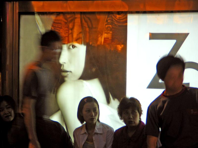
I used a slow exposure, less than 1/15th of a second, to shoot these people waiting for a bus in front of an elegant illuminated advertisement. Since these people were travelers, I wanted to use an extended moment in time to express a feeling of transition and movement. The incongruity of the large scale woman in the ad contrasted against the smaller commuters was also fascinating. I had no idea that I would also pick up the red reflection in the glass over the ad – it provides a curtain lifting on a drama. The two men in this picture are faceless because they moved while the shutter was open – another bonus for me. The blurred faces of those men only add to this mysterious flow of travelers crossing paths on a Shanghai evening.

Canon PowerShot G5
1/13s f/3.0 at 28.8mm full exif

other sizes: small medium large original auto
share
Phil Douglis12-Nov-2006 20:36
Thanks, Theodore, for appreciating the content here. The theme of "ships that pass in the night" is a common one in photography. But each photographer brings his or her own sensibilities to it. Look at three of Jen Zhou's images from her Shanghai Subway gallery athttp://www.pbase.com/angeleyes_zyl/image/27978457 ,http://www.pbase.com/angeleyes_zyl/image/52551262 , andhttp://www.pbase.com/angeleyes_zyl/image/34751430 . She uses very similar juxtapositions and ghostly figures in her images to tell her stories.
Guest 12-Nov-2006 14:32
Such a creative shot. Haven't seen anything like it on pbase.
Phil Douglis29-Mar-2005 18:18
And thank you, Benchang, for pointing out the fact that the only direct contact between viewer and image here is coming through the woman in the ad. Everyone else in this picture is too absorbed in their own thoughts and activities to pay heed to the fact that thousands of people are looking at them.
Benchang Tang 29-Mar-2005 09:09
Thank you all for the nourishing lesson! The funny thing here is the only one looking into the photographer is the girl in the ad and the only one looking into the girl is the camera. Poeple are bathed in the shine of the business world and some people do not notice or pay no attention to it and others just sit at the bus stop and wait for the bus, on the way...
Phil Douglis04-Dec-2004 23:43
Please come back and tell me more, Nut!
nut 04-Dec-2004 14:41
If I am a man, I will fall in love with innocent eyes of the girl in the mirror. But I am not, so
what I can do now is put one comment here then will come back again.
Phil Douglis02-Dec-2004 05:24
Thanks, 3stones. It's not a montage, it's all right from the camera. With a boost of contrast and color balance from Photoshop.
Guest 02-Dec-2004 05:16
WOW! What a shot. Your image gives me a sense of Montage. Really like it.
Phil Douglis30-Sep-2004 19:22
Thanks, Jen, for your faith in the content of my imagery. And I am so glad to hear, from your own mouth, how this discussion has utterly changed the way you see the purpose of your own work. I thank you for the thought and effort you have put into this image for me, for your thoughtful comments, and most of all, for being so willing to apply what you have obviously learned from this discussion to your own vision.

To better understand how form will affect your content is going to be a huge help to you, Jen. And it's a pleasure for me to spend so much time commenting in your galleries. You may be learning from my comments, but I am also learning much from your images. Every visit to "Everyone Has a Story" (http://www.pbase.com/angeleyes_zyl/everybody_has_a_story ) shows me new ways to extract human values from a situation and bring them to the viewer with impact and meaning. Now that you have moved beyond your former reliance on form for form's sake, you are free at last to interpret your subjects with greater clarity and expression.
Jennifer Zhou30-Sep-2004 15:48
Marek's three layers analysis strikes!!!

Phil, even I don't think we are going "too far", but I am already very satisfied with your whole content here and I won't expect anything more.

Sometimes I think this is just Phil's style as I said no need to use the looks to attract viewers, and I love your pictures for how original and contant-driven they are to present and speak to us! And it is strange enough to think Phil with some fancy PS works..I like your pictures for the way they are!! Please just to see this whole PS discussion as to help me understand the relationship with form and contant which really for the first time makes me understand my unhelpful effort of making good form for form's sake..To look at many of my pictures now, I feel totally different, I saw how some forms got in the way of my ideas and how some forms really helped.. Of course your comments Phil under every single of my pictures help a great deal as well....:)

Jen
Phil Douglis29-Sep-2004 18:34
Thanks, Jen, for adding your own thoughts to Marek's. Do you now think we went "too far" in post processing my original? Be enhancing the "look" of this picture (its form) did we hurt the content -- what Marek calls the blending of the three different layers of reality in this image? What do you think?
Phil Douglis29-Sep-2004 18:02
Marek, I couldn't agree with you more. You have gone into considerable depth here regarding my simple argument to Jen that form follows function. Perhaps, in Jen's desire to enhance my image, and in my enthusiasm to embrace her suggestions, we did a disservice to this image. By trying to bring more definition to these "layers of reality" you speak of in my image by increasing contrast and color saturation in Photoshop, we may well be diminishing the very point these layers are making to us. In other words, my original instincts here were correct. Leave the image be. Let the layers merge and speak for themselves. Do you and Jen agree?

Phil
Guest 29-Sep-2004 16:24
In The Name of The Rose, Umberto Eco states through his lead character, William of Baskerville, that all of life is like a book, full of clues, and you only need to know how to read it. If you substitute ‘read’ for ‘shoot’ this is how I feel about photography...
Jennifer Zhou29-Sep-2004 14:57
Seems we all agree here that Form should follow the content(or the Concept), and a good form does help to communicate better. The question remains here as M said how far we should go? Phil already told us the bottom line is not to change the meaning of a picture. I can take one of my picture as a bad example here:http://www.pbase.com/angeleyes_zyl/image/32300017 I was trying to make this picture look different or better(as I thought to be) by adding a sepia tone, but what I did here is to focus my viewers to see this cold miserable place through a very warm glasses, for sure they can't read clear what I want to say about this picture...because my bad form "backfire on my story"..

I think we don't need to avoid post-processing as a lot of people do, who think post-processing is like telling a lie. We don't avoid it as long as it can be helpful telling our ideas better. Everybody deserve to look their best so do pictures, as long as we still are ourselves and what's matter the most still the inside of us. We all know we need to be looking neat and nice in order to gain a good first expression from other people, but after that it all about things inside. (There are of course exceptions that people don't use their appearances to draw other people's attention but people always have their own style with is another kind of form.)

M, I was surprised that you have your shoppers' pictures (ideas and even forms) first in your mind, which requires lot of thinkings and plans ahead. You know why I said I always think that my pictures came out by accidents because I didn't do the "homework" before shooting and just take my camera out and then push the shutter whenever I see something intersting...But now I am learning to think first. I should always know what I want to say then I can have the chance to say it well...Thank you M for chipping in, me and Phil I believe are very happy to see you here!!

Jen
Guest 29-Sep-2004 11:29
Oh, one more thing. Last year I created the Shoppers gallery. In it, I deliberately went out with the intention of simulating (in post production) the high contrast, grainy mono effect of Salgado's Workers. Therefore, as I was shooting I was already aiming for the final result. It was a bit like using b&w film in a digital camera ;-) I knew what I was after and mentally ignored the colour aspect. The point I'm trying to make is that the final treatment was essential to my story, which in turn was first conceived in my head.
http://www.pbase.com/warno/shoppers
Guest 29-Sep-2004 10:40
Allow me to chip in here, by refering back to my Concept, Content, Creativity, Craft scenario. The driving force is Concept; the idea, the story. The other three are the variables (much like aperture, shutter and sensitivity), interdependent and whose particular mix affects the outcome. By Creativity in this instance I mean the purely aesthetic value (Is it pleasing to look at?). Can the enhancement of the aesthetic improve the story? It can, but it won't make it on its own. When the style itself puports to become the story, as communicators we are scraping the bottom of the barrel. There are so many people out there who claim to see art in a pair of socks at the bottom of their bed. Welcome to the world of banality and trivia. However ‘beautifully’ these socks will be framed, composed and colour treated, they will always be wallpaper, unless they contain a story, which is interesting enough for the (random) viewer to become involved. And to know what's interesting, first you have to live. The people who sit around at home taking photos of their plants and worse, of themselves (in a drunken stupor) should really ‘get a life’. BTW, we've all done it, as bored ‘target practice’, but let's not pretend it's art. Photography and discovery go hand on camera. It is the sharing of new found people/places/truths in general which creates an involving story, ie the Concept.

Whilst the aesthetic treatment can help the story by making it more accessible (as we are naturally drawn towards beauty), it can also become its obstacle. For example, this image is about a play of three layers of reality; the ‘real’ seated women, the face whose ’reality’ is expressed through an ’unreal’ image, and what we understand to be ‘real’ passers-by who have nevertheless become ‘unreal’ through the treatment of time using the photographic medium. The image is asking the question, “What is reality?”, especially as (Jen's point), one of the ‘real’ passers-by begins to fuse with the ‘unreal’ face image.

Therefore, we have a delicate balance here making the story. If, for argument's sake, we decided that we are going to ‘enhance’ this image by eg making it more contrasty and increasing the colour saturation, we would be simultaneously sacrificing some of the subtle distinctions between these ‘layers of reality’. The question is, how far can you go in terms of making the image ‘more seductive’ before that starts to backfire on the story itself? Ok you've got my attention, but what will I find when I get there? That's the difference between Form and Function ;-)


Phil Douglis27-Sep-2004 18:05
Jen,

Thanks for suggesting that I do further post processing on this image to enhance, but not change, its meaning. I have followed an example you sent me, and increased contrast and saturation. I never could quite match your color changes, but I think this will do just well, don't you? You teach me much about how I can further enhance -- but not change -- the meaning of my images with post-processing. Incidentally, the original image had no detail in the blurred people at all, but using Photoshop CS's revolutionary "shadow/highlight" adjustment control, I was able to bring it out. But I simply was not bold enough in my contrast and saturation enhancements -- thanks for showing me the way, Jen. What do you think of my improvements?
Phil Douglis27-Sep-2004 17:37
Thanks, Jen, for letting me know what you learned from my answers to your very important questions that this image obviously raised. You now agree with me that form follows function, and that form is really structure, not decoration or embellishment. I noticed that as a result of my answers to your questions, you have now converted your remarkable gallery (http://www.pbase.com/angeleyes_zyl/everybody_has_a_story ) from sepia to black and white. Overall, it is a huge improvement because you now emphasize content over form. I have gone through your gallery picture by picture and told you why I think black and white has strengthened meaning in each individual case, and also noted the few that seem just as strong or stronger in sepia. And yes, I think for consistency's sake, you should keep this gallery entirely in black and white, and post a separate sepia gallery that might be called "Stories through Time" or something like that, which capitalizes on sepia's power to give some of your images that timeless feeling.

Regarding the kinds of photography that are rooted in reality as opposed to fiction, I still believe that landscape photography takes its power from references to a real, not artificial, world. Galen Rowell told me that his driving passion was to capture the beauty of our world in order to preserve it. If he used filtersm it was not make it unreal. It was to make that reality more meaningful. Galen never changed the facts of what he photographed. He enhanced them, to be sure. But he never created a world of his own making. His legacy to us would then have been based on a lie. He told me that he passionately believed in revealing the truth.

As for your post processing enhancement of my own image, your improved it technically by enriching contrast and depth of color. But you did not alter its meaning through post processing-- you have made meaning come through with greater impact and resonance. I wish I had your post processing skills, Jen! I am in awe of your talents.

Thank you,

Phil
Jennifer Zhou27-Sep-2004 10:26
Thank you Phil for your thoughtful comment&answers here..I think I really should expand my definition of the "FORM" we are discussing here. It is not just a matter of making pretty pictures as you said, it is structure! And you used "effective" to describe how should form work with and help the content. No need to be so much or so pretty, just to be effective!! What I did with my story gallery is putting too much in term of form betweet my subjects and my viewers which I thought could make my pictures look good, but in fact I was telling a lie with that sepia tone and reduce the power of those true stories. That is an example of ineffective form and that is why it wouldn't help the content. I seem aware of this sepia problem lately, but some of my friends told me that they really like the sepia tone which they get that warm feelings from..And It didn't occur to me that I made this big mistake until you point out today which I am very much thankful. I will change them to B&W which we all think is more effective form. But some shots such as
http://www.pbase.com/angeleyes_zyl/image/32299670
http://www.pbase.com/angeleyes_zyl/image/32209671
http://www.pbase.com/angeleyes_zyl/image/30689724
would be more helped by sepia tone, do you think so? But to keep the consistency of this gallery I think I should better keep all the pictures in B&W...do you think so too? You also point out that the different between art photography and travel photography, photojournalism and landsape hotography ect... One is basised on the reality, others are not..I have no doubt except the landscape photography, as I know lot of landscape photographers including Galen make a great use of fiters which I think as you said adding another layer of unreality. What do you think of that?
Or there are actually greater differences between people and landscape photography?

At the end, you give me a very clear direction that when I make pretty pictures, I have to add three principles to make the pictures not stop at the surface of how they look. I will remember that "FORM FOLLOWS FUNCTION!!" and thank you for your excellent example to make me understand..Haha..

And for this picture above, I will try to do some post-processing when I get home, see if it comes out a bad form or effective one..


Jen
Phil Douglis26-Sep-2004 20:36
Thanks, Jen, for sharing your thoughts on this image with me. It is about as close as I've come to surrealism, and I am glad I've provoked your thoughts with it. Your interpretation of this image goes deeper than mine. I saw this image as a study in transition, a mysterious flow of travelers crossing paths on a summer evening in Shanghai. You go well beyond that message -- you see the incongruity of the moving man unknowingly merging into the huge woman in the poster. The man pays no heed to that poster. The lovely woman in the poster does not see the man. Yet he becomes part of her, and she part of him. My camera bonds them together forever in this moment. You say my picture implies that personal relationships are essentially a game of chance. We meet, you say, and we miss. I think your interpretation of this photograph is haunting, because I made it in June, while visiting your city. You could well have been at this very place at this very moment, but we could have never met that night, because we each moved in different worlds. Yet our paths merged on common ground only a few months later, and now here we are as friends, sharing insights with each other about expressive photography on pbase!

Now to your next question, Jen: The relationship of form and content is an essential part of expressive photography. Form clarifies, emphasizes, and organizes our content so it can mean more to our viewers. Form is not art for art's sake. Form is not just a matter of making beautiful or pretty pictures. Form is structure. Without form, we have chaos, confusion, distraction, and literal superficiality. Effective form matched with substantive content equals an expressive image. You ask me, Jen, if good form can, at the same time, reduce the strength of content? No, it can't. Bad form, however, can. Good form supports meaning. Bad form gets in the way of meaning, distracting us from it. Let me use your sepia gallery "Everyone Has a Story" as an example. You use sepia as form for every picture in that gallery. In my view, that is a mistake. You like the way sepia looks and feels and what represents -- a mellow, calming, nostalgic color makes every picture in that gallery more nostalgic in feel. Much of the content in that gallery, however, represents today's China, not yesterday's China. And the match of sepia color to a contemporary image, I feel, is potentially destructive to content. Black and white, a neutral form that does not impose meaning through coloration, would support your contemporary images much more effectively than sepia would.

You also wonder about using post processing on this image to make it come out "more beautifully" in form, thus making a "better" picture out of it. I can't agree, Jen. I think part of the appeal of this picture is that some of it appears "real" and normal, and other parts appear supernatural. It is the incongruous juxtaposition of reality and the supernatural effect of blurring and merging that gives this picture its meaning. If you were to make this picture look more "beautiful" with post processing, would you be strengthening this incongruity or weakening it? I can't answer that question until I see what you would do it it, but my guess is that you would subtract meaning, not add it. In expressive travel photography, this image is about as far as I would want to stretch reality, approaching the edge of surrealism as I do here. I would not even think of adding still another layer of unreality to it with post-processing, because it would no longer be travel photography. It would become art photography. Art photography is not based on reality. It is usually rooted in fiction that illuminates reality. Travel photography, street photography, photojournalism, nature and landscape photography all draw their strength from reality, and I respect that.

Now to your final question, Jen. It's a very significant one. Just looking at your magnificent galleries, I know how much you value aesthetic beauty (what you call "pretty"). But aesthetic beauty by itself does not usually express ideas full of thought provoking content. Pretty pictures can arouse emotion and feeling, but often stop there, and do not go on to stimulate thoughts and ideas. If you do want to include both beauty and substance in your images, you must make sure that whatever you call "pretty" also adds elements of incongruity, abstraction, and human values that stimulate thinking, as well as feeling. Always keep in mind these three words, Jen: "form follows function." For example, if you are designing a chair that is pretty, but hurts like hell to sit in, function has followed form, right? So, yes, bring beauty to your images, Jen, but never just for beauty's sake alone. Always for the sake of your story, your meaning, your content.
Phil
Jennifer Zhou26-Sep-2004 12:38
Phil, I really really like this picture.. Two faceless men, and three women all looking away to the right. Only that poster girl who actually not here seems aware of your presence which only is a illusion in our real life..

I like how you interpreted that red refection which works very well with that illusion.

The other incongruity here is that moving man seems becomes a part of that poster girl which they didn't realize at all of their mysterious encounter but captured by your picture and that moment will be forever...In this big world, we have chances to meet some people but at same time we miss the chances to know others. Life is such an adventure~~

Another question I have in mind for a long time. I know you always believe content should over form, if another way around we are just making some pretty pictures which lack of meanings..I learned that from you at the very begainning of my learning..But do you think if we have a good form, that would at the same time reduce the strength of a content?
I am thinking in my head if you did a little post processing with it picture, it would come more beautifully in term of form and alone with your wonderful content here that would make a better picture, wouldn't it? I respect very much of your honesty for photography by bring out with the most original shots, however if we use a little post processing skills to enhance a kind of mood in our mind which we can hardly create with the exsiting lights, wouldn't that be more wonderful?

Phil, I am learning now to see the contants of pictures but still I have a great love for those pretty pictures and I would really love to achieve both of them in my future pictures. Is that something impossible?

Jen
Phil Douglis14-Jul-2004 04:43
Thanks, Ray. Every now and then photography gives us a gift like this -- all we have to do is notice it.
Phil
Guest 14-Jul-2004 03:44
I love this fascinating juxtaposition of the poster girl with the real people.
Type your message and click Add Comment
It is best to login or register first but you may post as a guest.
Enter an optional name and contact email address. Name
Name Email
help private comment