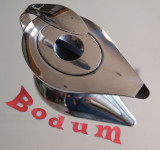
A lovely balance as far as lighting is concerned. I like the shape and style of the text and it is clear that you have gone to some trouble here - thank you. When we get to Photoshop Layers I will show you how you could have done this digitally. This might also have been an opportunity to use a smaller aperture e.g. f16 in order to include the reflection within the sharp depth of field. We'll cover that too.