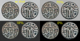
The upper left image pair of this set shows the background as shot with the coin supported over a gray card. While considerable effort was made to make the background even, there is still a little variation and a few dirt spots. Of my tests, this is the closest to an even gray I have achieved naturally. The background was selected and replaced on each of the other three pairs using different tones but the coin itself remained exactly the same. Optical illusion makes the one on black in the lower right appear the most contrasty and lighter with the 18% and 70% falling in-between. White, not shown, is flatter and more harsh looking to the point that I simply do not like it. This optical illusion is one reason I have always preferred coins shot on a black background but the edge of the coin separates more naturally from one of the lighter options. I find the standard 18% gray a bit too dark and close to the black to benefit the edge so the 70% gray may be the best of the set to my eye. Opinions or comments appreciated.


Please login or register.