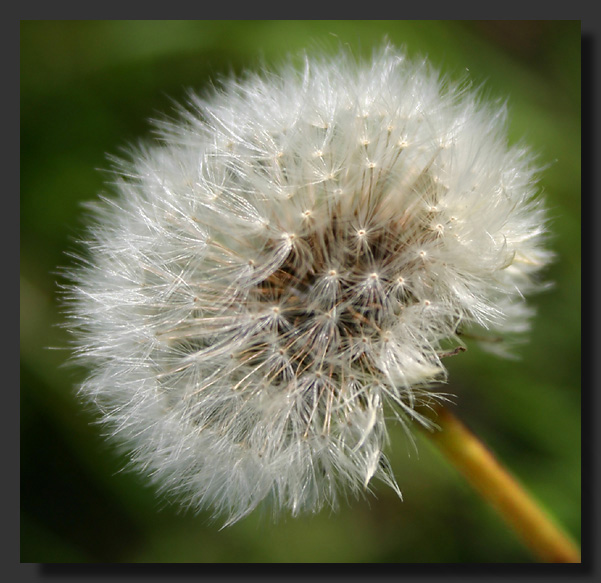
Very difficult to lighten it and still have it look natural, but I did the best i could. Hopefully it looks more like the letter it is supposed to be.
Byron
Guest
04-Dec-2004 13:39
creative "Q". could you lighten up the stem a bit to make it visuall more a part of the flower and less a part of the background? it would strengthen the "Q"