photo sharing and upload picture albums photo forums search pictures popular photos photography help login
Type your message and click Add Comment
It is best to login or register first but you may post as a guest.
Enter an optional name and contact email address. Name
Name Email
help private comment
ctfchallenge | all galleries >> Challenge 149 - Breaking the Rules >> Challange 149 - Exhibition > Life Perseveres
previous | next
05-SEP-2007 John Prichard

Life Perseveres

Mammoth Hot Spring, Upper Terrace, Yellowstone, Wy

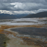
In the harshest of environments ...
Subject is bottom left corner in muted colors. Picture appears tilted although the cloud layer doesn't lie. Although the light was terrible and dark, I kept the lighting to keep the mood of harshness.

Canon PowerShot SD800 IS
1/500s f/3.5 at 7.6mm full exif

other sizes: small medium original auto
comment | share
ctfchallenge26-Dec-2007 15:38
My defense is this. I didn't know about placing the subject at thirds. However, in the shoot overall, I have two photos where I intentionally left the "weed" in. Even if I had known about the rule of thirds I wouldn't have placed The Weed in that much prominence since it has such a tentative hold on life in this place. Being relegated into the corner (more so since I rotated), makes its subtle statement of importance to the scene, but it is included. To my eye since I was there, it has major significance since I haven't been to too many places on this planet where there isn't life every few feet. So it stands out to me. My scenery pics all have detail to the corners to make you feel like you are there and I figure you will eventually notice that this. If you saw these shots in a row (like a slide show) you would instantly notice this piece of green. Since The Weed has a very tentative hold on life here, I've made sure not to recolor it brighter (life isn't flourishing here). So subtle life yes. So subtle subject yes, made so by not being on a third line. PS If you saw this in its High Res glory your would notice the rain drop splashes on the pool too. John
ctfchallenge25-Dec-2007 04:37
John, I don't think you can call the weed in the corner a "subject" when this is such a grand landscape of the Yellowstone caldera. Those clouds make it look a bit menacing instead of simply a famous tourist attraction. -tv
ctfchallenge24-Dec-2007 21:18
Oh, John, that feels so much better! Did you change teh contrast or saturation? Perhaps lightened it? Hmm... ok, I just pulled it back into PS, and it looks nice or the lighter grey desktop. That must be it. Hang this one on a light toned wall. :) Very nice. ~ Lonnit
ctfchallenge23-Dec-2007 16:49
Oh my. Thanks for the unsettling reminder. The subject perseveres, but looks very different from when I saw it eleven years ago.
Penny Street
ctfchallenge22-Dec-2007 19:47
Lonnit, I have a landscape of this shot that says it is very close to correct. I is just one of those things that works against you sometimes ... the edge is cutting away since we are not looking square over the falls. But I agree with you that if I could do what you are saying it would make a better picture. So I looked around and after rotating 2.5 degrees and can't find the tool that will allow me to distort the picture in the way you are saying ... i.e. stretching a box disproportionately. What tool is this. I am re-submitting the 2.5 degree tilted cropped version. John
ctfchallenge22-Dec-2007 02:39
To me the clouds do look a teensy slight bit tilted. I believe the tilt is ruining a very nice image. I just pulled it into PS. Firstly, I rotated it, pushing it as far as possible without the clouds starting to look like they were tilting the opposite way. Then I selected the whole image, and grabbed the upper right corner, pulling it downward, then grabbing the middle of the edge, skewing it down. I tweaked the upper corner again to get it just right, and now the horizon and also the clouds, were perfectly level. I cropped to get rid of the now missing areas, and the image looked spectacular! Straight clouds, straight horizon, leaving me unbothered, and free to roam the glorious scene undistractedly. Please consider this. It made a huge difference in my viewing comfort and the image was indeed a beauty! ~ Lonnit
ctfchallenge21-Dec-2007 15:48
Thanks Rod. I have been thinking about brightening the green alittle so that it becomes more the subject but it's tenacious hold in this whole ecosystem is made more fragile by not being on the 1/3 line. I like your art so tell me if you think I should or not. I put the example in pending. John
ctfchallenge21-Dec-2007 15:17
Rebuttal: Since I made this picture before the competition it is more an explanation of why it still remains in my collection while 100's got thrown away. I have a couple of landscape pictures of this spot one of which got thrown away. I purposely took this portrait orientation to make sure that little bit of life in this whole area of caustic was in the picture but I still wanted to get an interesting sky. Although this habit is a left over from shooting film/slides where every one is precious so get it all in one shot, it is before I started theses challenge and before I knew about the rule of thirds. I have since given this green an extra bit of sharpen to see if I can give it more prominence. This picture isn't tilted it just looks this way, however, I didn't try to balance the tilt like I have done in the past but kept it the same. So it wasn't purposefully tilted but it was purposefully not straightened thus giving it a little bit of tension. It is easy to see it isn't tilted if you study the clouds. As for the textures, I hadn't noticed, I just know what I like. However, I have given the picture a light sharpening overall to bring them out better and now I like it even better. Thanks. John
Rod 21-Dec-2007 13:31
Yes kop that John:-) In case you're not sure I can inform you the picy has passed:-)
ctfchallenge21-Dec-2007 06:45
I don't believe that the patch of plant is your subject. When viewing the image, the subject is quite clearly the landscape. Taking your claimed subject off the intersection of thirds, removed any prominance, making it an unimportant part of the image. You've proven why the rule of thirds works. :) The tilt is insufficient enough to truly seem intentional, thereby, looking like error. Remember my command to shatter the rules? You've broken them but it only served to prove that the rules are correct and that you did not have good reason. Although the image is technically qualified b/c you've attempted to explain, I feel it fails as an image. I desire to straighten it out, and I barely noticed your claimed "subject". Oh, it has lovely potential as a scenic - if you straighten it out and admit that it is the entire scene that is your subject - the texture of the image is what interests me, what I feel the subject to be, - the color being the secondary subject - and texture and color are a feast here; they are everywhere for me to delight in! Qualified. ~ Lonnit
ctfchallenge20-Dec-2007 20:26
After seeing the wonderful "corner" picture by abstract, I remembered that I have a picture where the subject is in the corner. Not as pronounced as his, but the little island of green in this hot caustic place stands out just the same. John