photo sharing and upload picture albums photo forums search pictures popular photos photography help login
Phil Douglis | all galleries >> Galleries >> Gallery Twenty Two: Black and white travel photography – making less into more > Lacquerware worker, Mandalay, Myanmar, 2005
previous | next
03-FEB-2005

Lacquerware worker, Mandalay, Myanmar, 2005

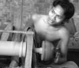
Stops at craft shops and factories rarely produce expressive photographs for me, but this busy fellow at work in a lacquerware shop proved to be an exception. By using a slow shutter speed, I was able to blur his hands, arms and machine to create the illusion of a hectic pace, a sharp contrast to his matter of fact expression. I posted this picture in color in my Myanmar travel article posted on worldisround.com at: http://www.worldisround.com/articles/139134/photo70.html

You will note that the color brings an edge of reality to it that works quite well. The warmth of the woven matte on the wall behind him complements the color of his skin, and his blue sarong identifies him as Burmese. It makes an effective expressive travel image.

This black and white version neutralizes the advantages of the color image. Instead, it presents an array of its own advantages. The abstracted black and white image allows the machine to seem to move even faster because it now has less to compete with it.
The black and white image is all about the blur, the invisible arm that is moving too fast to photograph, and his casual expression. It now has nothing at all to do with complexion or wall materials, or national dress. He now shows us that he does what he does so well that he need not even look at what he is doing. All of this was present in the color version as well, but it blended into the reality of the scene itself as documented by the presence of color. Take the color out and the image accelerates before our very eyes!

Panasonic Lumix DMC-FZ20
1/6s f/2.8 at 20.9mm iso200 full exif

other sizes: small medium large original auto
share
Phil Douglis03-Jun-2007 17:12
Thanks, Tricia, for taking the time to stop and give some serious thought to the purpose of black and white vs. color. All too many photographers use black and white as a visual crutch -- they think that by reducing their image to black and white, they are making it more artful. Yet in losing color, they may be sacrificing inherent meaning. We should never automatically convert our images to black and white just for the sake of black and white. Rather, we should stop and think about what we are trying to say with our image, and then use the medium best suited for that purpose.
flowsnow03-Jun-2007 07:57
You are so very right about the BW conversion. Somehow as I study your images I start to reflect back on my own images. For instance I recall this http://www.pbase.com/flowsnow/image/73718650. My image was of course in colour. But I got your point about the conversion to BW, takes away the eye from the colours and concerntrate on the spinning.
Phil Douglis11-Jul-2005 01:42
Thanks, Zane, for your comment on this image. One other effect that black and white reproduction brings to this image is to make it seem timeless. He could be working on this machine back in 1905, as well as in 2005. Nothing has changed. And you are right -- the eye focuses on the person much more readily in black and white because it goes right to the person, and not to a blue sarong or tan wall.
Zane Paxton10-Jul-2005 21:18
In this case, the B&W does allow a better focus on the person compared to the color shot. Good call.
Type your message and click Add Comment
It is best to login or register first but you may post as a guest.
Enter an optional name and contact email address. Name
Name Email
help private comment