photo sharing and upload picture albums photo forums search pictures popular photos photography help login
Phil Douglis | all galleries >> Galleries >> Gallery Sixteen: Story-telling street photography > Lost in time, Lisbon, Portugal, 2004
previous | next
04-SEP-2004

Lost in time, Lisbon, Portugal, 2004

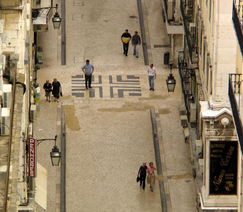
I shot this scene from the top of Lisbon's famous, if somewhat battered, Elevador de Santa Justa. The iron elevator was built about 100 years ago by one of A.G. Eiffel's apprentices. From my perch high over Lisbon, I used a telephoto converter lens to focus on a decorative motif set squarely into the middle of an intersection a few blocks away. I shot picture after picture of people walking through that intersection. Finally, I was able to get the proper spacing and interaction that would tell a story. In this cropped shot, I isolate eight people walking either to or from that decorative square in the middle of the intersection. I frame the scene between two signs and three vintage streetlights. Seven of these people seem to know exactly where they going. One, however, does not. He incongruously stands on the decorative pavement with his hands to his hips, wondering which way to turn. Needless to say, I could see him but he could not see me. I felt sorry for this guy and can empathize with him -- it’s easy to get lost in time in the 200 year old streets of Lisbon – they can often start and stop without notice, disappear into plazas, and climb around hills, all of which makes it one of the most intriguing walking cities in the world.

Canon PowerShot G5
1/320s f/4.0 at 28.8mm full exif

other sizes: small medium large original auto
share
Phil Douglis19-Aug-2006 23:24
I felt as if I was watching a theatrical performance as well. The street was a stage, and all the pedestrians were acting their roles, especially the fellow who seems lost. I like the nearly monochromatic look to the image as well. I did not want to convert to black and white -- the color of Lisbon's streets are part of the charm here. But the fact that the image is mostly a dull brownish gold simplifies the scene, and as you say, does not compete with the people.
Chris Sofopoulos19-Aug-2006 19:13
I love the symmetry, the angle and the theatrical approach of this photo.
Isn't it like a performance in a big theatre? Even the almost monochrome tones add to the image, emphasizing to the people walking. A beautiful shot!
Phil Douglis10-Apr-2005 03:31
Thanks, Benchang, for adding to the body of opinion that is gathering around this image. I am glad you have learned so much from the dialog that it has created. What you are saying about the role of "direction" here is very true -- people tend to follow certain paths and cues, and it is easy to sense when someone has "lost their bearings" so to speak. In this case, we are observers, not participants. We can see who seems to be lost and who does not. From our vantage point we do indeed have things easy --we are already "there" while the others are still making their way towards us, some better than others.
Benchang Tang 09-Apr-2005 15:19
What a pleasure that I have heard all the discussions among the author and the viewers in here besides the picture itself, one of my favorites. Very often we like the work but fail to know why and in the discussion we learn a lot and will be helpful for our work. First I heard about the " space" and I thought why and just as I wanted to mention the advantage of the vantage here I found it is touched upon, how wonderful! Here I want to add a little,the thing different from the picture of the rusty sidings picture taken in chile is " the direction". The feel of direction is made possible by the flanking walls, two rain drain lines and so on. Can we feel that people as a whole have no choice but follow the " unwritten rule" and here they are also willingly or customary walking in the same direction( the one lost is looking for another exit or way seemingly, and the one almost to be removed is curious about the lost person is doing), and this picture is so easy looking since the people are coming to us, not from us.
Phil Douglis27-Sep-2004 22:18
Thanks, Lara, for joining the long and fascinating dialogue I have going on this image. You are the first to really focus on the importance of the perspective here, which, of course, changes everything. The viewer sees everything from here that the lost man can't see. The life of the street and the street itself is so much larger than he is from this viewpoint, and that scale incongruity makes him seem even more lost than he is. (We'll be studying how vantage point affects perspective and meaning when we work together in my Sedona workshop next week.)
Phil
Lara S27-Sep-2004 14:22
And the fact that you've centered that the guy with his hands on his hips makes him stand out even more. I like this photo. It teaches me to take photos of people from a different angle. I usually am standing at the same level as the are and can never get a story from that point of vue. Next time I'll stand on an elevated area to get the "Better story"
Phil Douglis26-Sep-2004 21:23
I'm delighted to welcome a Lisboan to this discussion, which has already drawn comments from pbase artists from England, China, Malaysia, and the US. And now Portugal as well. It is a beautiful street, indeed Pedro -- not just as a street, but also as community. As this image seems to bear out! As for that perspective, how many other streets in the world can offer a huge tower as a vantage point?
Guest 26-Sep-2004 16:23
Very nice photo ! One of the most beautiffuls sreets of Lisbon! Excelent perspective.
Phil Douglis26-Sep-2004 00:38
And one more great comment to add to the many that have already been entered below. You raise an important point here, Bruce. In expressive photography, we are often as concerned with the effect of what is not seen, as what is seen. And that seems to be most compelling for you here. Thanks for this valuable observation.

Phil
Guest 25-Sep-2004 19:19
I don't see the fellow as lost - merely curious. He is looking at something that is happening on that cross street, as is the man to his right, as are the two men approaching from "above". So the real story is not what is happening here, but what is happening out of the frame that is so interesting to all these pedestrians! (IMHO)
Phil Douglis25-Sep-2004 01:07
I believe you, Marek. And if you did, you are ethically obligated, I believe, to inform your viewers in the caption that the photograph is an electronically altered photo-illustration. I tell my students that in non-fiction photography such as photojournalism, street photography, travel photography and nature photography, the line between enhancement and manipulation is crossed when you try to deliberately mislead your viewers. In other words, lie to them. Cropping, color and contrast enhancement, and even some cloning to take out irrelevant distractions are acceptable. Changing the story itself by rearranging pixels is not. (Needless to say, advertising and commercial photography is exempt from all such considerations, since most viewers with any intelligence already know that advertising itself is fiction.)
Guest 24-Sep-2004 23:42
Just a final word of clarification: I would never dream of doing what I did here (ie create a different story) to one of my own. Scout's Honour ;-)
Phil Douglis24-Sep-2004 17:59
Just noticed that you have weighed in here, too, Jen. Four of my favorite critics in one place at one time -- Celia, Marek, Robin, and now you. What a treat it has been for me to get all of your brains thinking about the same thing at the same time. As you and I have discussed, Jen, I see my pictures primarily as triggers to thought, but I never expected this one to trigger more thoughts than any other image I have posted in my cyberbook. You will notice that everyone who has left a comment here so far likes the picture, but for completely different reasons. If ever there was an example of how a photograph can inspire different thoughts from different people, this must be it.

I love your wonderfully optimistic and spiritual interpretation, Jen. Minor White would be first to tell you that your response to this picture has as much to do with who you are, as with what is really going in this Lisbon street. You can see trust, love, and intimacy in these couplings. You see the two individuals here as seeking another soul, and that moment seems to be almost at hand for you, Jen.

I called this picture "Lost in Time" because I see that man as lost, and caught forever by my camera in a moment of time that has now long passed. He may or may not have found his way. Or found that other soul that you see him looking for. We will never know. But you do, Jen. And that is the most important thing. Not what really happened here on this Lisbon street. But what you, Marek, Celia, and Robin think is happening, and why. I am thrilled that this image has been the cause of so many substantive thoughts. And that you all took the time to enter in to such a rewarding dialogue. I will look at this picture with entirely different eyes. Thanks again to all of you.

Phil
Phil Douglis24-Sep-2004 17:18
Thanks Marek for sinning all over my picture. You create your own "street" of "impossible perfection" here with a few clicks of the clone tool. Now I have a confession to make. I cloned a bit here myself -- there was a ugly kiosk roof protruding into the bottom of this picture, and I took it out. So both of us changed the facts of this picture to make it "better," but my clone was intended to clean up the picture in order to enhance the meaning that was there by removing a serious distraction that had no meaning. In scratching your own itch, you "cheat" by completely changing the event itself, and thereby give this picture its Warnovian ending. You can do this guilt-free in any work of art. But street photography's great appeal rests in the viewer's assumption that what is happening in the picture really happened in life. Your clone makes this no longer street photography, but a work of "Warnovian Art" instead. I am delighted to indulge your fantasies here, Marek. We can all learn much from them.
Jennifer Zhou24-Sep-2004 17:09
I have been enjoying Marek, Robin and Cecilia 's wonderful comments and of course Phil's wonderful photo which stimulates thoughts for the last 20 mins. There are so many very interesting points here in these comments which are very valuable to me..Thank you for all of you!

This place on my first look is just like how heaven should be. So peace and clean..
Everything is going to be perfect here just like that three pairs of people, they are full of trust, love, intimacy..But that two individuals who I guess just came up to here still on their way seeking another soul...until the time they find each other and apparently the one on the right already recognized the other one..they are so close...


Jen


Guest 24-Sep-2004 14:38
I like Celia's spatial approach to scene assessment, however I disagree on one point: I believe that it is part of the art of photography to elevate the ordinary to above itself; by editing out the extraneous as well capturing the moment. Therefore, I don't accept the ‘real life’ argument -- that's just a capitulation to the ordinary. The best images are the ones so impossibly perfect in their arrangement that they are presumed to be staged. That said, see me cheat below, as the best way to relieve an itch is to scratch it. Enjoy ;-)
Phil Douglis24-Sep-2004 00:30
Coming from my toughest critic to date, your words of praise for this image are taken with more than usual pleasure Celia. I thank you for reading this image with such clarity and for finding the meaning that you did here. Reading photographs effectively requires as much skill as making them. You must be able to open your mind, absorb the details and then put them together into a coherent story. You must enter the image yourself and leave of some what you are within the frame as well. You do this as well as any critic I have encountered in 40 years of teaching photographic expression, Celia. It a gift, a rare gift, to be able to grasp the essence of a photograph and then articulate it effectively to others. I am honored that you are willing to come to my images with both damnation and praise -- your comments on this picture and others have given me a second pair of eyes, and for that I will always be grateful to you.

For example, in making this image, I was paying my full attention to the position of the subjects, but never really considered the importance of the spaces I left between them until now. Obviously my instincts and experience as a photographer caused me to release the shutter at this instant -- and no doubt that spacing was part of the reason. You are correct -- it is in the spaces that we find depth, isolation and tension -- and yes intimacy. You are showing me my subconscious mind at work, Celia, which will be of huge value to me as both a photographer and a teacher.

Your observations about all those little mysteries moving down this street fascinate me as well. Now I see, for the first time, why this photograph speaks as well as it does. It is about a community and the life of a great city, as represented by diverse yet united individuals, including one fellow who needs to somehow find his way. I can't thank you enough, Celia, for what you have done for us here. I hope that you will eventually do likewise for many of the other images in this cyberbook. Whether you come to my images with open arms or a sharp hatchet, your cogent observations help teach us how to see, Celia, and you teach us that very, very well. And that is exactly why I post these images here on pbase.
Cecilia Lim 23-Sep-2004 23:36
I am drawn very much to this photo, Phil. Like Robin, I too feel it's among one of my favourites in this gallery. It reminds me of the image you made of "Rusty Facade, Valparaiso, Chile, 2003" in your colour gallery. (Seehttp://www.pbase.com/pnd1/image/25472088). They are both rather general photos about the environment, pulled together compositionally by mainly one dominant colour - in this case, the beiges - and most intriguingly, they both contain pockets of "stories" dispersed throughout the image, waiting to be told. All the people in this image have journeyed here to the same place, but they are all there for different reasons, under different circumstances. And we're given a chance to glimpse into their lives. We have clues about who they are from their age, gender, what they are wearing and who they are with. And it is this mystery about their lives and where they are going that grabs the attention and imagination of the viewers. Not many photographers are able to create pictures like this one - to capture a slice of busy everyday life of people living in the same city and walking the same streets, yet make us stand back and remind ourselves that in this very sameness, there are so many different stories being lived. In a way, your picture celebrates our individualism and diversity!

This image is also very much about space and shows us the importance of how it affects meaning. Every meaning in this image is created by the space between the subjects - space within the couples; space between the strangers; the space surrounding the lost guy; the space between the people and the buildings; space between the viewer (you) and the scene. Space creates depth, isolation, tension . Even intimacy! This is a great reminder never to ignore space in photography!

I also read with interest the arguments about whether the guy on the right looking at the lost guy dilutes the meaning or not. I personally like the guy there too. It maintains the orderly nature of things in this image by visually matching up with the other lost man. It also adds a touch of humanity and realism to this image because in the real world, there are many single individuals just as there are many "pairs", and we, like the guy on the right, are sometimes affected by people we don't know. The guy on the right adds tension to the story surrounding the lost man too.

I've truly enjoyed this photo Phil. It's like putting pieces of a puzzle together to make a bigger picture. And the bigger picture would not have been as fun without having the little pieces to figure out. Great piece of work Phil!
Phil Douglis23-Sep-2004 17:29
Marek and Robin -- I am delighted to see you both wrestling over the meaning, and the necessity, of the guy on the right. I like him there, because he makes it a more intriguing situation. However, when I made this image from the top of a tower several blocks away, I was concentrating on the lost fellow at a crossroads, period. I was not aware of the fellow on the right, nor did I see any particular meaning in the pattern of lamps, either. All of that came later, when I cropped this image and I took another hard, long look at what I was saying here. In essence, I made this picture twice. Once as I framed a mass of pedestrians at an intersection, and again when I cropped into a coherent statement. The original, uncropped version of this picture had ten people in it. I took two of them out, plus a lot of garbage on the left hand side of the frame. I answer your question, Robin, with a resounding vote for taking the picture that you want to take, even if there is a lot of other stuff going on, and then re-composing the image later by cropping it to make more sense out of it if you can. If it still doesn't work, at least you gave it your best shot.
Phil
robin statfeld23-Sep-2004 13:33
Marek, I'm fascinated by your religious interpretation of this picture! Aside from that though, I can understand about the guy on the right weakening the pattern and the message because he's not part of a pair. However, I think that argument would be stronger had this image been simply about Loneliness. Instead, it's also, and moreso, about Being Lost - the middle guy's body language and the fact that he's standing on a map-like (IMHO) pattern drives that point home. Although the right guy is alone, he seems to know where he's going. He also serves as a surrogate for the viewer, since he's looking where we are looking - I really like this device and will try to use it as much as I can.
The debate on whether the guy on the right detracts brings up a general question I'd like to pose. Had the right-hand guy bothered Phil, and had he waited for him to walk out of view or for another couple to appear, he would have missed this shot. Is it better to take the picture (and keep it), or to forego it, if there's an element that's not exactly perfect?? I have walked away from too many opportunities because a construction crane was in the distance or some other hair was out of place...
Guest 21-Sep-2004 10:39
Hmm... I still think the guy on the right dilutes the strength of the solitary figure. Observe this: The 'lost' guy sits in the middle of a Star of David formation, where one triangle is formed by three sets of couples, and the other (less obvious) by the three hanging lanterns. The guy on the right bothers me because he saps attention from the right lantern. The only way I can live with this (but not aesthetically, I'm afraid) is if the meaning is that the lanterns represent knowledge and the right-hand figure is a 'messenger'. Maybe I'm asking too much, but what I really want here is just one lost guy standing right in the middle of the cross... (The jury's out on that one ;-)
Phil Douglis19-Sep-2004 20:21
Thanks, Robin, for these comments on this shot. I agree -- this picture does speak for itself, but since I regard this cyberbook as a teaching tool, I feel obligated to explain what I was trying to say and how I tried to say it. Glad you feel I was successful here. I was fascinated by your observation that there are two mosaics here -- the one on the street itself, and the one made up of people and those street lamps. I was even more intrigued by your hunch that the guy on the right might come over and help the bewildered fellow find his way. As for the answer to that question, your guess is as good as mine. I was too busy making pictures to remember.
robin statfeld19-Sep-2004 17:13
Phil, I keep coming back to this image, as it's among my favorites in your street gallery. It's so interesting to read what you were going for, how you set this scene up, but (aside from the learning experience) it's totally unnecessary - the photo speaks for itself and conveys exactly what you set out to convey, in my book that's success! The mosaic in the street is only part of the pattern, it's enhanced by the mosaic of passersby and by the triangle of street lamps. And the timing of the lost man standing on the pattern is so perfect - the design and his stance evokes those hedge labryinths that people get lost in. Finally, I saw another story in this only after my third or fourth look - yes, there is loneliness in being lost in a strange street while pairs of people pass you by, but there is also hope. The man to the right looks like he just might stop and help the man to find his way. Will he or won't he? You might know the answer, but don't tell us, keep the mystery : )
Type your message and click Add Comment
It is best to login or register first but you may post as a guest.
Enter an optional name and contact email address. Name
Name Email
help private comment