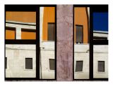
photo sharing and upload picture albums photo forums search pictures popular photos photography help login
Type your message and click Add Comment
It is best to login or register first but you may post as a guest.
Enter an optional name and contact email address. Name
Name Email
help private comment
Rob Rosetti | all galleries >> Galleries >> Abstractionism > Reflections II - IMG_0197
previous | next
July 2006 Roberto Rosetti

Reflections II - IMG_0197


other sizes: small medium original auto
comment | share
Fong Lam10-Nov-2006 14:58
Beautiful reflections. This is just as nice as the previous one, each has its own merits.
Ray Rebortira12-Jul-2006 01:36
This has a very formal quality but retains the dynamic electricity of the original.
ac11-Jul-2006 08:17
Contrast and perspective correction are good ideas for such shot. Well done Roberto.
Guest 11-Jul-2006 07:33
Exceptional - like a watery mondrian! v
Sue Robertson09-Jul-2006 23:25
Wonderful colours and abstract. Well done.
shatterbug09-Jul-2006 20:38
Great reflection! The strong contrast works well here, and comp is superb! V.
ltolksdorf09-Jul-2006 14:45
Great shot. V
Guest 09-Jul-2006 02:31
D'accordo con Andrea e Adalberto :-)))
Lucie
Doug Kessler08-Jul-2006 20:57
Both images are very good but this one really does it for me. Great work, Roberto. V
Adalberto Tiburzi08-Jul-2006 20:00
D'accordo con Andrea!
Adal
Guest 08-Jul-2006 19:47
in parte simmetrica, in parte distorta...
... è stupenda.
ciao Roberto
Andrea
Shimon Levkovich08-Jul-2006 18:47
I prefer this one because of the saturation and the geometrical lines. GMV
Sergio Pessolano08-Jul-2006 18:21
Excellent, clever composition. Voted.
Squared C08-Jul-2006 16:31
As much as I liked the other yesterday, I like this one even more. It is less busy which for me lets the geometry speak more clearly. This one is excellent!
AL08-Jul-2006 15:55
I can't decide which one I like better... Definitely a "neater" perspective and more uniform geometric effect. But I also like the other one with more blue and different abstract detail. Well, here is another vote to you :-)
Guenter Eh08-Jul-2006 15:35
Yes agree - I prefer this one too! There is more calm with the perspective correction. This enhances the strong graphical effect with this composition! Excellent work with your post processing Roberto!
Guest 08-Jul-2006 13:45
prefer this one...
Donald Verger08-Jul-2006 10:52
vote! wonderful... keep these coming... ihave a little gallery... contemporary images... abstracts kind of ... i have a show this fall in a huge barn... i am meeting with her this weekend... Stadler Gallery maine... and am trying to gather some abastract contemp images or even take a few purposefullly
anywya

i like this one and the one near it .. but like the deeply staurated colors of this one best and maybe the comp of the other ambit better ")
vote