photo sharing and upload picture albums photo forums search pictures popular photos photography help login
Phil Douglis | all galleries >> Galleries >> Gallery Two: Travel Incongruities > Smoke, Bagan, Myanamar, 2005
previous | next
03-FEB-2005

Smoke, Bagan, Myanamar, 2005

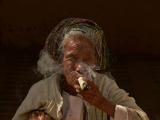
This woman puffs on a massive cigar wrapped in a banana leaf. When she saw me aiming my camera her way, she made sure to wreathe her face in a fragrant coil of smoke. This is a good example of layered incongruity. The longer we look into this image, the more incongruities we see. The base incongruity, of course is age. Smokers are not supposed to live as long as non-smokers, yet here is a person robustly smoking at a very advanced age. Then comes a layer of scale incongruity. People normally smoke smaller things than this massive hand-rolled cigar. And finally, there is the incongruity presented by the layer of smoke that coils around her nose and cheek. It hangs and droops around her face in the same pattern that her turban droops around her head. I used strong sidelight here to stress one side of her face and cigar. The rest of her, including the hand that holds the cigar, is in shadow. I allow the background to go entirely black, removing all distractions.

Panasonic Lumix DMC-FZ20
1/500s f/4.6 at 72.0mm iso80 full exif

other sizes: small medium large original auto
share
Phil Douglis16-Jun-2007 05:37
Once again you suggest a novel title for one of my images, Sun Han. Puff the Magic Granny, indeed!
Guest 16-Jun-2007 04:29
puff the magic granny living on the street, the smoke adding curls to her silver hair while the wrinkles writing something about her age-- the charm of a non-neat-look life
Phil Douglis30-May-2007 17:39
Thanks, Henrik -- I hope you will visit my galleries often and find value in them.
Guest 30-May-2007 07:28
Brilliant...
Phil Douglis06-May-2007 18:07
Thanks, Aliusvetus. I agree. They are similar images, and I hold his in just as high a regard as my own. We each interpret this woman and the act of smoking according to our own vision of it.
aliusvetus06-May-2007 15:53
I followed the link from Manny's "Cheroot again" and yes, it's really a very similar approach - I like very much, both.
Phil Douglis28-Apr-2007 23:55
Thanks, Manny -- coming from a master such as yourself, I consider your comment a huge compliment, however I can't agree that that my image is "better than yours" athttp://www.pbase.com/manny_librodo/image/77824047 I don't see any evidence of superiority here -- what I see is difference. My image offers rich coloration, while you offer close up intimacy, pushing that smoke right up all of our noses. We both tell similar stories, but in different ways.
Manuel Libres Librodo Jr.28-Apr-2007 17:46
I like the colours. Thick smoke makes it! and the warm colours. I think it's not the same woman. I like yours better than mine.
Phil Douglis14-Nov-2006 01:23
You are welcome, Theodore. Incongruity is at the basis of humor.
Guest 13-Nov-2006 07:52
I had a good laugh when i came across this picture! Thanks!
Phil Douglis11-Nov-2006 01:33
Every once in a great while, I run across a sight like this. It is icongruous on two levels at once -- the subject itself (an older woman smoking a huge cigar) is not what I would have expected. And my photograph of her, which covers almost half her face in a cloud of smoke, is incongruous as well.
Guest 10-Nov-2006 19:44
:-) just incredible
Phil Douglis29-May-2006 18:03
No studio, Jack. And not Churchill, either. But one of the most famous portraits of Churchill ever made was created because of a cigar. In 1941, during the darkest hours of World War II, Churchill was asked to pose for the great portrait photographer Yousuf Karsh. He wanted to depict a belligerent, defiant Churchill. The prime minister was smoking a cigar as he took his pose, but Karsh snatched it away from him. Churchill's reaction produced one of the most famous portraits of its time. See it athttp://www.masters-of-photography.com/K/karsh/karsh_churchill_full.html And all because of a cigar that wasn't.
Guest 29-May-2006 17:20
Its a studio portrait!! Could be Winston Churchill.
Phil Douglis17-Apr-2006 06:00
Willie, the "slide like effect" you see is simply rich color made richer. I warm all color by using a "cloudy" white balance setting in my camera, even in the sun. I almost always add a slight amount of red and yellow in the "color balance" control in Photoshop, as well as a bit of saturation. I also intensify contrast and color with a slight adjustment of "Curves". Taken together, these decisions generally make my images warm, rich, and colorful. And if that is a "slide like" effect, so be it.
Willie BC13-Mar-2006 19:21
How much Photo Shop Post Processing ( if any ) have been applied to achieve this slide like effect? Had the skin tones been adjusted?
Phil Douglis24-Feb-2006 00:48
Small world. Two people travel through the same country one year apart and photograph the same person. Amazing.
Gul Chotrani23-Feb-2006 12:34
We must have walked thru similar paths, meeting same people. You're right - this is the same cheeroot smoker we've met. I've been away for a few days, so this belated reply.
Phil Douglis19-Oct-2005 23:23
The detail in the eyes and mouth here is very effective. The light on her face is equally effective. I like shadows, because they give the face a natural look that makes her seem more real. "Better Lighting?" I could have blasted her face with fill flash to illuminate every detail and banish those shadows, but that is never my style or my purpose. I have always appreciated the value and meaning of light as it falls naturally upon a face -- and this is a good example of such natural light. She is a mosaic of textures, tones, and colors, each of them adding to the value of this portrait and to the context that makes that big cigar so incongruous. To me, the lighting is perfect for what I am trying to express.
Denny Crane 19-Oct-2005 19:21
Summary judgement: Close, but no cigar.
The most expressive object in this photo is and should be her eyes (and mouth). But the eyes are in shadow and slightly out of focus. I think they should be in focus and with light on one or both of them. The smoke maintains dominance because it is sharp, is lit up, and looks good. I'd like to see more texture and detail in the cigar and her hand. This is an okay shot, but it could have been striking with a little better lighting. I'd also like to see more of her arm (right side) and knee (left side) within the frame.
Phil Douglis02-Oct-2005 03:58
You use your imagination well here, Lisbeth. The only thing you missed was the smell!!!!!
Lisbeth Landstrøm01-Oct-2005 20:34
This lady seems so far away, but also so present in the sunlight. You can feel the heavy smoke working within her - melting together the past and the presence and laying a calm blur on the future. A million for her inner pictures - really!
Phil Douglis28-Aug-2005 23:47
That was a very good lesson from your grandma, Kostas. Glad this image awakened those old memories.
Kostas 28-Aug-2005 18:56
That takes me years back where I grow up on our village. We used to have a land growing tobacco. My grandma & grandad used to make their own cigars, peaking leafs from a bug.
Once I asked my grandma, we I can't smoke ?
Instead of telling me that's not good for a child she stood up, grap some leafs and make me on. Go on, smoke she said.
By the time I light it up and took a whiff I was coughing for at least half an hour.
Raw tobacco is much much heavier than the one we buy in shops.
So I am thinking this old lady is trying to "scare" some children and prevent them from start smoking.
Phil Douglis03-Jun-2005 18:32
It's amazing, Cory, how cultural contexts affect the interpretation of images. You also make a good point about how tonality can effect meaning. I do my best to put my ideas into my images, but once the image is posted it acquires a life of its own, and can be seen in a multitude of sizes and tonalities on various monitors that can greatly affect how it is perceived. It is something that none of us can control --we can just make the most expressive images we can and hope that others will be able to view what we intend them to view (even though many of them can't.)
Guest 03-Jun-2005 00:35
You make an excellent point here Phil. I have no experience with the Burmese culture and so I interpret it one way. Not only do individual ideas apply here but those of an entire culture. While we find it odd to see a lady of her age smoking a cigar of huge proportions they look upon it as not unusual at all. On taking a second look at this (and now I look at it on a properly calibrated monitor) the tones are warmer and I think I read her expression wrong. At first I found it challenging, and now I find it calm, at peace with who she is, and uncaring if someone else is taking her photo. This is her relaxation and no-one is going to disturb that.
Phil Douglis02-Jun-2005 23:07
It is interesting to me that we tend to interpret this picture based on own standards of how little old ladies are supposed, or not suppposed, to behave, Cory. When traveling to what for us is a strange culture, we are often attracted to incongruous behavior or appearance. Yet actually, the behavior in this photo is not incongruous by Burmese standards. Elderly women have been smoking these big cigars there for years. This must seem as business as usual to Burmese viewers. If I was to show this image to them, they would probably wonder why it is even here. Yet very few, if any, of my pbase viewers are Burmese, and most of them do not have a context for such an image. What they will see here is surprising at least, and shocking at most.Because of that, this image becomes a good teaching example to demonstrate incongruity at work.
Guest 02-Jun-2005 21:47
The first incongruity here that I see is a very aged woman with which we would normally associate frailty and one who would be careful of lifestyle choices with years of wisdom. Instead she has a look of total disdain , "I will smoke if I want and I will smoke the biggest darn thing I can find!". I can hear her challenging life with her statement as well as you photogrphing her Phil.
Phil Douglis14-May-2005 02:39
Thanks, Anna, for this wonderful comment. I value your comment so very much, because you have been to Burma as well and have photographed a woman who looked very much the same athttp://www.pbase.com/annapagnacco/image/37310342 I appreciate the fact that you have focused on the light here. As you know, I look for light first and then the subject -- I saw the inherent contrast working here before I even made the image. I knew that if I used my spot-meter to expose on the bright cigar that the shadowed wall behind her would go to black. I hope the cigar you carried home from Burma will always remind you of these women -- they are the essence of old Burma and at the same time very incongruous.
Anna Pagnacco14-May-2005 00:25
The light is great here and the smoke creates a wonderful pattern and mood----
This is a fantastic capture Phil... in every aspects...
She jumps out of the screen...
No, I think she is not the same woman I shot at the Bagan market.as well
Mine had her eyes completely lost and looked older...
Maybe they both go to the markets to be shot and to gain some money from the tourists...
I recognise the cigar ...I remember a woman making it it under my eyes in a village...
I have still one at home like souvenir :-) Ciao, Anna
ruthemily17-Apr-2005 22:56
i will certainly try my best to do just that!
Phil Douglis17-Apr-2005 22:04
You have expressed it as well as I did, Ruth. Now practice what you are preaching here!
ruthemily17-Apr-2005 20:27
that serves to clarify the form/content idea i was asking about last night. i totally understand it now. you cannot sacrifice content for the sake of "good" form. good form is only good if it complements and better still, enhances the content.
Phil Douglis17-Apr-2005 19:03
Thanks, Ruth, for commenting on this image, which I feel is among the most incongruous photographs I've made to date. As I said in my caption, there incongruities layered upon incongruities here, involving perceptions of age, scale, gender, and form. I thank you also for endorsing my centered placement as well -- as you've implied, it is form that enhances content, not form used for its own sake.
ruthemily17-Apr-2005 18:55
i knew i liked this image as soon as i saw it. the main incongruity i get is the sheer size of that cigar! and i think the gender thing as well, which was touched upon by monique. i guess there is the western notion that being a woman means being "feminine" and "womanly" and "ladylike". smoking a big fat cigar falls a long way short of all of these categories! i like the composition - i think it would feel unbalanced were it not for the lady being centered. i guess that echoes what you are saying about the sturdy anchoring effect of the implied triangle.
Phil Douglis13-Apr-2005 00:55
Glad you can appreciate my thinking on this, Henk. Thanks. I try never to do anything in my pictures without having a good reason for doing it in terms of what I am trying to express.
oochappan13-Apr-2005 00:27
Thanks Phil in a way I agree that a total centering can evoke that curious feeling to give it more attention, how rules can mislead us to stand still to obseve more closely.
Phil Douglis12-Apr-2005 22:52
Hi, Henk,

Thanks for the comment. I welcome your off-center composition suggestion -- Mike Curtis suggested that as well -- because it gives me still another chance to explain why I structured my image in this way. As I told Mike, I wanted this particular image to be composed as classically as possible. A triangle suggests tradition and formality, while the cigar expresses the ultimate in informality. I am not composing here by the so-called rules of composition. I am breaking those rules to create a static triangular base and then topping that triangle with an outrageously incongruous act.

I structure my images according to the idea I am trying to get across, and to me this was a perfect solution. As you know, Henk, there is no right or wrong way to compose a picture. Composition for me is never based, as it is for so many photographers, on aesthetics. I use composition to organize my pictures for meaning, and to me, a formal triangle was the perfect structure to crown with the incongruity of an old woman smoking a big cigar.

Hope this explanation of why I composed it in this way will be useful to you, Henk.
oochappan12-Apr-2005 22:36
Hi Phil, nice seeing this lady smoking a cigar and that in Myanamar, a place still a tiny bit closed off from external influences. Ok you know me, let's try to evaluate....
Content impecable as nothing else is taking away the attention to your subject placed in a very classical potrait-setting isolatd from everything else by the black background.
Technically spoken gives the centered position a very static feeling like a statue but it is not as smoke induce some action here, apossibility here was to bring her left arm also into the scene to place her higher into the frame slightly outcentered. I know getting older, bending knees can hurt but if you had you would have less the feeling that you look downwards to her, making her a tiny bit more impressive active to the viewer. Involving some elements even slight out of focus could also help to eye-travelling and an antagonist to enforce the target.
Conclusion: still most important is that we get a clear message to your subject and you wisely avoided compo-techniques (lately too much abused to get all attention on the photographer ridiculizing the subject if there is any). The colors are fine warm softly darker reholded for the intime mood of the shot. An ejoyable person to see with an unusual cigar. Thanks for showing.
Phil Douglis23-Mar-2005 18:48
Thanks, Mike. By the way, this image is also spot metered. That is how I was able to get the detail in the face and cigar to work.
Mike Curtis23-Mar-2005 18:35
I see that now, and agree that this composition is better. Again, great shot.
Phil Douglis23-Mar-2005 18:12
Thanks, Mike, for your comment. As for shifting her to the left, I agree with you that normally, off center subject placement makes images seem less static and implies movement. However in this case, her body and arms formed a triangle, and I wanted that triangle to be rooted in each of the lower corners. If I had moved her to the left, I would have chopped into the triangular base that anchors the image.
Mike Curtis23-Mar-2005 16:35
Ah Phil, she isn't old. She's really 45, but smoking has made her look that old.... ;-) Just kidding of course. Great shot. I'm no where near as experienced as you, but wonder if placing her a bit to the left would work better seeing that she is looking toward the right of the frame. I do like the layered look and think it tells a great story. Good job.
Phil Douglis12-Mar-2005 00:26
When in doubt, Lara, always shoot both horizontals and verticals unless you are sure of what you want your frame to do for expression. In this case, the triangle is critical. It has to be a horizontal.
Lara S11-Mar-2005 23:03
I agree with you Phil. Shooting it vertically would have been distracting to her face and the smoke.
Phil Douglis08-Mar-2005 23:01
Hi, Clara. I must disagree on your suggested vertical here. I shot it horizontally so that I could create a triangle out of the body, drawing the eye to the cigar with the diagonals coming out both of the lower corners. A vertical would have simply embraced more of the subject, adding information that would have probably distracted from that wonderful face, turban, and cigar.
Guest 08-Mar-2005 16:38
Very interesting portrait. Maybe I'd shooted it vertical to see more of the woman's body.
Phil Douglis04-Mar-2005 17:50
I wish there was a general guideline I could give you on this question, Dandan, but there can't be. That's because we must look at each image as an individual case and decide what we want it to say. Does the abstract power of black and white intensify that point. Or would color help the idea get across. The color in this turban is very important to the picture because it adds so much to her character. I would never want to remove it by converting this to black and white. On the Maker of Rice Bowls, the purple tank top was not essential to meaning, and the image became much siimpler and more powerful in black and white. Does that help?
Guest 04-Mar-2005 09:53
Phil, I have been compare your “Maker of Rice Bowls” http://www.pbase.com/pnd1/image/40169890), colour and B&W version with this, I converted it B&W; They all look so great to me. My question here is for a portrait, when a B&W version will bring the dramatic feeling out of the picture, and when a B&W will suck the life out of the a image/character?
Phil Douglis28-Feb-2005 05:05
Good point, Mo. So do I. Another mark of an effective portrait, right?
Phil Douglis27-Feb-2005 20:23
That is why I've made this image the new "representative" thumbnail for this gallery.
monique jansen27-Feb-2005 19:12
Another quick note - when I look at this picture, I want to know what this woman's life was like, because of her wrinkled face, the expression of her face, and her attitude.
monique jansen27-Feb-2005 08:47
And there is also the incongruity of an old woman smoking a big cigar, not often seen in the world around us.
Type your message and click Add Comment
It is best to login or register first but you may post as a guest.
Enter an optional name and contact email address. Name
Name Email
help private comment