photo sharing and upload picture albums photo forums search pictures popular photos photography help login
Phil Douglis | all galleries >> Galleries >> Gallery Two: Travel Incongruities > Sheer Scale, The Guggenheim Museum, Bilbao, Spain, 2004
previous | next
01-SEP-2004

Sheer Scale, The Guggenheim Museum, Bilbao, Spain, 2004

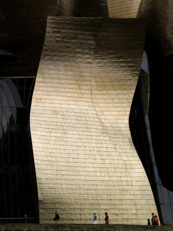
Frank Gehry’s Guggenheim, a 350,000 square foot colossus, is the focal point of a $1.5 billion redevelopment plan for Bilbao. Its revolutionary architecture remains controversial. Locals call it the "Californian Cauliflower", while the New York Times hailed it as the first great building of the 21st century. No matter what your view of it, the sheer scale of its central piece of massive titanium sheathing is hard to ignore. I shot this picture on an overcast day, from a position just across the Nervion River from the museum. Focusing my spot meter on the titanium panel, which is angled so that it is reflecting light into the camera, I was able to darken the panels and glass behind it. I waited these people to walk below the titanium panel -- they appear so small in comparison. This scale incongruity tells us just how enormous that panel really is.

Canon PowerShot G5
1/1250s f/6.3 at 25.1mm full exif

other sizes: small medium large original auto
share
Phil Douglis08-Sep-2006 18:27
Thanks, Chris and Vrushaket, for enjoying this image so much. And thanks, too, Chris, for pointing out the role the light here plays in defining the texture of Gehry's huge titanium sheathing. The play of light not only is central to this image, but to Gehry's architectural focus as well. I use my spot meter to expose on those highlights, deepening the shadows around the sheathing and increasing the effect of light upon texture as much as I can.
Chris Sofopoulos08-Sep-2006 17:04
I fully agree with you Phil. This building is so huge in comparison with the people.
I like the texture and colour of it due to light. The perfect exposure here shows exactly the angles with light and shadows of the building. The huge size of the building, the light and the dark parts around it (due to exposure) give a dramatic appoach to the image.
Phil Douglis13-Apr-2005 20:49
Thanks, Sonia, for understanding and appreciating what I was trying to do here. I had no idea this was actually a sculpture within a sculpture, because I did not have the same context for Gehry's work as you, a student of Architecture, would have for it. I was working on pure instinct. I respected the power and form of that panel of titanium as part of a colossal work of art. To me it was an essence of the whole structure, a building that gains much of its energy and meaning from its sheer scale. It was impossible to contrast those tiny figures to the entire building to create scale incongruity --they were simply too small in comparison. But they were the perfect size to contrast to this panel, and thus make the same incongruous point. Once again, abstraction, incongruity, and human values are all working together here as expression.
Guest 13-Apr-2005 15:12
You're incredible, Phil, cause Gehry really treats his buildings as sculptures and you shot this one as a piece of sculpture!
Phil Douglis13-Apr-2005 03:29
Thanks for this wonderful observation, Sonia. As a graduate student of architecture, I am sure your understanding of what Gehry has accomplished here goes far beyond what the eyes of a layman such as myself can see. For example, I am sure you can truly grasp the technical genius that went into this structure, as well as its playful aesthetic. I am sure that Gehry must be well aware of the potential of each and every part of his building to reflect light, be viewed as an abstracted part, and read symbolically. It's interesting to me that you see this building as "sculpture," -- because that is exactly how I photographed it here. And yes, cropping is indeed a form of abstraction, Sonia. I cropped this single slab out of the entire building within the frame of my viewfinder, and made it work as an incongruous abstraction to bring out the staggering size of this sheet of titanium --reducing the museum to a Tower of Babel for our times. I sure that as both an architecture student and an expressive photographer, you will have an unforgettable time in Bilbao when you go there.
Guest 13-Apr-2005 02:31
Phil, I'm sure you won't be surprised to see me comment on this image. The Guggenheim has never looked as gigantic as what I perceive here, the shearing scale surely does its work in this picture. The subtle golden color of titanium under overcast sky juxtaposed with the darkened glass give your picture a mysterious, fearful atmosphere. It makes me think of the Tower of Babel - human, so tiny and fragile yet ambitious. I'm thrilled by modern technology that made possible Gehry's playful structure. Wonder if he would be scared of what he built if he looked at this picture. (I've decided to go there and see this huge sculpture myself, I want to take a picture of the same angle in the clear sky and see what happens.)

I'm also comparing this image to the exercise of cropping, and I see it clearly now what abstraction can bring. Thanks so much!
Phil Douglis02-Jan-2005 03:16
Thanks, Zandra. I encourage you to come back to an image as much as you want to add more comments, and also respond to mine. As you will see, my friend Nut from Thailand has come back six or seven times until she was sure she has learned all she could from a picture.

I looked closely at this image and I can also barely make out a tiny person standing in the dark over near the left hand edge of the panel. (You said that he or she was standing to its right, but I know exactly what you meant, so don't fret. Being a lefty, I often say left when I mean right, and right when I mean left.) I also see that light on the panel fading at left. Such details do, indeed, make your light and shadow theory about this picture mean even more. That person in the dark really does look as if he or she needs a friend.
Guest 01-Jan-2005 23:53
Comming back to this image, and readng your reply, i actually see one person standing in the dark, to the right. She or he is almost invisible and also seem to look in to the light, seeking fellowship perhaps. looking even closer, depending on how far you want to take it you can also see that the light part of the buildign is fading towards the right. The less people that walk close to eachother the less is the light. The family to the left are those that are in the birghtest light here as to them man almost by the edge has waled in to a slight shadow. Thsi is why i go back to the picture several times. I see more things each time as i break them apart. It is the same with your replys and comments.
Phil Douglis01-Jan-2005 23:30
Once again, Zandra strikes gold! You begin with a lesson in scale incongruity and end questioning the meaning of life itself. This is a deceptively easy image to start with. There are so many different kinds of incongruities, and scale incongruity is among the most easily understood. And don't worry -- you will eventually become a master of it. You have already made several images that are very rich in incongruous content.

You critique this image by taking it apart, piece by piece as usual, and telling us how each piece speaks to you. The easy part is the juxtaposition of those human beings to a huge titanium panel. It tells us how big that panel is by contrasting its size to the size of the people. I want you to understand the role of scale incongruity not just as an effect, but also in terms of its meaning. You do just that in this critique, Zandra. You look for that meaning and you find it. You see another incongruity. The hardness of metal and the softness of humans. It makes you think of how vulnerable people really are -- yet these folks seem oblivious to it, don't they?

You guessed that this meaning was probably not intended. You are correct in that I did not actually think of hard vs. soft. But I did think of vulnerability, and that is what hard vs soft implies, doesn't it? And as you reveal a few paragraphs later, you were thinking of the same thing. You say this image symbolizes and illustrates the fragility of mankind. And fragility is certainly a form of vulnerability, right?

I am thrilled that you are already trying to integrate what you have learned in my other galleries to what you see here, Zandra. That's because we can't build walls between abstraction, incongruity, human values, and all of the choices we have available in light, time, and space to express our ideas. They are always affecting each other, and as such, they may be equally present in the same image. In this particular case, the scale incongruity, as you point out, is intensified by abstraction. We don't see where the building ends, and as such, it seems to go on and on. And from this effect, you get to what for you may be the ultimate meaning of this image. You relate those small people to the vast building, and you find in that a symbol of how small and insignificant man is as part of the universe itself.

You also have grasped the importance of the interplay of light and shadow -- the subject of still another one of my galleries. You show me something here, Zandra, that astounds me. I was completely oblivious to the meaning created by the interplay of light and shadow here. I was intent on using my spot meter to create as powerful a contrast in exposure as I could for the sake of my composition, and thereby stress the scale incongruity that is at the core of this lesson. But now you also show me, for the first time, that all of the people here are in the light. Where there is no light, there are no people, only darkness. And that leads your thinking to the importance of community -- how all of us need the companionship of other people to feel safe, happy, wanted, and ultimately to survive.

You reveal much of yourself in these thoughts, Zandra. This image has triggered your imagination to sense the essential need for community, yet you also see in this picture the ultimate insignificance of man in the universe. You even end by referring to the meaning of life itself. Each of us, you say, will find that meaning for ourselves.

This image, as my other images you have critiqued, has certainly triggered an abundance of meanings for you, Zandra. Thank you again for sharing them with all of us, and for helping me see my own image with new eyes. I am sure you learned much from this process. So did I.
Guest 01-Jan-2005 16:12
I find this to be one of the strongest pictures in this gallery, or in the contecst of what you are teaching in this gallery, maybe i should say obvious. Which is why i start with this as i find incongruities quit hard to master myself. So i am makingit easy for me to start with.

The first thing that srikes me her is obviolsly the contrast in sizes. The samll men and the big building. That is what makes it attract to me at first and also what makes it so strong in composition. But you know me by now, i'm not saticfied with only one meaning in a picture so i ahve been searching for more Incongruities. For me it is not onlay the size but also the structure. Humans are soft and the building is hard, this is enforeced by the size difference abut works on it's own as well. It is just not apperant and probably not intended.

Coming from your abstactsion gallery i try to use what i have learend ther to whe lookng iat this. More then demostrating the size Incongruities you must have wanted something else when taking this picture. I'm lookign for that hidden meaning, well it is aparent for me so i did not have to search for it.

For me the image as a whole illustrates and symbolises the fragility of man kind. we are so very small in tis world. Another thing that strikes me is how the light and shadow plays with my imagination as well. All the people in the image is where the light is, where the r are no people, there is only dark. It makes me think of how we need other people around us to feel safe and happy. Someone who is or atleast feels loonely, often desrcibes the world as being dark place.

As you can not see where the building ends, it can go on and on and on. That makes me draw parrarells to the universe itself. The bulding becomes more then monumental and the people becomes even smaller, almost incignificant. Not incignificant for the image or the story which it tells but as a whole. What are we in this big universe...probably quit incignificant. Maybe not the most uplifting thought for those who try to find a meaning with life but...well i belive we create our own meaning so...
Phil Douglis22-Dec-2004 06:35
That's the genius of Gehry's design, Mikel. These massive yet gracefully curved plates give the Guggenheim a sense of airy fragility that from certain angles and in some kinds of light, make it seem almost bird-like.
Phil Douglis22-Dec-2004 06:11
Thanks, Mikel, for your perspective on the Guggenheim from the view of someone who lives in Spain. As you can tell, I was staggered by its sheer scale, and I try to get that across here. Whenever I am shooting an inanimate subject such as a building, I ask myself how it makes me feel and i try to express that feeling when i make my pictures. I use not only scale incongruity here to do it, but as you say, I also abstract the image by not showing where it begins or ends. Much is thereby left to the viewers imagination, so this Guggenheim might well be perceived, as you say, even larger than it actually is.
Guest 22-Dec-2004 01:53
One little apointment though, the curve metal structure also gives a certain sence of fragility, now that I look at it wice.
Guest 21-Dec-2004 23:55
I look at the Gugenheim building as a piece of art it's self though not quite sure if it fits in the land scape were it is posted, on one hand for the river 'Nervion' and the actual landscape it is kind of shoking, but on the other hand, we have to think that the sides of the river once was full of heavy industry, specially metall industry, and the Gugenheim gives a certain remembrance of that part of the city, when Bilbao was a dirty shabby city mainly industrial. In any case, the scale incongruosity of it makes it a mighty building showing it as a Pharoes Piramid, it is even more accentuated with the aspect that you can't realy see were the building ends since there is no sky so it still could be ten times bigger to someone who doesen't have a knowlage of what is the real size.
Phil Douglis05-Dec-2004 20:36
Thank you, Nut, for your insights into my Guggenheim series. I wish I could use that fog shrouded image you link us to below here on pbase, but I try not to use too many images of the same subject in these instructional galleries. I already have three Guggenheim images here, which to me is just right.

Your observation about scale is correct. Sheer scale would not be sheer scale without scale incongruity, made possible by the small people.

Regarding the taking away of information by abstracting, it is always a choice that photographers must make. How much context do we feel the viewer will need to understand the image? I try to answer that question, and then make sure to keep just enough information in the image that the viewer needs to understand the point I am trying to get across.

As for your comment on the Guggenheim as a ship, you also correct. In reality it is not a ship, but from certain vantage points, it can been seen as a sailing ship in our imaginations. That is what Gehry intended. Spanish sailing ships once ruled the seas, and the design of this structure was intended as a tribute to that tradition. I tried to evoke it in my shot of the entire museum from across the river.
nut 05-Dec-2004 15:37
You have five photos in total that drove your thoughts about the Guggenheim Museum in here. Only one of them is missing http://www.worldisround.com/articles/75601/photo5.html of "The Guggenheim Museum in traffic in the moving of city" to me]. I hope you can find some place for this one in
the future.

You used "Scale Incongruity" to express the great architecture of the Guggenheim Museum.
And it won't be "Sheer Scale" without small people. It's all about "Scale Incongruity" to me.

In "The Guggenheim Museum", you used an abstract to express the original idea of Frank Gehry’s masterpiece based on your own ideal. According to Phil's norm..."Abstraction means to take away information, leaving only the most important and allowing room for the viewers"... But you didn't take away all information in "The Guggenheim Museum",
you kept the titanium sheathing in "Scale Incongruity" of this photo and the most important is you kept the information of the real surrounding of this architecture.

You can do nothing about the light. But you had your own idea. If Nervion River is represent the sea then the Guggenheim Museum is a big ship at Bilbao harbour. But this is
a real ship, an answer is "NO". I can see the titanium sheathing with your "Scale Incongruity" on "The Guggenheim Museum". The meaning of Frank Gehry’s masterpiece is also
can find in "Surfaces.
Phil Douglis05-Dec-2004 00:13
Another good question, Nut. I can answer your question easily. Look at this picture I made of the Guggenheim Museum from across the river:http://www.pbase.com/pnd1/image/33923977

Frank Ghery's design is incongruous in itself. And I made it more so, by photographing it from this vantage point, whre it seems to almost float on the water like a giant old sailing ship. Have you even a building that looked this before? If not, it is certainly incongruous, right? Have you ever seen a building that reminded you of a sailing ship before? If not, that would be incongruous to you as well.

You are so right when you say that one photo can give us more than one thought or one feeling. It can give us many feelings and thoughts, depending, of course, upon the context we might bring to it. Yes, there is also scale incongruity in that shot I've linked you to above. If we look closely at it, we can still see the tiny people contrasting in size to the large panels. But that picture of the entire museum also makes of think of old medieval castles, of great sailing ships, and to some, even a giant cauliflower! We also feel the power of great art as well, because architecture is in itself a form of aesthetic expression. Because of adverse light conditions that photo becomes more abstract and less conventional that it would be. It looks much darker and more brooding than it would to our eyes. I have been able to change its appearance through light, color, and vantage point, all of which may work on your own imagination in many, many ways.

Hope this answers your question, Nut.
nut 04-Dec-2004 15:46
Phil, if you have to shoot another photo of the Guggenheim museum without people. What will you do to make this photo as incongruous as this one? Just curious, but I know that you
have your own thought about this. So one photo can give us more than one thought and/or
one feeling right?
Guest 01-Dec-2004 19:43
as a report image, it works, and shows the incongruity you wanted to show. however, I would have shoot another one without the people, just for its formalist power.
Phil Douglis01-Nov-2004 17:39
Agreed.
nut 01-Nov-2004 11:26
All about scale incongruity.
Phil Douglis11-Oct-2004 00:15
I think we must give some of the credit here to architect Frank Gehry for coming up with this concept in the first place. The Guggenheim is all about scale, and as a photographer, I tried to capture of the essence of that structure by stressing it.
Guest 10-Oct-2004 21:05
The sense of scale here is incredible. Not only do we get the idea of how huge that titanium sheet is, but we see there are some even taller in the background. Like an orchestra, this flows, is light, and stands out in front, like violins...while the more huge instruments, with their deeper qualities, loom in the backgroud, supporting the whole.
Phil Douglis25-Sep-2004 23:59
A steel waterfall? I wonder if Frank G. thought of that when he designed this incredible building? All I am doing is bringing out the size of the building through scale incongruity, and defining the wondrous texture of the titanium plates covering this building by controlling exposure to bring out their texture. I abstracted the building down to this one segment to simplify my approach. Thanks, Bruce, for this comment.
Phil
Guest 25-Sep-2004 17:18
Lovely - looks like a steel waterfall. Your control of exposure brings out the texture - and, as you say, the human figures give us that sense of dramatic scale. It has a wondrous quality.
Type your message and click Add Comment
It is best to login or register first but you may post as a guest.
Enter an optional name and contact email address. Name
Name Email
help private comment