photo sharing and upload picture albums photo forums search pictures popular photos photography help login
Type your message and click Add Comment
It is best to login or register first but you may post as a guest.
Enter an optional name and contact email address. Name
Name Email
help private comment
Nick Clarke | all galleries >> Landscapes in black and white > Richmond Park
previous | next

Richmond Park

Richmond Park, Surrey


Hi everyone,


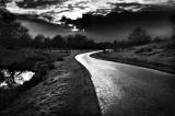
Some of you might of seen this image before, it was one of my PAD entries in
Feb. When I took it, it was a really dull colour image, underexposed, and making
best of very poor light. I decided to convert it to tones, as this was the only
way to really show what it was I found interesting about the scene, and it transformed
into something I could only of dreamed of. WHen I did this back in feb, I didn't
know as much as I do now, and I made many of the adjustments to levels by hand
using burn and dodge tool without selections. I was quite happy with the results,
but I recently bought a digital photography book here in the UK, and they had
some lessons on how to do this a bit more selectively. They have competitions
each month, and I noted that they loved it when people actually produce work
based on their tutorials, for obvious reasons. So I thought I would rework it
following their instruction (kind of), and hopefully that will put me in with
a chance. The top price is a £800 camera, that will pay for a flash and
a new lens.


Any comments or constructive feedback before I print it would be very appreciated....


Original colour image:


Here is Feb's PAD image:


Here is the alternative in similar tones as the original:


One final note: I will probably be updating the image, as I get new ideas or agree experiment with suggestions that look better. :)


other sizes: small medium original auto
previous | next
comment | share
melissa 02-May-2007 13:13
beautiful!!
Guest 07-Aug-2006 20:32
You've done a great job with this one - a really dramatic shot that leads you in.
Lazy 3L Photography20-Apr-2005 05:05
Very striking image....good luck!....hope you'll let us know how you faired. To be honest, though, I rather like your Feb PaD image the best, but I hope this one wins for you.
Antonis Sarantos19-Apr-2005 20:21
Awesome b&w tones. Voted!
markvm19-Apr-2005 15:35
Very nice B&W! Love the sheen of the road.
henrywong19-Apr-2005 04:14
great work!
Guest 19-Apr-2005 03:11
The primary image you've posted is extremely powerful!
Guest 19-Apr-2005 01:30
I like the first one here best.
I don't think warm tones add to the image.
The only part of the image that sort of bothers me is the darkened grass just along side the road. That we go from bright road to dark grass to lighter grass doesn't look completely natural to me.
Overall though, excellent image that packs plenty of drama.
Good luck.
Guest 19-Apr-2005 01:22
dramatic image Nick....vote
Nick Clarke19-Apr-2005 00:54
Hey Joshua,

Thanks , you reminded me, I uploaded the wrong image, the sepia was suppose to be an alternative, I been working zoned out on this image for nearly 3 hours! I have now swapped them around the right way!

What problems do you think I might have keeping the tones? I use a photo printers called www.photobox.co.uk you upload high res JPEGS to their server, and then they use lazers on fuji-film archive paper, its' normally pretty good.
Guest 19-Apr-2005 00:33
Well I wouldn't do anything to it at all. And please no sepia tones either. Mainly I am focused on the road, ok that's obvious. But I'm also focused on the clouds and the little canal too, ad then I see all the silhouettees. This is a vey dreamy image and will make a great print. It may take a little doing to get the contrast right in the print though.
I'm voting