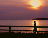
I got your ponit and that works great. But I think there is too much space on left. Composition wise my eyes prefering the far center and because of the downward slope of the fence: from left to right. Also for such scenes and landscapes eyes tend to get relaxed and focus on the far objects. Which does not do justice to catching the walker.
Thanks Guarav and Michael.
I replaced the original image with the 8X10 version. This does not mitigate the several compositional flaws - all of which I was already aware. The objective of the shot was to catch the walker in that sunset reflection, and this - along with the profile characteristics of the walker - makes this a rather popular image on my site.
This a good image right on theme. It seems unusual for me. I would have positioned the elements very differently. The sun on the left and the man on the right. Also the man is right on the fence leg: seems to have three legs! ALso there is too much unused space on the left a cropping near the man will also help bring the the far hills also in the focus.
--Gaurav