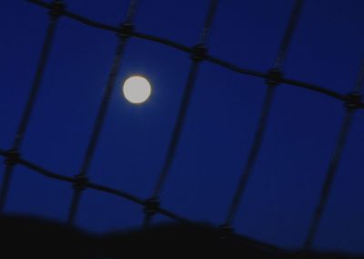
Another take on the same moon shot, just played a little with Levels in Photoshop. As Phil suggested in the preceding image, the moon needs more definition to look like something other than a giant light. Next time.
I like the idea. And the title " blue moon" - the moon isn't blue, but when we are blue, we see it blue, very nice title. The bottom part I guess is a mountain. But it looks a little like a human body to me. Feeling blue, being bound and looking at the moon. Love the mood.
Much improved, Jenene. The only thing lacking is detail in the moon, which could have easily been solved with metering on the moon itself. Moons are very bright, and very white, and require faster shutter speeds even at night. I like the fact that you have deepened the night, which makes the fence less blurry because it is abstracted.The moon looks more like a moon and less like a light. The diagonals organize the image nicely. You come much closer to caging a moon here than in the previous version. Keep practicing, Jenene. I salute your persistence.