


|
|
|
|
|
|
| |
| 14-JAN-2010 | |
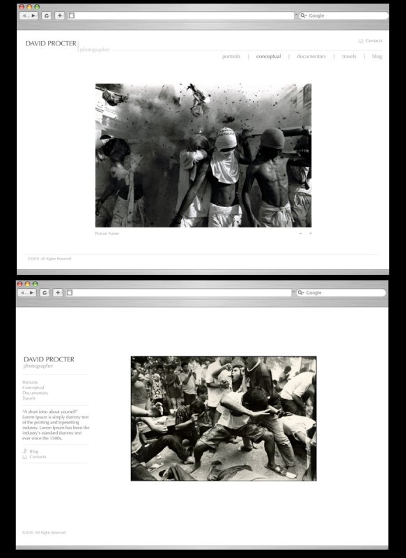
HELLO I NEED HELP!
I'm designing my website at the moment. Which do you prefer sections along the top or sections to the left?
I really appreciate any input no matter how brief.
David
copyright davidprocter 2014
| david procter | 16-Jan-2010 07:12 | |
| Oleg Birioukov | 16-Jan-2010 01:45 | |
| david procter | 15-Jan-2010 13:32 | |
| Steve Viscot | 15-Jan-2010 13:14 | |
| david procter | 15-Jan-2010 13:13 | |
| anuschka | 15-Jan-2010 11:59 | |
| david procter | 15-Jan-2010 05:58 | |
| Raymond Ma | 15-Jan-2010 05:25 | |
| david procter | 15-Jan-2010 04:58 | |
| david procter | 15-Jan-2010 04:46 | |
| Russel Ariola | 15-Jan-2010 04:04 | |
| Sam_C | 15-Jan-2010 02:57 | |
| david procter | 15-Jan-2010 02:41 | |
| Sue Robertson | 15-Jan-2010 02:30 | |
| david procter | 15-Jan-2010 02:03 | |
| kruanne | 14-Jan-2010 20:25 | |
| Gonzalo Garcia de Viedma | 14-Jan-2010 16:20 | |
| david procter | 14-Jan-2010 15:30 | |
| Sharon Rogers | 14-Jan-2010 15:26 | |