photo sharing and upload picture albums photo forums search pictures popular photos photography help login
ctfchallenge | all galleries >> Challenge 149 - Breaking the Rules >> Challange 149 - Exhibition > The Wall
previous | next
27-MAR-2007 Gerry McBride

The Wall

Cd del Carmen, Campeche, Mexico

Rules Broken
1) Rule of 1/3s
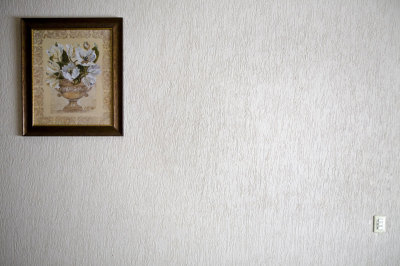
2) No large areas of empty space

The extreme position of the apparent subject (Print upper left) is balanced by the extreme diagonal opposition of the the 'light switch' (lower left) and 'the switch' provides a real world limit to the empty space which is not provided by the border. If 'the switch' had not been included focus would remain in the upper left corner. 'The switch' provides a non-competitive focal point (due to its size) which draws the attention of the viewer across the frame and allows the texture of the wall to become a feature of the whole.

Canon EOS 5D ,Canon EF 24-70mm f/2.8L USM
1/125s f/2.8 at 34.0mm iso400 full exif

other sizes: small medium original auto
comment | share
ctfchallenge30-Dec-2007 17:08
Nicely done Gerry - and nice wall covering too! - Kelly
ctfchallenge29-Dec-2007 08:16
Yes, McB. As I've stated earlier, it's when we break that rules that we suddenly find we have made art. Following all the rules will create pleasing images, but it's the creativity that breaks through the barriers, that suddenly makes the viewer sit up and take notice to the image. I've always said that a technically perfect image can be a very boring image, and that one with imperfections is usually the one that speaks to me, tugging at my emotions, capturing my attention.

The purpose of this challenge is to help people become more aware of the rules, so that they understand them, which sets a good foundation, and then they know when the time is right to break them. I believe that one should always adhere to the rules, unless there is specific reason to break them. Sometimes these infractions occur accidentally, via user error, but, the artist that takes note of the error, sees and understands that a rule has been broken, and understands why breaking the rule gave the image more impact, and realizes he has not lemons, but lemonade, will be the artist that stands out in the crowd. Happy accidents are wonderful!!! Recognize them for what they are and profit from them!

What I also wanted to emphasize, is that in order to successfully break the rules, there must be a solid foundation in other rules to strengthen and support the image, giving it power, instead of looking like a mistake. I also wanted people to have the courage to really shatter the rules, and understand that if you meekly dabble with a little bend, you are going to come out looking like you made a mistake. You've got to go ballstothewalls with it, with confidence, so everyone sees your intention, and understands that you intended it to be that way. It means taking risks. It means expanding your horizon. It means that you'll have images that fail miserably. But, the discussions will help you understand why they failed - the likely reason being that you didn't push it far enough, or, you didn't have a solid base anchored in following the other rules - the ones you weren't intentionally breaking.

So, my purpose was purely educational, making people really think about why an image is successful or not, when to break the rules and when to follow them, learn what the rules are, and why they exist, and to expand one's comfort zone. When one stops growing, one starts dying. In all aspects of life, rules are important - but in photography, as in life, sometimes rules were meant to be broken. ~ Lonnit
ctfchallenge29-Dec-2007 07:06
I'm almost in complete agreement with you; negative space can be used to artistic effect but very often is not. However the artistic use of it is not a rule.

The rules as stated are generalisations to aid the photographer with structure. They are guidelines which if followed should result in pleasing images; not works of art!

One of those rules is 'fill the frame with the subject' which is the compliment of 'no large areas of empty space' I think the purpose of this challenge is to demonstrate that these rules are not rules but guidelines. :) -mcbit
Guest 29-Dec-2007 00:06
I find it interesting that this and several other images in the challenge have quoted use of negative space as a rule to be broken. I thought that negative space was a very valid and useful element to include in imagery and graphics to draw the attention to the subject when used properly.

I don't see negative space as a rule, rather than a compositional and "artistic effect":http://en.wikipedia.org/wiki/Negative_space
ctfchallenge28-Dec-2007 05:02
No, not since the comment. When I started processing for here it was much brighter. -mcbit
ctfchallenge27-Dec-2007 22:44
Do you mean since I commented? It does look darker now - is it? ~ Lonnit
ctfchallenge27-Dec-2007 20:41
Thank you Lonnit, I have toned down the brightness of the mass quite considerably from the original and feel that it is close to the correct level; any more and the impact would have been reduced.

-mcbit
ctfchallenge27-Dec-2007 16:31
Yes, the rule of thirds is broken - the picture does not quite make it to the thirds line. If one drew a line down the image at the right side of the frame, one could repeat that section of image @ 3.33 times before reaching the end of the canvas. Gerry, it is not only the switch that is balancing the image, it is the brightness of the blank white space, which creates enough mass to balance the whole. It is said that if one imagines dangling the image, that the image should dangle level, and then one knows one has achieved proper balance. This one feels as if it would, indeed, do that. Nicely done. Such a shot, done improperly, could be quite dull. You have achieved interest. :) Well qualified. ~ Lonnit
ctfchallenge27-Dec-2007 14:11
I agree with your comments on white space and the inclusion of the switch. However, until I read your description did my eyes go over to see the switch. It does make me like the picture more, but my eyes when straight to the texture of the wall in the first place. Don't know if the rule of thirds is really that broken here. John