My first thought was that the special background was added in a photo editing program. The flower looks to be pasted in, I suppose that's because of the lighting aswell. The blotches on the background aren't too eye appealing. I do agree that perhaps a greater DOF would help.
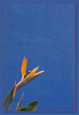
Interesting that you perceived the set-up as hideous or the wall as dirty, Michael. The wall is sponge painted with different shades of blue and turquoise to give it texture/depth, as designed by the architect. I thought it translated well photographically, but clearly you do not. Perhaps greater dof with the wall more in focus would have made the architect's intent clearer. Thanks for taking the time to comment. -Michael
Guest
20-Feb-2005 02:35
The blue background acts as a great complimentary color to the flower but it seems to be hideously setup that it _almost_ look dirty... Clone those out and it'll look better.
- MS