Commenting on this page requires a PBase account.
Please login or register.
Guest
30-Jun-2004 04:36
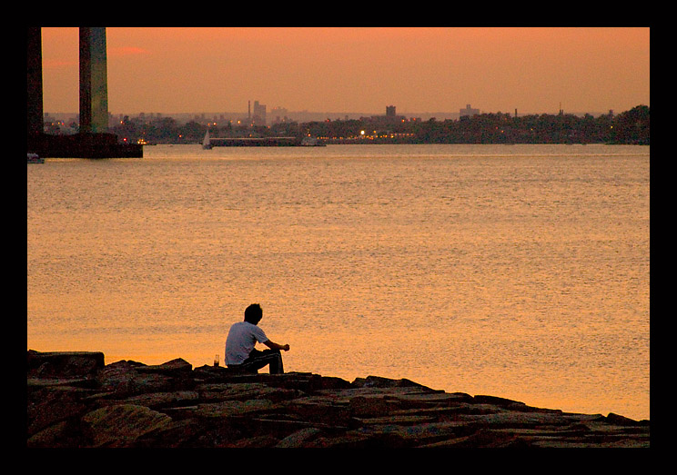
Cropping that leftmost support out looked funny b/c it brought too much attention to the upper left and threw the hole thing out of balance. The left third line comes in around the middle of his back so I figured that was close enough to get him there! LOL! I've also got this thing for 2:3 formats and shortening them up to anything less looks so boxy to me. I actually most prefer golden rectangles but I gave up on them b/c it was just too time consuming to re-crop every shot I take to that format. If I tried to get him any further left I would have felt compelled to scale the shot down, making it shorter as well. There was just no room for cropping top or bottom. I could easily have made it an 8x10 but they just look so dang stubby to me. I'd rather go square before 8x10. Funny, it must go back a long way with me b.c. long before I ever got into this hobby, about 14 years ago, I had my wedding album done in square format. LOL! ~ Lonnit
Guest
28-Jun-2004 11:11
I'm with you on the rotation Lonnit, but wonder if you should just crop the first bridge support - that would move the lone figure slightly closer to the left third which improves the composition ever so slightly, I think. A nice shot, and the grain from the high ISO actually adds to it. Phil
I had to rotate it a bit but couldn't go as far as I would have liked b/c of the bridge supports in the background. The resulting crop cut off too much. This was a compromise. :) ~ Lonnit