


|
|
|
|
|
|
| |
| 31-AUG-2010 | Andrys Basten |
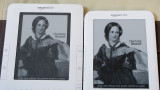
Note that the bottom instruction is easier to read with that higher contrast.
Also notice that the black border around the Kindle 2's screen-sleeper
does not make the screen look appreciably lighter. In fact, I use
black backgrounds on PBase in Photoshop to make BLACK areas look lighter.
Black borders have that effect to some extent on everything. But more
important here is the actual contrast possible with the display itself.
Copyright © 1997++ Andrys Basten. Contact me if you'd like to use a photo.