photo sharing and upload picture albums photo forums search pictures popular photos photography help login
Phil Douglis | all galleries >> Galleries >> Gallery Fourteen: Expressing the meaning of buildings and structures > Ceramic roof tiles, Temple of Heaven, Beijing, China, 2004
previous | next
20-JUN-2004

Ceramic roof tiles, Temple of Heaven, Beijing, China, 2004

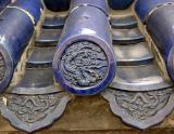
The Dragon is an ancient Chinese symbol. Its emperors ruled China from the Dragon Throne. The dragon often appears on ceilings and on rooftops to ward off evil spirits and the dangers of lightening. I even found the dragon engraved on the ends of the ceramic tiles on the roofs of Beijing’s Temple of Heaven complex. Once again, less can be more – instead of showing the whole structure, I move in on just the end of the tiles and use a macro approach. This allows me to stress the detail that few will notice, but to me it symbolizes the time and the beliefs of a particular era in Chinese history – in this case, the Ming Dynasty. I was told that these tiles were made at the time of Emperor Yongle, between 1406 and 1429.

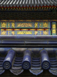
(I revisited these same tiles three years after I made this image. I backed up a bit and re-photographed them, this time adding expressive context that repeats the theme of the dragon again and again. You can see my new version of it by clicking on the thumbnail.)

Leica Digilux 2
1/100s f/2.8 at 15.7mm iso100 full exif

other sizes: small medium large original auto
share
Phil Douglis22-Sep-2004 03:10
Anna, thanks for your followup. I agree with your point that different people see pictures in different ways. And you also feel that Celia's crop is extreme, which is the way you see it. I feel, however, that Celia's crop has significantly improved the expressive nature of my tile picture. Keep in mind that each of you is looking for something different from this picture to begin with. She is evaluating this image as an expressive image, and she finds it fails. You evaluate it as a descriptive image and you find it succeeds. What is important about all of this discussion, is that it raises important issues seldom discussed here on pbase. It goes far beyond my roof tile example itself. My site is an educational site. A perfect place to discuss the differences between descriptive photography, which seeks to accurately and attractively present a good likeness, and expressive photography, which seeks to define meaning, stimulate thought, emotion, and ideas. And with that, I agree. Let us not talk about about this roof anymore. But let us will always remember the lessons we can learn from it. Thanks, again, Anna for your willingness to contribute to this thread.
Anna Yu22-Sep-2004 02:52
For heavenssake this picture is over discussed and over analysed. If some people find it boring then fine for them. Every picture, even one in National Geographical will be boring for someone. It's a matter of personal taste. Just take the picture you like Phil and if YOU are satisfied with it then that's enough. I certainly like this picture, I don't find it boring. What I find boring is all this discussion. And I don't like that extreme cropping. Let's not talk about this roof anymore. To expect a roof picture to be of NG grade is a bit silly.
Phil Douglis22-Sep-2004 02:06
Celia, you have restated your original criticism here, only this time with far greater impact and meaning. You prove your point with your own cropped version, which is far stronger than what I came up with. (And I teach cropping, remember?) But as I said earlier, I was obviously too close to the forest to see the trees when I composed this image. i am going to ask Anna Yu to respond to this second, more devastating salvo, and see if she, too, will admit that my image, in your own words, is "a boring picture that any idiot tourist could have taken with a point and shoot camera." If I had only turned my camera vertically, and cropped in my camera as you did for us here, I might never have had to catch this pie in my face! Your cropped version shows far more "imperial authority" than my roofing catalog version, and your harsh criticism, Celia, now carries much more authority with it as as well. You no longer beat about the bush -- you have had your judgment challenged here and you come back to us with both guns blazing. I stand convicted and convinced. For 40 years I've been railing against boring, predictable literality, yet I've produced an example of it here. I am thrilled that someone out there has the guts to call me on it, and more importantly constructively point out a way to do it better. Thank you, Celia, for taking off the gloves and challenging me in this way. Only a friend could be as blunt, yet as helpful, as you have been here. And I thank you for that. The next time you stop at my site to praise a picture, it will carry a lot more weight with me.
Phil
Cecilia Lim 21-Sep-2004 23:35
Anna seems to be pretty happy with this image, saying that a roof should look like a roof. But come on, this is a BORING picture that any idiot tourist could have taken with his/her point-&-shoot camera. How is this picture any better than a documentation of a roof tile? It is not, and certainly not expressive photography. I definitely don't think this is the kind of image you would see in the National Geographic, whom I believe most would regard as among the best of the best. Even though the colour of the image was enhanced by Anna, it did little to evoke any of my emotions. It is still a badly composed, literal description of a roof tile, with a nicer blue. A good expressive image should at least provoke a thought, curiousity or emotion in the viewer -Not just visual data that is processed through the eyes of the viewer and then forgotten.

Phil, you mentioned that form should follow function. I truly agree with this philosophy. In this case, if the function was to show what the detail of a roof tile looks like, then it has succeeded. If its function was to express that the dragon is part of a roof tile, then it has succeeded. But has it expressed the power and dominance of the dragon ? No - How can it? It is competing with all the other details that make up about 70% of the photo. Has it expressed the importance of the dragon symbol by showing how it is used repetitively to embellish the roofs that span across the temple? No - we only see a small portion of it.

I don't have a problem about showing more roof for context, and I don't have a problem about zooming in tighter to see the details either. What I have a problem with is that this image is neither this nor that. As a result, the power of the image is lost. It is wishy-washy, undecided in what it wants to say, so it has taken the safe way out by being literal, predictable and utterly boring. I can see much better ways of shooting this image, be it macro or wide angle. Take for example this image which I've taken the liberty to crop from the original : Go tohttp://www.worldisround.com/articles/76839/index.html
Cropping tighter around the circular dragon symbol would have drawn our attention more to this very dynamic, energetic, symbolic design of a dragon. Filling an image with this symbol would have no doubt given it a stronger presence that implies power. Preserving its symmetry also helps to project a sense of authority. You can still see its beauty, but now there are less details to compete with. It is also abstract enough so that it holds the viewer's attention ("What on earth is that?!") by arousing his/her curiosity. The horizontal lines and curves radiating out from the dragon on either side even suggest the form of an outsretched wing, like a bird, further suggesting flight, which is always associated with the dragon, a mystical creature of the heavens. OK. So if you think this macro approach is crap and doesn't say what you want to say, then toss it out!
You want to see more roof for context? OK. Then show more roof. Anchor the shot with the circular dragon symbol in the foreground, and use a more interesting angle to show us rows of ceramic tiles disappearing into the distance. Too much detail? Then blur the middle and background with shallower depth of filed. It is more abstract now, but yet still identifiable as a roof. Too much roof? Then select perhaps 3 to 6 circular symbols cropped as a panoramic frame to give us an idea of how important the symbol was - that it was repeated every chance they got in every single ceramic roof tile. Dragons, dragons,dragons everywhere! I am not the photographer and I was never there, but there must have been a better way to express this detail than what has been done here so literally and uncreatively. I would expect at least that much from a photographer of your calibre, Phil.

The arguments that have been going back and forth between Anna and you Phil seem to be about context - how much roof to show and how abstract it should be. I think ultimately, the photographer has to decide what he wants to say first. There's nothing wrong about shooting macro ,shooting wide to show more context, or using abstraction -they just express different meanings, and the photographer has to decide which of the meanings is the more important story he wants to tell. And look for ways to tell the story as clearly, interestingly, creatively and provocatively as possible so that the viewer may leave the image feeling more inspired than looking at a roofer's catalogue!
Phil Douglis20-Sep-2004 06:02
Thanks for clarifying, Anna. I had misinterpreted your previous comment. Your opinion of this picture is important to me. Maybe this image is not the lost cause I thought it was, because I do respect your judgment, Anna. Celia feels that the context I included to support the dragon is distracting and literal. You call my context "framing" and you feel that those "distractions" that Celia listed should be there so that the viewer knows its a roof. You feel that some descriptive element should always be in the picture, and Celia feels that everything here is a descriptive element. Is she right and are you wrong? Or are you right and is she wrong? I would say that the matter rests in the eye of the beholder. It all depends what the viewer is looking for -- a matter of expectations. A dragon as metaphor or symbol? Or as an ancient roof tile? I hope Celia does check in on this because I would like her to respond to your argument. This is how I teach -- no rights, no wrongs, everyone gets a say, and everyone makes up their own mind. Because that is how expressive photography works.
Anna Yu20-Sep-2004 05:06
I meant that the tiles and rest of the roof are important because they show that the dragon detail comes from a roof, therefore they should be left alone. I cropped out the top a bit, but the layering of the tiles is lovely. Certainly you don't have to show a whole roof or the details would be lost, but the framing of the details is very important so that the viewer knows it's a roof. That's why I disagree somewhat with Cecilia's comment. Some descriptive element is nearly always necessary in a photo (only my opinion).
Phil Douglis19-Sep-2004 20:56
I both agree and disagree with your excellent point, Anna. I don't think a roof has to look like a roof. If you can take a picture of just a part of that roof, as I tried to do here, you may be able to make a point that a shot of the whole roof can't make. I agree that "extremeness" is dangerous when used for its own sake. Form should always follow function, not the other way around. However I also believe that there are ways we can abstract our subject, and thereby interpret it as a metaphor or a symbol expressing larger meaning, and still be able to do it in a way that allows you to still "know what it is." For example, we all know this tile probably belongs on a roof, but we don't have to show a whole roof of this tile, do we?

I see what you are driving at here, Anna. Effective expressive photography need not be an obscure series of questions and mysteries. But asking questions of the viewer and demanding answers from them can invite thinking and feeling, and that to me is the bottom line in my kind of imaging. Showing a roof as a roof is another kind of photography altogether-- documentation, perhaps, but not expression.

Thanks, Anna, for triggering these thoughts. That's what I am trying to do with this cyberbook.

Phil
Anna Yu19-Sep-2004 18:17
I think that a roof should look like a roof. I don't like extremeness just for the sake of art or expression. When I look at a photo I like to know what it is.
Phil Douglis18-Sep-2004 19:28
Hi, Anna,

Yes, my aim was to emphasize detail, but my problem, as Celia Lim points out in her thought-provoking critique of this picture, was including too much conflicting detail and awkward composition. Thanks so much for taking the time to enrich the color of my picture, I love what you've done to it and I welcome the posted example. And yes, the blue tile is now richer and deeper in color and thus more emphatic and more pleasing to look at. It just gleams. You define "expression" in terms of how this richer color projects the detail in the dragon more effectively. And I agree -- your version of my image could be considered to be more expressive than it was before you "doctored" it (pun intended!) Its enhanced detail makes it less literal as it once was, as well. Yet the conflicting distractions, and the awkward framing that Celia has objected to, are still very present. Does this picture really work better now as expression? You think so, right? Will Celia? Let's ask her to comment on your suggestion. I hope she will be williing to continue the dialogue she began.

Phil
Anna Yu18-Sep-2004 07:00
If your aim is to show the dragon detail, then it's OK by me as a definition of expression. The strength of the image lies in the beauty of the blue ceramic. I would try to emphasize it more, by some post-processing. Hope you don't mind me playing around with your pic, will delete it if you like, Phil.

Phil Douglis17-Sep-2004 16:01

Wow! What a critique, Celia. I am at a loss for words. Well, not really. I have to agree with absolutely everything you have charged me with here. This is why I need you -- and everyone else with strong opinions out there that may be willing to state them – to be constructively critical of the examples I have posted in this cyberbook. We can all learn from each other. Your criticism of this picture spares no punches. You make constructive suggestions for improvement as well. (You are as complete a critic when you dissect my work, as you are when you praise it! You show no mercy, and in this case, none is deserved.)

The point I was trying to make with this photograph, as both a photographer and a teacher, was simple: by showing less, we can say more. Instead of showing a whole roof of beautiful old tiles, I tried to zero in on the end of just one ancient tile to symbolize the power of the Ming dynasty. That was my thinking. So my heart was in the right place, right? But as you point out so vividly, my eye was not.

Your lesson is clear: I am concentrating so intensely on the "trees" that I can't see the "forest." You have changed the way I look at this picture Celia. Now I see nothing but a literal description of a ceramic roof tile. It might show us what an ancient tile looks like, but I did nothing here to interpret it.

I have often urged my students, including you, Celia, to avoid making literal "post card" shots. Yet I have made a literal image here myself, because I failed to go far enough in my abstraction process. I should have done exactly what you suggest here – create a more expressive image through abstraction by filling the frame with only the central dragon. This would have allowed the ancient details to speak without distraction. My big mistake was trying to include enough context to show that the dragon was an embellishment on a roof tile. You spotted the problem instantly: I filled this picture with a lot of extra crap. (Go ahead and call it that next time, Celia, because that is what all those non-functional details you've described really add up to. They drain the image of any communicative power it might have had. I started out with a macro shot in mind, but in my zeal for roof tile context, I diluted it.)

As you said, I should have left more room for the imagination of my viewers to work. I didn't.

You show me how easy it is to be seduced by my own concepts. I did not consider what my viewers will really see when they look at this picture – a lot of crap.

Your critique triggers another critical consideration: the human eye is selective. It only sees what it WANTS to see. But the camera sees everything, and must be forced by the photographer to see just as selectively as our eyes. I was so carried away with the idea of reducing a whole rooftop to a single tile that I failed to force my camera to work harder as an abstracting tool. I accepted incoherence when I should have demanded coherence.

I should have stood back and asked myself, "is this really the most powerful image I could have made of this subject? If I had asked that question to myself at any point in the process, I would have come to the same conclusion that you did. I would have seen this image for what it is – an illustration from an old Chinese roofer’s catalog! (Oh well, at least Mo Jansen liked the details and the color!)

Am I ashamed of myself for posting this image? Not by a long shot. Your criticism has turned it into one of my most valuable examples, worth its weight in gold for what it teaches us. And for that I thank you, Celia. I hope this is not the last time you will catch me with my blinders on. Because every time you do, you will help me, and all who read these pages, become better photographers. Most of all, you stand to help yourself. Thank you, my friend, for your honesty, your candor, and for your contribution to learning. I hope your blunt criticism will become an example for others out there who may also be willing to help me see my images with fresh eyes. Thanks, Celia, for these valuable insights.

Phil
Cecilia Lim 16-Sep-2004 23:34
Phil, how is this exactly expressive photography? To me, it is a literal description of a ceramic roof tile. You show us exactly what it looks like, with the dragon right bang in the centre, flanked by bits of the other pieces of roof tiles on its sides. You try to make symmetry an important element here, yet it is imperfectly symmetrical. By showing more of the left ceramic rib than the one on the right, yet not quite enough to make a point, you've made it appear like a careless oversight in cropping. Is this supposed to enhance the image in some way because it only causes a distraction. You imply the power of the dragon by explaining its ability to "ward off evil spirits and dangers of lightning", but the image feels anything but powerful. Your supposed focal point - the dragon in the centre - seems lost, almost insignificant among the copious amount of detail around it: horizontal ridges, cylindrical tubes, A-shaped perspective lines, rough textures of cement, patches of brown on the bottom, more details of indistinct dragon symbols framed in pointy, curvy V-shaped borders. And you said "less can be more"? If it is meant to be a macro shot, I would have liked to see a tighter crop, less detail, something more abstracted so that you can leave something to the imagination of the viewers. Perhaps zoom in more into the central dragon so it dominates the frame to reinforce the idea of power. If your intention is repetition, exploit it - show us more dragons! Repeat the dragons over and over again so we may feel its power and influence in its numbers! But I wouldn't say this image is a lost cause though- I am sure it will sit in very nicely in a book on ceramic roof tiles - a catalogue text book!
Phil Douglis14-Jul-2004 21:58
Thanks, Mo, for the comment. Small things can say a lot. This certainly does.
monique jansen14-Jul-2004 13:10
This is one of my most favorite images of your China trip because of the level of detail and the colors
Type your message and click Add Comment
It is best to login or register first but you may post as a guest.
Enter an optional name and contact email address. Name
Name Email
help private comment