photo sharing and upload picture albums photo forums search pictures popular photos photography help login
Sony Forums Challenges | all galleries >> Challenge 120: In the City (hosted by MCsaba) >> Challenge 120: Exhibition > edit image
previous | next
16-JUN-2006 Franky2005

6th: World Cup In The City *
by Franky2005

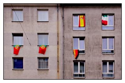
Just a quick shot from the city. The world cup brings some color on the facades.

Sony DSC-V3
1/320s f/5.6 at 8.4mm iso100 full exif

other sizes: small medium original auto
comment | share
Franky2005 25-Jun-2006 20:53
Please note I did move this image from the eligible to the exhibition gallery myself intentionally. Nothing to worry, just my personal preference not to be part of the voting there.
Thanks a lot for all yoour comments.
Cheers,
Frank
Katherine Stanback's Photos25-Jun-2006 16:06
Very neat capture I love the bright colors of the flags! You did a great job with the perspective correction.
bottles 21-Jun-2006 22:45
Wow, you did an excellent job Frank! Yes, it sounds like you used a little different method but got about the same results. Anytime you can eliminate a lot of difficult cloning you'll save yourself some time. The editing you did on this image has produced a really nice final entry! Very nice work indeed!
Franky2005 21-Jun-2006 20:42
Thanks a lot bottles! I was really impressed how quickly you was able to provide a solution to the wire removal. I have tried to apply your suggestion to the full resolution picture, but I am sure that I did not fully understand your guideline. I must say that I am not much familiar of all the function that can be applied in post processing - all my fault. Finally I used a method to copy and move areas from below the wire on top of it. This way achieves the same I think - but takes longer! :-)
Now I am very happy with the result and would like to thank again all of you for your suggestions and comments. Cheers, Frank
bottles 21-Jun-2006 02:13
This is an interesting shot Frank, I like it. I agree with Helen about the splashes of color against the drab concrete. I also like the rusty drain pipe :-) I just wanted to add that those wires are extremely easy to remove, if you should desire to do so. The fact that you are now using the square version is what makes it so easy. All you have to do is change the name of the Background layer and duplicate it. Then, after clicking on the Move tool, use the keyboard up key to nudge the lower layer up a little (press 5 or 6 times). Now make the top layer active and simply erase (better yet use a layer mask) the wires on that upper layer. Remember that you can click on one end of a wire then, while holding the shift key down, click on the other end and you'll remove the entire wire all at once. I removed the wires in less than five minutes. I did have to touch up a couple of places (the cable attached to the building for example) but it was very easy to do. I put my results in the demo folder for you to check out.

Link to Demo Folder...http://www.pbase.com/stfchallenge/challenge_120_demo
Franky2005 20-Jun-2006 20:09
Helen, thanks for your comment and the hint to straighten the image. This was really needed! Having done a rework I decided also to play just a little with the color and to put a white frame, as I think the background color of the gallery was not suiting the shot best. The frame allows a more neutral viewing IMHO.
Finally I have spend much more time I ever thought on this shot. I really appreciate your feedback, that allows me to develop a bit further. Thanks,
Frank
Helen Betts19-Jun-2006 08:54
I like the scene, Frank, with the splashes of color against the drab concrete; the wires give it a very urban feeling IMO (besides, it would be a lot of work to remove them). The one thing I would do would be to straighten it a bit as the pipe and left windows seem to be slanting upwards. Perhaps it's a matter of removing distortion on the left buiding since the right-hand side appears pretty straight. Helen
Franky2005 19-Jun-2006 06:56
Thanks Adam, for your very comprehensive comment. It was exactly hitting the main point where I was looking for a feedback. I have changed the image to the square version, but I am still wondering whether it is always a must to work on the shift. Many years ago I had been dreaming of a shift lens for my SLR and today it is just a few clicks. :-)

The wires definetely do not help the shot, but I do not think the image is really worth to start removing them. BTW these are from trams running in that street..

On the reflection I am not so strong with my opinion or maybe ignorant, I must admit. In that sense I personally more prefer to keep them as they are.

The colors. Yeah, the German yellow is orange, but I have the feeling that this is really the nature of this flag, as the Spanish yelllow is fine. I will revisit the place to check it out.

What I like about his shot is for sure the 50/50, but also the diferent levels of the floors in the right and left which gives an interesting extra of asymmetry. I had been thinking also of converting all except the flags to b/w to enhance the perception of the color and might do that later.

Cheers,
Frank
Guest 18-Jun-2006 09:00
Hi Franky. I like the idea here, but I'm not sure it's all that well implemented. For starters, all the shots I've seen similar to this work best when they're totally square on - here you're obviously angling up and that spoils the pattern somewhat. The reflections in the glass are a bit half hearted - in such a simplistic shot I'd prefer either total transparancy or total opaqueness - a polariser would help. The telegraph wires don't quite fit into the pattern, they cut across the squares rather than working in harmony. Finally, while the blocks are dully coloured, no doubt as you intended, the flags don't really brighten it up that much! The white in the italian flag is grey, the yellow in the german is orange and the others aren't as punchy as I'd like either.

I see what you're trying to do here - the 50/50 composition with the 2 drainpipes, with flashes of colour, and I like the idea. I'm just not sure you've quite pulled it off. Sorry! Adam Bramley
Franky2005 16-Jun-2006 21:07
In the demo folder I put an alternative version of this picture http://www.pbase.com/image/61963237). I am just courious on how important you think the shift of perspective is for such a shot. No big deal, but comments are very welcome.