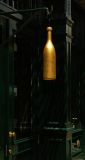
It was a simple sign with no words – only a large bottle hanging over the street to mark the shop of a wine merchant. I juxtaposed that golden bottle with the dark green doors and pillars at the entrance to the shop – comparing light to dark, and gold to green. By juxtaposing objects of opposite brightness and colors, we express maximum contrast to draw the eye and stir the mind. The fact that those dark doors have bright brass doorknobs only enhances the contrast. This sign is a throwback to another time when literacy was rare and merchants used signs showing exactly what they sold, often in stylized form such as this. South Street is one of Manhattan’s most historic neighborhoods. Some of its buildings are nearly 200 years old. This image, because of its powerful juxtapositions, helps to tell its story.