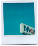
Grant, you know already that I closely follow your flickr photostream and do like this unusual and most characteristic style of yours. Thanks for posting some of your "blue" highlights here as well. I find it difficult to pick a favourite. (Even when I first saw this on flickr, I wondered whether you should not have cropped more tightly in the bottom right corner, so as to have less of the "b" visible? Yes, you would then have lost a fraction of the "o" too, but I think the "Mo" would still have been easy to recognize. Just me pondering, more a question than a criticism.) Regards jnconradie