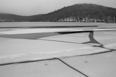
This is an interesting landscape. I'd love to see how it might look with a slight contrast boost in the lower tones. But mostly I just like the composition and the strong ice shapes and the lovely curves at the far horizon. This image would probably look great seen larger,and printed,and so for on-screen viewing I think I'd bump the contrast up slightly to make us feel like we're getting a better look at the neat stuff,like those few small leaves there in the foreground. Still,I do like this photo,I'd just like to see it with a more lively tonal variation,and a bit snappier too.