photo sharing and upload picture albums photo forums search pictures popular photos photography help login
Brenda | all galleries >> 2012 >> April 2012 Contrasts PAD > 6 - Thick/Thin
previous | next
07-APR-2012

6 - Thick/Thin

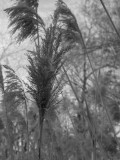
I'm not sure if I like this photo or not. It was taken as the
sun was rising and so it's in the shadows. The grass is tan-colored and not green.

Here it is in color:

Canon Powershot G11
1/160s f/4.5 at 21.5mm iso100 full exif

other sizes: small medium original auto
Cindi Smith13-Apr-2012 01:57
I like it in B&W and I do think I like the color better.
Mieke WA Minkjan11-Apr-2012 07:06
you could have processed the B&W a little into something more graphic
Sheila11-Apr-2012 05:45
I agree with Scott. I like the colour one just a little better.
wernere0110-Apr-2012 19:45
Hm... I don´t see a thick and thin contrast (forgive me I´m a bit blind sometimes), but a fine straight and diagonal one.
Guest 10-Apr-2012 16:38
I like them both, but I love the warm colors in the color version!
Janet Donnelly09-Apr-2012 20:38
Either way it's a lovely potograph.
Laryl09-Apr-2012 19:13
I like the thinking to go b/w.. maybe a strong desaturation to not totally b/w, leave some warm tones.. the contrast in the color one really works tho
laine09-Apr-2012 17:07
I go along with Scott's comments..I like the earthy colours in the second shot.
J. Scott Coile09-Apr-2012 16:50
Grasses in the dormant state. I lean toward the color version. The slightly more red-brown color of the seed head pops a little more in color. I still think the B&W has potential but maybe a little tighter with a more shallow focal plain.
Type your message and click Add Comment
It is best to login or register first but you may post as a guest.
Enter an optional name and contact email address. Name
Name Email
help private comment