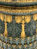
Elegant rhythms and color. If you used curves in Photoshop and pulled down the "shadows" portion of that diagonal line (lower left corner) to make the dark content here a bit darker, and lifted the highlights portion (upper right corner) to make the gold brighter, you will get more contrast. As it stands it is nice but a bit flat.
I will send you my version in an email. I warmed it a bit in color balance, and added a bit of saturation and sharpening as well.