


|
|
|
|
|
|
| |
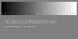
Most off-the-shelf monitors are set way to bright for closely matching the "look" of a printed photograph.
Using this chart and following the directions, you can get an "eyeball" start to adjusting your monitor settings -- you will typically have to set things lower than you might expect, especially Brightness, but you will get used to working with the lower luminance, you will see that it more closely matches the brightness of a print, and you will find that sharing across various monitors will not result with your images seeming too dark on other monitors, especially of you process a photo in an image editor.
© 2000-2013 by Anthony Long, Vancouver, WA, USA (Please contact me for usage)