photo sharing and upload picture albums photo forums search pictures popular photos photography help login
Sony Forums Challenges | all galleries >> Challenge 134: Beginnings & My Best of 2006 (hosted by MCsaba) >> Challenge 134: Exhibition - CLOSED > edit image
previous | next
June 9, 2006 Carmen

Monet and Manhattan
by Carmen

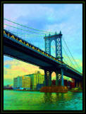
This was taken on my first trip to New York this summer.
Unfortunately I had problems with my main camera, the F717, and many of the shots turned out muddy or blurry.
I did a lot of creative compensating in PS when I got home; this was one of the more radical ones. The _original_ of this photo wasn't too bad actually; just a little bland.

Mainly I just loaded the image up with saturation. The result reminded me a bit of some of Monet's paintings; there is a painting he did of the _Waterloo Bridge_ that I think the colors in this are quite similar to. Maybe not quite as saturated. ;^)


other sizes: small medium original auto
comment | share
Katherine Stanback's Photos10-Jan-2007 01:59
Beautiful image - I love the composition, and the very saturated colors!
Carmen08-Jan-2007 05:32
Thanks for the advice. I went in and tried the canvas texture, but ended up liking the addition of a low grade grain best - it softed the edges up uniformly just a little bit and made them less defined without taking away from a whole lot of the detail. I think I like it a little bit better this way though.
Guest 08-Jan-2007 04:38
Carmen, if you're using Photoshop, you could apply a Canvas texture to the image. That would keep the "painting" idea and would probably get rid of the blotchiness for you. Just a thought.
inframan 08-Jan-2007 00:22
Only thing I might suggest is to try a noise manipulator like Ninja. OTW leave well enough alone. ;-)
Carmen07-Jan-2007 16:42
Thanks. I do have a question; is the digital blotchiness (mainly the pink & yellow of the sky) too distracting, and either way what would folks recommend to smooth it out if I wanted to, without introducing a too-smooth texture (I kind of like the graniness overall)?
Sony Forums Challenges07-Jan-2007 16:41
Carmen, I really like how you experiment with images at times...and I like the effect you achieved with this one. It does remind me of the style of a Monet piece. Nice photo and procesing. MFC
inframan 07-Jan-2007 12:50
I like the way this turned out, Carmen. Kind of looks like a 1950s post card. You could probably sell a lot of them at the South St. Seaport. ;-)