25-JUN-2009
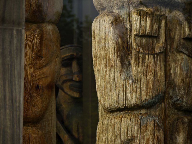
Ancient figures, Royal British Columbia Museum, Victoria, British Columbia, Canada, 2009
I found these ancient carvings layered within a window of the museum. They have been carved from trees by Indians, and each of the three figures shows its textures differently. The carving closest to the window is the brightest, and reveals the powerfully primitive pattern of its art in a brilliantly detailed manner. As the light falls off within the window, the textures become darker. The figure at left seems a bit more sophisticated in its textural presence, while the exaggerated face in the deep background turns soft and somewhat more remote. Yet it is that final softly focused face that gives this image its ultimate meaning.
17-JUN-2009
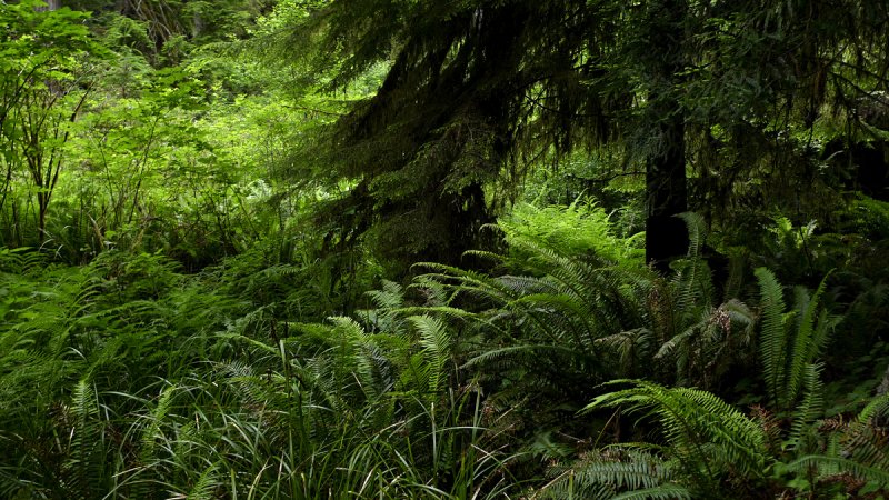
Redwood forest, Klamath, California, 2009
The massed ferns surrounding a young redwood tree create a study in texture. The dappled light deep in the forest plays on some of the ferns and leaves the others in shadow. The result – a comparative array of leafy textures and colors defining the density of growth, and the seemingly chaotic world of nature itself.
22-JUN-2009
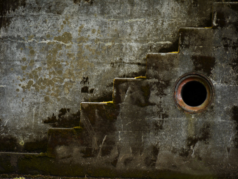
Gun emplacements, Fort Canby, Ilwaco, Washington, 2009
The ruins of Fort Canby go back to the Civil War. However this particular gun emplacement dates to World War II. The fort was built to protect the mouth of the Columbia River from potential invaders. Today its concrete bunkers speak of the passage of time itself.
15-APR-2009
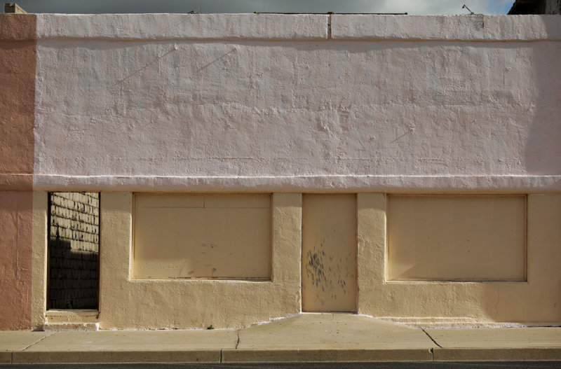
Door to nowhere, Kingman, Arizona, 2009
The early morning light brings out the ragged texture beneath the white and yellow paint that covers this sealed storefront. It has two doors. One is sealed as tightly as the large windows that once looked out onto the street. It's surface is scuffed -- somebody has probably tried to kick it open. The other portal has no door at all -- the opening reveals an exterior space within, featuring an abrasively textured wall. I found a fascinating incongruity here -- the warmly sunlit building, painted in pleasant colors, seems at first glance to be nostalgic and benign, yet the rough wall standing within, along with the scuffed, sealed door and the blocked windows up front, speak of harsh and unforgiving realities.
23-OCT-2008
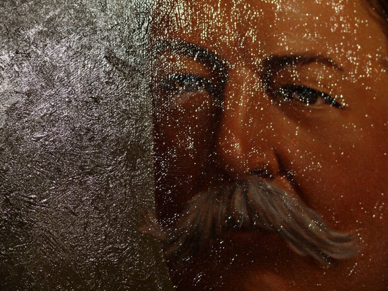
William Howard Taft, The Old State Capitol, Phoenix, Arizona, 2008
Arizona’s admission to the union was preceded by political conflict involving President William Howard Taft over the state’s right to recall judges. Eventually, a compromise was reached and in 1912, Arizona became a state. The hard feelings have long evaporated -- an oil painting of Taft, whose signature eventually granted statehood to Arizona, still hangs in its old state capitol building. As I moved in on that painting, I noticed how the light was playing with the textures of the paint, which seems to be exploding into Taft’s face. Given the political strife over Arizona’s statehood, I thought this explosion creates an appropriate metaphor.
18-MAY-2008
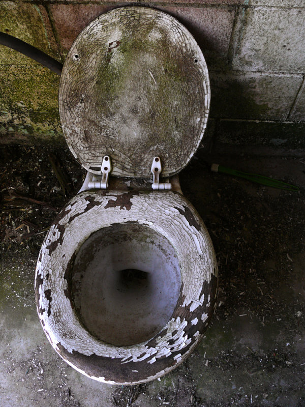
Rest room, Placerville, California, 2008
I found this toilet in the rest room of a long closed service station. Like the rest of the service station, it no longer functions. Nature has taken it toll on the paint that once covered the wooden seat. It is cracked and flaking, the flakes covering the floor around it. The lid is turning green, as is the cinderblock wall behind it. I make the image into a study of abandonment, decay and erosion. What once offered relief to generations of desperate motorists has become a study of unwelcome textures. Yet the lid remains upright, an incongruous gesture of welcome.
19-MAY-2008
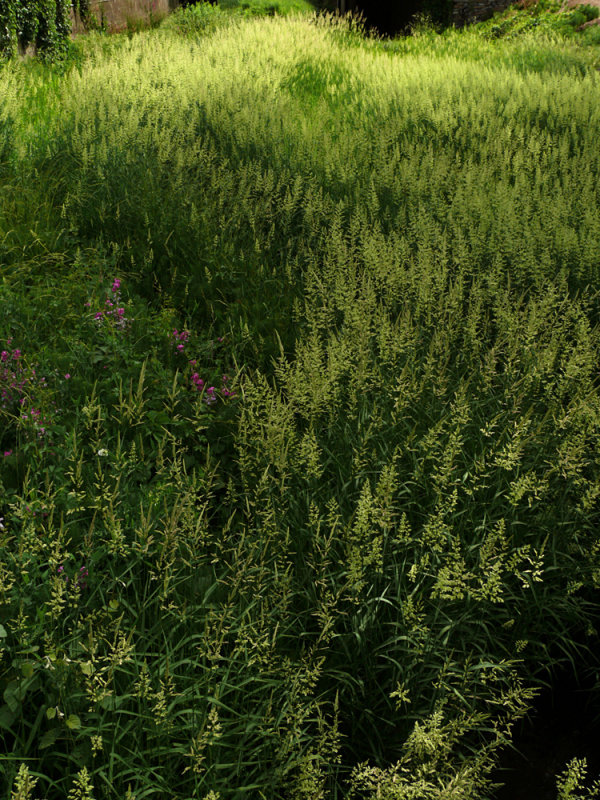
Weeds, Jackson, California, 2008
I made this image using a 28mm wideangle lens from a bridge over an old creek bed. The former creek had become a field of weeds, a fascinating carpet of varying textures. The weeds closest to me are viewed from the side, and as such are outlined in shadow. Meanwhile, the weeds further away are sun-struck, and gradually rise to a glowing green dome in the background. This image is a tactile one, inviting us to reach out and touch the velvety smooth leaves of vegetation.
04-APR-2008
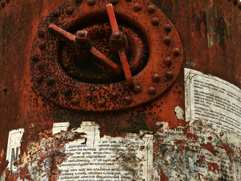
Boiler, Cochin, India, 2008
This old boiler once powered the cranes that served Cochin’s dry-dock. The cranes have moved, but the boilers are still there, retained as relics of the 1950s. I found layers of textures here – not only are the old boilers rusting, but placards and advertisements that have been pasted on to them over the years are rotting away as well and form their own textures as a result. Every bit of free space on Indian walls, signs, posts, and even old boilers is made use of, again and again. Such is the nature of communication in a land of a billion people.
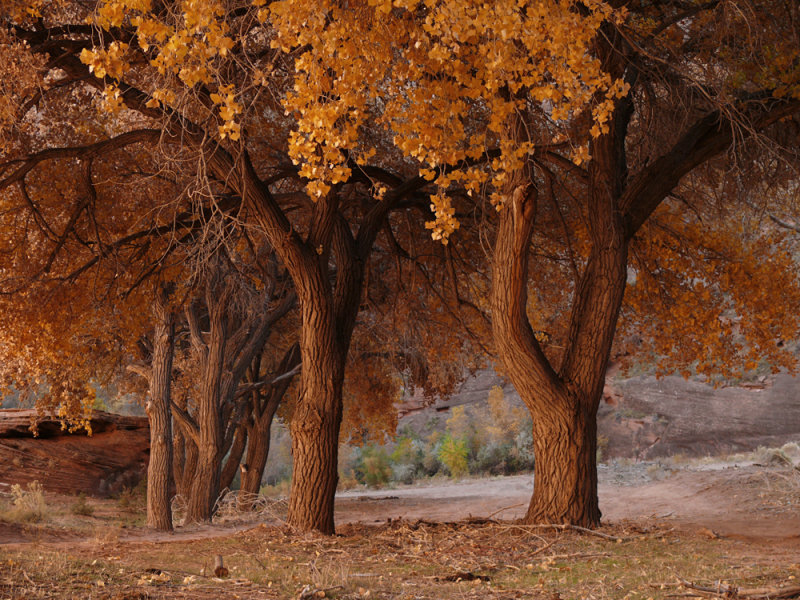
08-NOV-2007
Red autumn, Canyon de Chelly National Monument, Arizona, 2007
Hundreds of cottonwood trees flourish on the floor of Canyon de Chelly. As the evening draws near, the lowering light coming out of the west bounces off the canyon's eastern wall, changing all within to reddish gold. In the process, the reflected light also reveals a rich array of texture – bark, leaves, even the ground, seems dimensional and inviting to the touch.
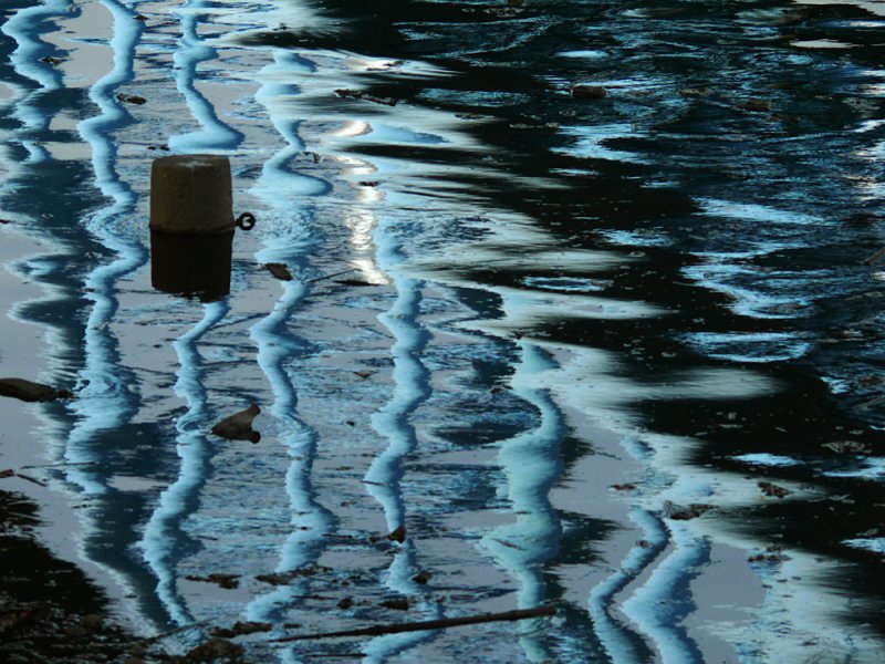
11-SEP-2007
Bridge, Stone City Park, Nanjing, China, 2007
The reflected bridge at left breaks into long strands of shimmering blue steel. The reflection makes them tremble in the face of the waves that prepare to engulf them from the right. This reflection works because of tension created by the contrast between the shimmering bridge at left, and the surging dark textures that stalk it from the right. It is a study in contrasting textures that echo the story of Nanjing itself, a city that has known much destruction and tragedy over the centuries.
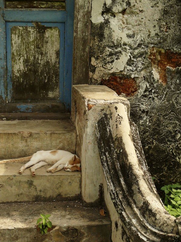
01-SEP-2007
Abandoned house, Merlimau, Malaysia, 2007
This sleeping cat was one of the few signs of life in a house that has been left for dead. The house, built in 1894, was once the home of the local tribal chief. The textures of decay remind me of the brush strokes of an oil painting. The slumbering cat, surrounded by such unlikely beauty, seems soothed by its surroundings.
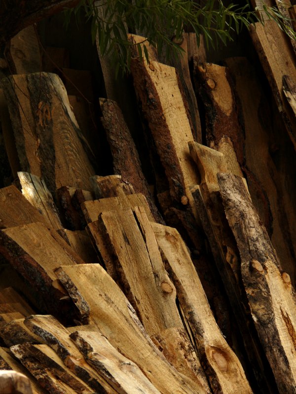
06-AUG-2007
Sawmill, Gold King Mine, Haynes, Arizona, 2007
A steam powered working sawmill is featured at this restored 19th century mining camp just outside Jerome, Arizona. I photographed some of the planks of lumber stored in the sawmill, featuring the different textures revealed by the blades that sliced through massive pine tree trunks. The planks were stacked vertically against a wall of the sawmill, and I arranged them in my frame as a series of diagonal thrusts.