photo sharing and upload picture albums photo forums search pictures popular photos photography help login
Phil Douglis | all galleries >> Galleries >> Gallery Twenty Nine: The Layered Image – accumulating meaning > To Market, Santa Fe, New Mexico, 2005
previous | next
16-JUL-2005

To Market, Santa Fe, New Mexico, 2005

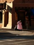
On summer weekends, Santa’s Fe’s central plaza is filled with Native American artists selling hand-made jewelry to crowds of tourists. I stationed myself on one corner of the plaza and watched as the artisans arrived to set up their wares. I saw this woman coming at me from a distance. She had to cross two streets to get to her selling location, and was slowly dragging a wheeled cart behind her, carrying her chair and jewelry. My telephoto lens compresses distance, allowing me to stack three distinct layers within this image. The foreground context layer is filled with a pedestrian walkway leading across the frame, while the middleground subject layer features another walk way leading toward us, along with the artisan herself, head lowered to watch each step as she makes her way in our direction. The background layer offers additional context – it is the corner of the La Fonda Hotel, a Santa Fe landmark. The early morning sun defines its distinctive architecture and coloration, and its shadowed side allows the artist plodding towards us to stand out in striking contrast. It is a demanding task for this elderly woman, and it takes every bit of her strength to make this journey to market.

Panasonic Lumix DMC-FZ20
1/500s f/5.2 at 38.3mm iso80 full exif

other sizes: small medium large original auto
previous | next
share
Phil Douglis10-Dec-2005 04:24
The burden of life meets the shadows of eternity -- thanks for the metaphor, Jack.
jack 09-Dec-2005 21:56
An elderly person faces lengthening shadows.
Phil Douglis26-Jul-2005 18:27
Thank you, Marek, for adding a new dimension of meaning to this image for us. In my caption, I call her journey a demanding task, and I said it will take all of her strength to get where she wants to go. And now I know why. The tension created by what you call "violently opposing diagonal lines." The two opposing pedestrian crossings become a symbolic obstacle course. As I mentioned to Mo, the cross walks make us feel as if we are falling into the image. And now you show us why they make her journey seem much more difficult. And I also agree with you that any peripheral untidiness here adds to that burden. All the more reason to keep the crop the same. Thanks, Marek, for illuminating this image for us. I see it with new eyes.
Guest 26-Jul-2005 11:35
I'm not going to get into the cropping discussion, I don't think that's so critically important in this image and for a reason I'll explain. Basically, this is all to do with the story and the relevance of the layering, compression of perspective, etc, to this story is that it results in a series of violently opposing diagonal lines. Their effect is to provide a series of obstacles to the woman, literally anchoring her to the crossing. You have caught the moment very well, with her bowed head informing us of the build up of energy she is trying to muster to drag herself from the spot. Not only has she got to struggle with the weight of the trolley, but the visual confusion of the foreground is adding to conspire against her. The image is all about effort and the graphic context emphasises this. Therefore, any peripheral 'untidiness' actually adds to the effect.
Phil Douglis25-Jul-2005 18:24
Thanks, Kal, for this comment. I could have just as easily have used this image as an example in my "Frame" gallery to focus on the cropping choices that Alister and I have been discussion. Or, as you point out here, I also might have used it in my light and shadow gallery, because the interplay of light and shadow gives this image its sense of dimensionality and indeed has produced a "fourth dimension." The warm coloration of the light is creating a lonely mood and atmosphere that sets an emotional tone, so I could have used it in that gallery as well. The heavy shadows are hiding as much as they reveal, so this image might also have worked as part of my abstraction gallery. The essense of this image rests in how it expresses human values, so I could have displayed it in that gallery, too. However, since it offers us a remarkable example of how layers add up to meaning, I ultimately chose to use it here as a key example in this new gallery. I am glad you learned you have used it to learn how light and shadow can build layers, which in turn can become the substance of expression.
Kal Khogali25-Jul-2005 11:47
Thanks Alisetr and phil for the discussion below. I think I am getting better at croping my images for meaning, and discussions like the one below helps. This is the kind of image I think is in my style, which is why I like it the way it is. I think you have both focused on the crop, but again and consistently in the most expressive of the images I find here (in my opinion) light is playing a key role. It layers in itself (perhaps we should call it the fourth dimension?) I have learned somthing new from this gallery. Thank you Phil.
Phil Douglis24-Jul-2005 17:57
Good point, Alister. It is always a huge step forward when photographers come to appreciate the differences between cropping for meaning and cropping for effect. Semantics aside, cropping is part and parcel of framing. We can frame or crop an image to eliminate distractions and fix accidents, to the pull the eye through the frame more fluidly, or to change the shape of the frame so the thrust of the shape of the picture echoes the thrust of the content.Which is fine. But equally important is framing and cropping for meaning -- where we place the edges of our picture, as you say, can enhance the information it conveys. Often we must accept trade-offs. By removing that extra space to the right of the parking meter, you would make my image leaner, longer, and tighter, enhancing its vertical flow. Yet by retaining more of both of those crosswalks, I have made this woman's journey seem longer and more laborious, which enhanced the point of the picture itself. There are no rights or wrongs, goods or bads when it comes to cropping. It all comes down to making the most of our intentions.
alibenn24-Jul-2005 11:14
Thanks for that Phil, again, perhaps my nature photography background still needs to be broken further, the aesthetic nature of wildlife is often the driving force in a crop, whereas, your statements and metaphors work best with a more informative crop...

a point well made...
Phil Douglis24-Jul-2005 05:22
Thanks, Alister, for the cropping suggestion. In theory, everything you suggests makes sense. But as a photo-editing teacher for the past 35 years, I have always told my students to crop primarily to enhance the objective of the picture, not for aesthetic reasons. In this case, I wanted to stress the JOURNEY this woman is slowly taking. She must cross TWO cross walks, one leading to the left, the other to the right. I framed the image to stress this two crosswalk journey. Your crop tightens the image, and makes it more vertical and more compact. But it chops off the right hand edge of both crosswalks, and seems to me to make the journey appear shorter. Yet she will plod all the way to the right and then come all the way to the left, and that is what I want my viewers to anticipate. I feel the part you suggest cutting away is critical to this objective.

On the other hand, I want to thank you for the suggestion. You have given me a chance to grind one of my favorite axes. Crop for content, not for form.
alibenn24-Jul-2005 04:56
Okay, crop without rotation!!!
alibenn24-Jul-2005 04:49
A great image Phil, the early morning light, as you say enhancing the architecture, but also bringing life to the metaphor, "the sunny side of the street".

I'm going to call you to the dock on cropping technicalities again though!!? I will send you my image by email, but will explain it here:

The left side is great as is, the abstracts of shadow and light are great and add a great deal to the context of the image. The right side less so, to me everything right of the parking meter are redundant, but can see why they balance the image, so why not, straighten the image using the stong vertical of the parking meter, this will pull the left side over more, bend the woman even more and stregthen the metaphor of her struggle. Crop away everything right of the parking meter, abstracting the right hand side further by eliminating it. Her position further right in the frame and walking out, rather into the frame adds tension and the cropping of the cross-walk adds to that tension....

The layers here are essentially vertical anyway, the removal of distracting right hand side content will not harm the image, unless you feel there is something in those shadows that cannot be expressed by other sections of the image?

As i said, I'll mail you the idea I have..
Phil Douglis22-Jul-2005 17:49
You are right, Mo. The purpose of the foreground layer -- the cross walks -- is to make you feel as if you are falling into the image. It also implies that this woman still has a long way to go, and since she appears to be walking slowly and with great effort, that idea is at the heart of this image
monique jansen22-Jul-2005 12:39
Human and architectural layers here, as well as the crossing. You feel yourself drawn to this picture, almost falling into it.
Type your message and click Add Comment
It is best to login or register first but you may post as a guest.
Enter an optional name and contact email address. Name
Name Email
help private comment