photo sharing and upload picture albums photo forums search pictures popular photos photography help login
Phil Douglis | all galleries >> Galleries >> Gallery Twelve: Using color to express ideas > The Red House, Willemstad, Curacao, 2003
previous | next
14-DEC-2003

The Red House, Willemstad, Curacao, 2003

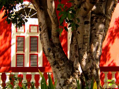
Red is the most noticeable color of them all. It is no accident that stop signs and fire engines are usually red. This Curacao house is painted red as well, but I photographed it so that the red does not scream at us. I made a point to shoot it as the dappled shadows of the old tree standing before it broke up the color to create a sense of color, rather than describing the literal color itself. The low-key effect gives the house a less strident appearance – still unusual, but not shockingly so. I use color here to express mood here rather than to describe it as a red house. It leaves more to the imagination of the viewer, and that’s when images work best as expression.


Canon PowerShot G5
1/160s f/4.0 at 25.1mm hide exif
Full EXIF Info
Date/Time14-Dec-2003 22:30:16
MakeCanon
ModelPowerShot G5
Flash UsedNo
Focal Length25.1 mm
Exposure Time1/160 sec
Aperturef/4
ISO Equivalent
Exposure Bias-0.33
White Balance (-1)
Metering Modematrix (5)
JPEG Quality (6)
Exposure Program
Focus Distance5.140 m

other sizes: small medium large original auto
share
Phil Douglis17-Apr-2006 06:54
Thanks, Guest, for this observation. No photographic approach works for everyone. We try to make the most of what is there, and if it helps us express an idea, it works. If not, we move on to something else.
Guest 31-Mar-2006 12:44
Nice composition with the red of the house behind standing out very well. The use of trees to frame or layer other subjects in the photo in this manner does not always work for everyone and tends to invite differing opinions, but I think you have pulled it off marvelously in this case.
Phil Douglis11-Mar-2006 22:17
If my image makes you imagine what the entire house must look like, it is doing its job, Ramma. I deliberately only show you a small part of it to make you want to see more. The art of photography is based on taking away, rather than adding information. I show you only enough to make you think, wonder, and feel. Less can usually be more.
Ramma 11-Mar-2006 12:28
Looks so good, i would have loved to see the house as a whole
Phil Douglis01-Nov-2004 04:10
Thanks, Maureen for this one, as well. I am a sucker for red. It draws my eye like a magnet. But I wanted to use that house as context, rather than the subject of my picture, and create an interactive relationship between that house and something else. I tried people first, but they did not work as well as this tree did. I never noticed the ABC carved on the tree either. You have some kind of an eye. Glad this tree brought back childhood memories -- its amazing how images can trigger thoughts that are buried deep in our past and bring to life again.
Guest 31-Oct-2004 15:08
This has to be one of my very FAVORITE photographs here, Phil. The window and railing of the home are stately, as is the tree. Both are strong - the color of the home suggests strength, as do the thick limbs of the tree. The red is so vibrant, it reminds me of the primary colors used to decorate a childs playroom. And the A B C carved into the left limb remind me of childhood, too. The shadows of the leaves remind me of afternoon and sunny days and playtime. This is a wonderful place for a child or the inner child in all of us.
Toni Moore17-Sep-2004 20:10
Love the relationship of the tree to the house. The red pops but the Old Gentleman Tree in front wears it wonderfully.
Phil Douglis04-Apr-2004 16:26
Thanks, Anna. Subject placement can vary, depending upon what you are trying to say. There are no "better or worse positions" for a photographic subject. I wanted to stress the age and size of that old tree, so I placed it in what you call an overpowering position. That's exactly what I wanted this picture to say -- that both this tree and this house have been standing here -- quite solidly -- for a long, long, time. If you had chosen to reduce the size of the tree by cropping it and moving it more to the right, the picture would become a beautifully colored architectural study of the old house -- but an entirely different picture.
Anna Yu04-Apr-2004 04:22
The black and white birch tree and the touch of green leaves contrast very well with the red. I would personally have placed the tree a bit more to the right, maybe cropped out a bit as it's rather overpowering. In my eyes at least, but I'm still learning :-)
Phil Douglis13-Mar-2004 21:41
Thanks, Kaja -- I am glad this picture warms your soul. Just standing in front of that house warmed mine. It is amazing how color can affect the senses, isn't it? Red does indeed make the blood race a bit, and seems to elevate our temperature. But those shadows are there to temper our response, to cool us even as we heat. The tree, of course makes the picture -- it adds perspective, offers shade, casts shadows, and serves as an icon of age. And this is an old house -- just as the tree, it has stood the test of time.
Guest 13-Mar-2004 07:50
I am so glad I found this beautiful image
because it´s winter right now here where I
live and looking at this makes me so warm.
Shadows and light works great and I love
the tree in front of the house, you are so
right, it adds something important to the
picture. So very well done!

Regards
Kaja Lund
Phil Douglis05-Feb-2004 21:23
Martha, thanks for the comment on this shot. I must be grateful for that big tree in the front yard. If it was not there, this would just another picture of a house. It provides a focal point, offers contrast in color and texture, speaks of age, and casts a shadow which redefines the color of the house. Thanks, tree!

Phil
Martha _Netherlands 05-Feb-2004 12:43
,,the red house ,, is the best
greetings from Netherlands
Phil Douglis01-Feb-2004 03:56
Thanks, Brian. This photo works largely because it is not an image capturing color directly -- but rather indirectly. The house is painted red, but we are looking at it in the dappled shadows cast by an old tree, which breaks up the red into many other shades as well. This picture might have worked just as well in my Light and Shadow Gallery, because light and shadow are the movers and shakers here. Yet it still remains a vivid study in color -- color as mood for the imagination.
Guest 01-Feb-2004 03:33
This is a wonderful capture!

Brian.
http://www.pbase.com/galleries/DigiDawg
Type your message and click Add Comment
It is best to login or register first but you may post as a guest.
Enter an optional name and contact email address. Name
Name Email
help private comment