photo sharing and upload picture albums photo forums search pictures popular photos photography help login
Phil Douglis | all galleries >> Galleries >> Gallery Five: Using the frame to define ideas > Schonbrunn, Vienna, Austria, 2003
previous | next
24-APR-2003

Schonbrunn, Vienna, Austria, 2003

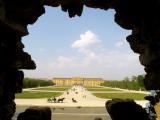
Sometimes it is possible to place a frame within a frame to provide a greater sense of depth to a picture. This palace would have been just a distant building on the horizon had I not used a rocky window within the Neptune Fountain as my vantage point. The frame of the picture frames the jagged edges of the rocky window, which in turn, frames the vast garden leading up to the distant royal palace. The sense of depth is also enhanced by the gradually receding scale of the figures in the gardens. Even the clouds play a role here -- the huge cloud in the center is similar in shape to the rocky window.

Canon PowerShot G2
1/640s f/5.6 at 7.0mm full exif

other sizes: small medium large original auto
share
Phil Douglis07-Mar-2006 03:23
Lana and Maria, thank you for your thoughts on this image. It seems to have engaged both of your imaginations, and that was my intention.
Lanna 07-Mar-2006 02:34
wow, i think it is excellent it captures the palace in a great way. It looks so beautiful.
Maria 07-Mar-2006 02:14
Oh wow i think it is beautiful. You really captured the palace because the black shadows contrast with the light scenery. I love it even though I do not know you I like your painting.
Phil Douglis23-Oct-2005 04:33
I want to add an critically important postscript to the previous comment, which I posted two days ago, in which I made a very strong plea to photographers to pursue expressive images instead of "perfect" pictures from a technical standpoint. This is not just my personal opinion. Coincidentally, this evening I learned that Chris Johns, the new editor of National Geographic Magazine is thinking along similar lines. In an interview in November, 2005 Outdoor Photographer Magazine, Johns -- who is the first National Geographic field photographer to edit the magazine-- is quoted as saying "There was a point in my career where I was keen to take 'perfect pictures.' Perfect pictures don't interest me; what interests me are energetic, curious, fascinating pictures. A photographer who works for us has to go out and take risks, calculated risks. I'd rather that the picture be a little rough, but more honest, more revealing that postcard cliche or calendar perfection." Johns is obviously charting a new course for National Geographic. He also was quoted in this interview as saying "We have to be careful that our pictures don't look too produced, too slick." That has been one of my own pet peeves -- The Geographic, as good as it is has been, has often placed a premium on technique at the expense of expression. It was, for example, the last major editorial publication to shoot entirely with film, because its editors believed that film delivered better quality images, even though digital imaging provides creative, on the spot feedback that no film camera could ever match. Chris Johns is, thankfully, changing all of that, dragging the publication kicking and screaming into the 21st century, by going digital and encouraging his photographers to forget technical perfection and instead concentrate on expression!
Phil Douglis20-Oct-2005 22:05
Nobody is saying here that my images are perfect works of art. They are responding positively to the ideas I am trying to get across to them. I am a teacher. These images are not intended to be viewed as ends in themselves. I have a larger purpose in mind than you seem to recognize. This is a teaching site. And a learning site. The people who are learning here come with open minds. They are reacting to what they learn. Perfection is an impossible objective in expressive photography in my view. There is simply no such thing in expressive photography. You can't measure the perfection of an idea. Everyone sees and thinks differently. An expressive photograph lights a spark in the imagination of a viewer and leads to thought and emotional response. It is either there or not there. You seem to be speaking largely of technical perfection. I am not teaching technical photography here.
Denny Crane 20-Oct-2005 09:33
The rocks are good in providing the illusion of depth. There's just a slight imbalance to the picture as a result of the things I mentioned. A viewer would expect symmetry of the background (not the framing rocks). The fact that the castle and grounds are off-center, and the tree rows are different lengths, and there's nothing balancing the horse and carriage on the right side of the sidewalk -- all these things weaken a scene that should be very restful and ordered. If you wanted a little edginess or discomfort or unbalanced asymmetry, then something more-- another element -- needs to be in the picture.
About the head/grass intersection. I mentioned this as to what a painter would do, and though I'm not art student or artist myself, I think the beauty and perfectioin (or beauty through imperfection) of any piece of work lies in the tiny details. So I am nit-picking here. But without any nits, a picture can be perfect. If I hung this photo on the wall, every detail that falls short of perfection (or imperfect beauty) becomes more and more noticed, degrading the experience and shortening its wall-life. In the same, if the driver's head was perfectly and pleasingly positioned, this tiny positive detail would increase my appreciation and enjoyment of viewing the picture, extending its "wall-life". I'm picking out things I think weaken the picture, because almost all I've read since discovering your post yesterday are people congratulating you are your brilliant and perfect pictures. I see flaws which I think should be pointed out, and that ought to be instructional for viewers who only see your work as being perfect works of art. There's nothing wrong with presenting a photo as a good example of a teaching point (framing, symbolism, etc.), even though the photo is not perfect, but I cringe at reading those posts that laud the pictures too strongly as being perfect. Oh, by the way, I don't like the off-white/grey objects between the dark rocks on the far right. I'm sorry not to have noticed that before writing my criticism.
Phil Douglis20-Oct-2005 00:24
The rock on the right side is there to give the illusion of depth to the image. We know there is a sidewalk and grass there. We don't need to see it. I never intended this image to be perfectly symmetrical. It is an asymmetrical view of a symmetrical garden. As for the drivers head intersecting with the grass, it is so small that this merger is irrelevant. It is the horse and carriage we see here at a distance, not the drivers head in the grass. The left and right row of trees need not be the same -- I intentionally introduce the casual into a Baroque gardener's plan that worshipped predictability.
Denny Crane 19-Oct-2005 20:17
Good idea, poorly composed. What's the rock on the right side doing blocking the whole sidewalk and edge of the grass. This picture begs for symmetry, yet blows it in the worst way with the frame. The inner lower framing rocks should frame the back scene identically. The picture in the background almost looks like a painting. Except for the placement of the carriage in the left. The driver's head shouldn't be high enough to intersect with the grass it is doing. The symmetry should extend throughout the framing, so the left row of trees should be similar in length to the row of trees on the right. A painter wouldn't do this. A good idea for a photo and a decent attempt, though not fully realized.
Phil Douglis27-Feb-2005 04:27
I like your description. Actually, Vienna itself was badly bombed during World War II. Although this is not a bomb crater you are looking at. It is a rocky frame for a lovely fountain.
Guest 08-Feb-2005 19:32
Very original framing here. It keeps the viewer wondering.
The contrast between the very ordered subject and the broken-like frame is very interesting.
Is like a classical painting of a 18th century scene seen through some bomb hole.
Phil Douglis01-Dec-2003 00:04
Thanks, Dirk, as always, for your perceptive comment. I always try to use my frame to imply a third-dimension -- depth -- within a two-dimensional medium. This time, I framed another frame to intensify that sense of great depth. And as you say, it is also about scale as well. The difference in size between the rocks that frame the scene, the horse and carriage, and the gradually diminishing human forms as they lead us to the great palace, tells us just how vast this distant building really is.
Guest 30-Nov-2003 15:45
Absolutely great example for the fine use of a frame for an image. So great and what a fine play of people, horses leading to the castle at the end of the road. Love also the fine warm colors, this image has something from old illustrations in books and using the rocks to provide depht works wonderfully here, bravo Phil !
Type your message and click Add Comment
It is best to login or register first but you may post as a guest.
Enter an optional name and contact email address. Name
Name Email
help private comment