photo sharing and upload picture albums photo forums search pictures popular photos photography help login
Phil Douglis | all galleries >> Galleries >> Gallery Thirty Three: Using light and color to define and contrast textures > Door to nowhere, Kingman, Arizona, 2009
previous | next
15-APR-2009

Door to nowhere, Kingman, Arizona, 2009

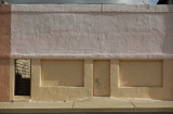
The early morning light brings out the ragged texture beneath the white and yellow paint that covers this sealed storefront. It has two doors. One is sealed as tightly as the large windows that once looked out onto the street. It's surface is scuffed -- somebody has probably tried to kick it open. The other portal has no door at all -- the opening reveals an exterior space within, featuring an abrasively textured wall. I found a fascinating incongruity here -- the warmly sunlit building, painted in pleasant colors, seems at first glance to be nostalgic and benign, yet the rough wall standing within, along with the scuffed, sealed door and the blocked windows up front, speak of harsh and unforgiving realities.

Panasonic Lumix DMC-G1
1/800s f/8.0 at 51.0mm iso100 full exif

other sizes: small medium large original auto
share
Phil Douglis23-Apr-2009 18:56
Thanks, Vera, for underscoring the importance of the continuing dialog that goes on beneath many of my images here in my cyberbook. This is the one of the few places on the Internet where photographers can ask questions of another photographer and always get a detailed answer, and hopefully learn from the exchange of ideas. You are right -- such a thing as a frame adjustment or crop should not be a matter of instinct or past practice -- it should be done according to the feeling or meaning we are trying to convey.
Guest 22-Apr-2009 23:50
Thanks to Tim for picking up on the fact that you use these galleries for teaching and asking the question for all of us. I think our immediate thought would be to crop the sky and the street out. Nice to know there are times when it is important to shake things up and don't do what is expected...why? Because when you look at the meaning, and emotion we are trying to convey, it works better. Thanks Phil.
Phil Douglis21-Apr-2009 21:27
Thanks, Tim and Rosemarie, for this question. This is an uncropped image -- just the way I framed it in the viewfinder. Just as I kept a sliver of the street at the bottom of the frame, I kept a sliver of sky at the top of the frame. I wanted just a bit of environmental context to allow the building to breathe. I looked at the image without the street and without the sky, and it seemed cramped to me. And cramped was not my point here.
sunlightpix21-Apr-2009 21:11
I had the same question. The sky appears dark and stormy. Including more of it might add to your theme of harsh and unforgiving realities. Removing it seems to keep the emphasis on the doors and the textures.
Tim May21-Apr-2009 20:23
As photographic artists we all made decisions. Since you use these galleries for teaching, and since I will probably post virtually the exact same image when I get to my posting I have a question about your cropping here. Why did you decide to keep the strip of sky at the top of the image?
Type your message and click Add Comment
It is best to login or register first but you may post as a guest.
Enter an optional name and contact email address. Name
Name Email
help private comment