Interesting take on the theme. Lots of repetition and color.
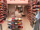
I think if you could lower the saturation a bit, the shirts on the shelves would appear sharper.
I would definitely crop off the 2 red signs at the top. Don't think I'd crop the left, but I would consider cloning out the metal post (lower left). On the other hand, the clothes on the lower right don't bother me at all.
Is the inside of this shop that pink - or does the w/b need adjustment?