


|
|
|
|
|
|
| Gordon W | profile | all galleries >> Tips & Techniques Galleries >> A Basic Explanation of Histograms | tree view | thumbnails | slideshow |
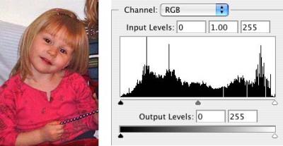
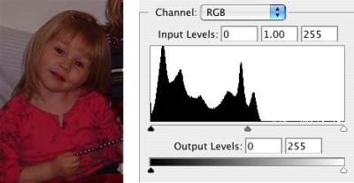 Original Image |
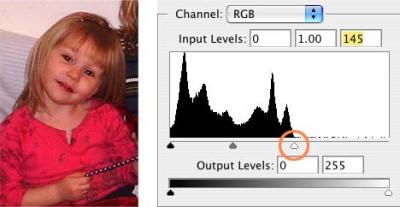 Adjusting White Point.jpg |
 After White Point Adjusted |
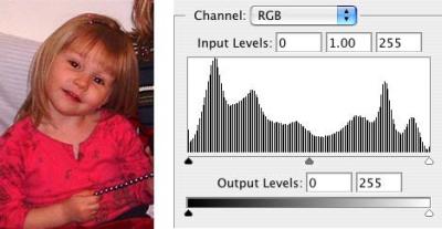
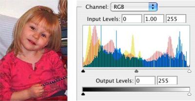
 Levels Adjusted Color Balance & Midtones |
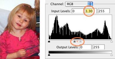
 Alternately Adjusted w/Color Balance & Shadow/Highlight |
 Composite |
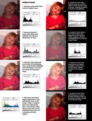 Variations in Dynamic Range |