photo sharing and upload picture albums photo forums search pictures popular photos photography help login
Phil Douglis | all galleries >> Galleries >> Gallery Twelve: Using color to express ideas > Cowboy and color, Jackson, Wyoming, 2006
previous | next
30-SEP-2006

Cowboy and color, Jackson, Wyoming, 2006

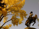
I photographed this same statue as an abstraction (click on the small thumbnail below) to make its viewers think it almost real. In this case, however, I use this statue of a rodeo rider, which stands in Jackson’s town square, as context for the brilliant color coming from the tree overhead. The bronze statue acquires a golden tone all of its own as the vivid leaves seem to bow to it in salute. This image is largely about the nature of color and in this case, it provides much of the meaning.
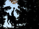
Panasonic Lumix DMC-FZ50
1/320s f/5.6 at 10.6mm iso100 full exif

other sizes: small medium large original auto
share
Phil Douglis08-Mar-2007 15:04
Thanks, Ceci -- it works for me, too. Your metaphorical golden dust is much appreciated. Once again, you add a new dimension of meaning to one of my favorite images.
Guest 08-Mar-2007 08:15
I love the golden leaves above this realistic statue of bronco and rider, it's as though the frantic hopping and leaping of the horse has kicked up clouds of yellow dust which has been even more stirred around by the flapping of the cowboy's hat. Works for me!
Phil Douglis05-Mar-2007 18:54
I think this image clearly demonstrates the variability of subject-context relationships. It all depends upon who is looking at it. I do not see my thinking as vague and uncertain at all. For me, expressive photography itself works in entirely unpredictable ways, depending upon how each viewer responds. You see it one one way, I see it in quite another way. And other viewers would differ in their responses from each other as well. It is true that we can't be certain how people will respond. But that is a beauty of this medium -- its variability, depth, and breadth of meaning.
Zane Paxton05-Mar-2007 12:20
I acknowledge your tenactity and passion, but you are arguing for being vague and uncertain which is what makes it a weak image.
Phil Douglis01-Mar-2007 19:02
We disagree on the nature of "distraction" here. In my view, the tree does not distract from the statue at all. Is the tree the subject of this picture? For some, yes. Is the statue the subject? For others, yes. It is left to the viewer to make that distinction. I often find that one person's context can be anothers subject, and vice versa. A distraction is something that dilutes meaning. In my view, neither the tree nor the statue obscure meaning. They are complementary.
Zane Paxton28-Feb-2007 23:49
"...but for me, the tree is what draws the eye because of its richly symbolic colors."

That's exactly my point!!! You just described and clearly defined the gigantic distraction in this image. Distractions weaken an image. A more neutral foil would allow the primary subject to shine. Why would drawing the eye away from the primary subject in such an agressive way (with a more background type object) possiblly be considered a successful tactic? All it does is create a huge unresolved visual tension that weakens the image!
Phil Douglis26-Feb-2007 23:07
Sorry you don't see this image as "successful,"Zane. I intended this image as a lesson in subject-context relationship. The statue is indeed laden with inherent cultural meaning, but for me, the tree is what draws the eye because of its richly symbolic colors. The colors of autumn are often seen as nostalgic, and this image is about the heroes of another time. As for the distracting conifer at upper left, I see it as giving depth to the image.
Zane Paxton19-Feb-2007 06:36
"This image is largely about the nature of color and in this case, it provides much of the meaning."

Here I find the meaning difficult to discearn and the intent seems similarly muddled ("Largely" and "much of" are not terms that are crisp and definite)...

The statue properly is the primary subject, but the yellow leaves are not a foil but a huge visual distraction. Conversely, if the fall color is the primary subject, the statue is too laden with inherent cultural meaning and importance to be relagated to any kind of comfortable secondary status; it DEMANDS our attention. Also the dark conifer in the upper left is a distraction and should have been cropped out.

Sorry, I don't see this as a successful image...
Type your message and click Add Comment
It is best to login or register first but you may post as a guest.
Enter an optional name and contact email address. Name
Name Email
help private comment