photo sharing and upload picture albums photo forums search pictures popular photos photography help login
Phil Douglis | all galleries >> Galleries >> Gallery Twenty Two: Black and white travel photography – making less into more > Closeup, Tad Fane Falls, Pakxong, Laos, 2005
previous | next

Closeup, Tad Fane Falls, Pakxong, Laos, 2005

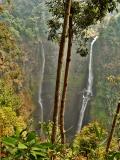
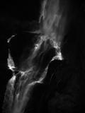
This is one of those long, narrow waterfalls that has formed a crater in the middle of its drop. I used a 432mm telephoto lens to zoom in on that crater from across the valley. (You can see the entire waterfall in my Landscape Gallery by clicking on the thumbnail at the bottom.

Later, when looking at the color version of this image, I noticed that there really was not much color showing in my closeup picture at all. The backdrop for the water was in deep shadow. Only a few green trees barely showed in the picture. When I converted it to this black and white version, I honed the image down its very essence – the force of the water, as it flowed into the crater and the out of it again. The black and white version intensifies the crater's effect on the water's movement, and made this photograph much more expressive than it had been in color. (The color version of the entire waterfall, appearing in my landscape gallery, is a wideangle image embracing the view from across the valley. It works because of the way the light falls on the green’s, yellow’s and gold’s in the brilliantly colored foliage that embrace that scene and because of the foreground trees I added to that image.)

When I made my black and white conversion, I enriched the simplifying effect of the black shadows surrounding the falls by removing whatever traces of foliage lurked within them, and substantially abstracting the scene. I also increased the contrast and detail in the water as it smashed into and then flowed out of the crater, by playing with the different “channels” in the “channel mixer” selection box within Photoshop’s “Layers” palette.

This black and white image goes well beyond a travel photograph. Because it is now an abstraction, it becomes art-oriented image as well. It goes well beyond describing the appearance of Tad Fane Falls itself. It becomes a symbolic rendering of nature’s power, a much more universal statement. It is also becomes more mysterious in black and white – when coming upon this image, we might at first wonder exactly just what we are looking at. It almost resembles a fanciful X-ray picture made deep inside the human body. But it’s not – we are looking at my own impression of the massive authority of nature itself. It is up to the imagination of the viewer where it may go from there.


other sizes: small medium large original auto
share
Phil Douglis11-Jul-2005 01:17
Context, Zane, comes from the words and other images that may accompany an image, in addition to any context that may come from within an image itself. This allows us to create abstractions as powerful as this one. If I had to show you the surrounding countryside here, this image would no longer work as it does. No travel image comes to us without an opportunity for presenting the viewer with additional context. Travel photographs are not works of fine art designed to independently hang on a wall of a museum (although this one might go beyond travel photography and be displayed as personal art) . Travel images are presented in books, albums, in web galleries, attached to emails, or shared over a cup of coffee. There exists ample opportunity for the photographer to add context by word or voice as needed.
Zane Paxton10-Jul-2005 21:04
Hi Phil,

I like the image,as an abstact, but there is no "Context" that it exists in (a black void in this case) so there is no sense of place (that would seem important for travel photography). So this could be anywhere on the planet. The point being that there is more "meaning" when there is a sense of place about it, color or no color. This commentary is from the vantage point of "travel" photography.
Phil Douglis07-Apr-2005 21:36
Glad you like this one as much as I did, Alister. I'm sure its no accident that your began today's series of comments with my distant view of this very subject, and you end it with this abstracted version. You loved the overall view for its ability to make coherence out of chaos. And you enjoyed this one for its minimalism. In both instances, I essentially tried to simplify, isolate, and emphasize key aspects of the image on behalf of meaning. Thanks again for your thoughtful comments -- coming from a master photographer, they mean a great deal to me.
alibenn07-Apr-2005 14:11
I have to concur with m on this one. A Phil classic.. Much has been said on this already, so I won't repeat, but I love this minimalistic approach very much, the BW abstraction and the strong diagonal composition. Wouldn't change a thing. Superb...
Phil Douglis30-Mar-2005 20:51
Thanks, Guy, for your kind comment on this picture and glad you see what I was trying to do here, and why I did it in this way. If and when you decide to move to digital imaging yourself, you will learn much more quickly, because you will be able to see not just the images of other photographers, but you will see your own images as you make them, and learn from them while you still have the chance to improve them. Good luck.
Guy Dube30-Mar-2005 05:30
Bonjour Phil,
I found your picture very nice, a perfect composition all the way. I began b&w since two months, I tried Tri-X400, 400TMax, BW400CN... I don't have a digital camera. All my cameras are 35mm, all Canon. I am reading all the time on the subject. I think we learn a lot when we see pictures of other photographers.
Guy
Phil Douglis20-Mar-2005 23:06
I just knew you would be commenting on this one, Zandra. It is your kind of image -- haunting yet also lovely, a theme you often enjoy using in your own photography. Black and white is a medium of abstraction, and abstraction, when expressively used, can trigger the imagination, and your imagination is always in superdrive! You also love to hone down an image to its essence, and walk that edge between what is seen and not seen. So it is no wonder that you see the hint of a face in the black area at lower right. I see it now myself -- a stone face of an old man, right? It is definitely not friendly. Actually it is vegetation, which in the original color version of this picture was a faint green splotch. I love your conclusion - nature telling us "don't mess with me." The more I look at this image, I feel an open wound being cleansed by the healing power of nature's waters. You see the force of nature at work as well, but in a different way. And that is what expressive photography should be all about. Triggering different ideas in different minds.
Guest 20-Mar-2005 18:36
The use of B&W in this really enhances the movment of the water as well as abstracts the waterfall to whatever the viewer wants it to be. The focus is clearly on the moving water but it seems somethign mightlirk in the shadows as well. It is haunting and beautifull. Me and my vivid imagination can even see traces of a face in the lover right corner. Hard to say if it is a friendly face or not though. This is nature at its best, tellingus...don't mess with me...
Phil Douglis04-Mar-2005 20:30
When I made this conversion from color to black and white, my thoughts were of you, Marek. Your fascination with photographic interpretations involving life, death, and spirituality has influenced me to the point where I am continually looking for such connections in my own images as well. My friend, pb artist Tim May, who was shooting in Laos with me, would call this a "Douglistic" image. You have given me a good definition of Douglistic -- as one who often enjoys expressing ideas on an epic scale, which means an emphasis on size, scope, timelessness, and even, perhaps, a heroic quality as well. I admit it -- I love the challenge of reducing something infinitely large, powerful, or mysterious into an essence through abstraction. I am delighted you think I've done that here.

As for the composition, I agree with your reasoning regarding my diagonal placement of the waterfall in this frame.
I am not sure why Celia suggested I center it and move it away from the left edge.
Guest 04-Mar-2005 17:04
This is my favourite image in your B&W gallery, and possibly because I have already typecast you into someone who can convey an EPIC so successfully ;-) This, not only conveys your favourite themes of time and scale, but uses the abstraction into B&W to make it appear like anything ORGANIC, which adds to the power and mystery. From the comment below I also feels Celia knows nothing about composition is she is suggesting that you position the waterfall centrally. That would have the effect of abstracting it TOO much, removing it from the context. The space on the right shows us the scale and solidity of the rock, simultaneously creating a beautiful contrast to the fluidity. Moreover, I love the way you can only just about make out the murky detail of the rock. For someone interested in life, death and spirituality this image is especially satisfying ;-)
Phil Douglis01-Mar-2005 18:19
Thanks, Celia, for your striking analysis of this picture. You beautifully describe the elements that go into making this black and white abstraction effectively express the beauty and power of falling water. I also thank you for your question regarding my deliberate positioning of the bottom the waterfall so close to the left edge of the picture. I wanted the flow to exit the lower left hand corner, creating as close to a diagonal flow across the image as I could possibly get. I know it left a large void to the right, but that void is counterbalanced by a similar void at upper left. Diagonals are line that symbolize power and energy, and what could be more powerful or energetic than a scene such as this? Thanks for the question -- and for your kind comments on this image.
Cecilia Lim01-Mar-2005 12:04
I was so intrigued by your thumbnail because it is so abstract and almost unidentifiable. By stripping this down to B&W, I love the way you've abstracted a documentation of a waterfall into the expressive nature of of falling water. By darkening the background rocks and foliage, you now focus our attention to the amazing energy and fluidity of water, that transforms itself every step of the way as it falls, from harsh droplets to waves of mist and vapour. This somewhat surreal behaviour of water is further enhanced by your mysterious abstraction of it into shades of white and grey that jump out from the depths of darkness. But I do wonder why you've placed the waterfall so close to the left frame, leaving a big dark void on the bottom right of your image. Are we suppose to get the feeling that the watarfall is about to leap off your photo?
Phil Douglis01-Mar-2005 04:31
You are right on all counts, Mo. It is a very abstract image on its own, and when you know what it is actually is, it becomes even more fascinating to study.
monique jansen28-Feb-2005 17:40
Without having looked at your color picture, I am sure this one is made more mysterious by eliminating color, at first it looked like smoke, very strange, dark...
Type your message and click Add Comment
It is best to login or register first but you may post as a guest.
Enter an optional name and contact email address. Name
Name Email
help private comment