photo sharing and upload picture albums photo forums search pictures popular photos photography help login
Type your message and click Add Comment
It is best to login or register first but you may post as a guest.
Enter an optional name and contact email address. Name
Name Email
help private comment
Phil Douglis | all galleries >> Galleries >> Gallery Eight: Light and shadow shape meaning > Urban Tree, San Diego, California, 2004
previous | next
15-APR-2004

Urban Tree, San Diego, California, 2004

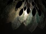
Interpreting the art of another artist is a great challenge to a photographer. I want to maintain the integrity of the original concept, yet also express my own point of view about the work. San Diego offers a stunning variety of public art works. Among my favorites are the “Urban Trees” that sprout along the harbor – each of them interpreting the work of nature by using man made materials in different ways. One of these trees features huge textured leaves made of tinted opaque plastic. By putting the sun behind five of them – along with their metallic supports – and using my spot meter to expose for the brightest area, I was able to bring out the richness of texture and tinting through backlight, abstraction, and translucence.

Canon PowerShot G5
1/1600s f/8.0 at 12.7mm full exif

other sizes: small medium large original auto
share
YNW29-May-2005 04:10
Wow, I like this capture!! Simple but beautiful!!!!
Phil Douglis25-May-2005 23:12
This is one of those images, Ana, when nothing can become something. (All to often, we see photographs where something becomes nothing, so I guess we are ahead of the game here!) You know by now why less can often be more. It's not what I am shooting here that is important. It's why and how I shot it that makes it so expressive. That "strange gray color" is opaque plastic, yet it's translucent enough to allow the sun to illuminate it from behind. The image changed for you, Ana, not because of the image itself, but because of what you were able to bring to the image. By spending so much time looking at it and thinking about it, it became whatever you really wanted it to be become. Such is the power of abstraction and of the interplay between light and shadow.
Ana Carloto O'Shea25-May-2005 22:38
This one could be anything! I like the straong sense of abstraction of the image, because if you didn't write about waht this one was, I wouldn't guess it.
The textures and the shy colour hues definitely make most of the impact that this image has for me though I must say that I find the strange grey colour of the background quite appealing. It puzzles me how can it be that with such a strong light in the photo my eyes keep falling back to the grey background... It's almost like I was expecting that something could come out of there at any second now! It's a strange mysterious background and though it looks really plain I think it makes the leafs shine a lot more. I can't explain it well, but sometimes it's the least significant part of a composition that really grabs my attention.
The truth is that I love it, I really like it when a photo seems to be nothing and suddenly I look better at it and it becomes everything...
Phil Douglis06-Nov-2004 05:01
How romantic, Maureen. It's only a piece of public art on the San Diego waterfront, but the power of symbolism and abstraction has you dreaming of moonlight and leaves. I am delighted to be the agent of your pleasure!
Guest 06-Nov-2004 04:56
The thought of moonlight sifting through the leaves on a tree does bring me back to this photo over and over again.
Phil Douglis01-May-2004 03:11
Thanks, Anna. The color is subtle, but definitely there. As for exposure, you could get a shot such as this to work by using your spot meter on the brightest part of the picture. Everything else will fall into place. And the great thing about digital shooting is even if you can't get it just the way you want it to look, you can always re-take it, using your exposure compensation control. Just underexpose it and see how it looks. And if all else fails, you can use the levels control in photoshop to adjust your exposure still again. No excuses, Anna. You can make a picture work just as well as this one if you do any or all of these things!
Phil
Anna Yu30-Apr-2004 22:52
The textures really stand out and the title is wonderful. I like the blue-green color in the glass. Again I ponder the exposure question, don't think I would have gotten this one right.
Type your message and click Add Comment
It is best to login or register first but you may post as a guest.
Enter an optional name and contact email address. Name
Name Email
help private comment