photo sharing and upload picture albums photo forums search pictures popular photos photography help login
Phil Douglis | all galleries >> Galleries >> Gallery Eight: Light and shadow shape meaning > Dusk, Svir River, Russia, 2003
previous | next
27-JUL-2003

Dusk, Svir River, Russia, 2003

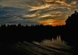
The Svir River links the two largest lakes in Russia -- Onega and Ladoga. We moved onto the Svir at dusk, its rippling water still reflecting the lingering sunset. I exposed for the sky, allowing the Svir's mysterious waters to grow even darker. Light sculpts its ripples into rhythmic echoes of the clouds overhead. Of the thousands of images I made in Russia, this is one of my favorites -- I can look at it again and again and never tire of it. I think it holds such fascination for me because of its dimensional and abstract qualities, created largely by the interplay of light and shadow in the sky and on the water.

(In November, 2004, after a number of people expressed dissatisfaction with the point of this image, and after Zebra was kind enough to suggest the "revision" below, comparing it to my original image, it occurred to me that I could make an additional point with this image by revising it myself, using Photoshop as my tool. The version above is my new version of the same image that Zebra has labeled as "original." What I have done, essentially, is to use the new Photoshop CS "Shadow/Highlight" tool, which revealed much more detail and color in the clouds that I had realized were there. I did not have the Shadow/Highlight tool available to me when I originally edited this image back in 2003. I essentially have changed the message of this image in Photoshop by creating more emphasis on the Sunset (highlights) and less emphasis on the shadows. We now not only have the tranquility I wanted so much to express, but it is also an evening of great beauty. The added color brings warmth into the image that was not there before, extending an idea that Zebra suggested in his first re-do of it. I think this image is much stronger in its new version, and wonder what its critics will have to say about this. It shows us that with Photoshop we have infinite opportunities to affect the meaning of our images. It is if I went into the darkroom (in the good old days of film) and created a print that expressed entirely new ideas. It is perfectly legitimate in my view to do so. I added nothing to this image that was not actually there that night. It was just not properly presented in my first version. It is now. Let me know what you think.)

Canon PowerShot G5
1/1000s f/4.0 at 7.2mm full exif

other sizes: small medium large original auto
share
Phil Douglis16-May-2005 23:42
I agree with you wholeheartedly, Marisa. The spirit can speak louder than the mind, but your mind did a wonderful job in analyzing it. I look forward to many more comments from you in my cyberbook. Welcome to pbase.
Guest 16-May-2005 19:59
Thank you very much Phil for your kind words.
I just wrote what I felt about this picture, my sensations and emotions without considering all the technical stuff; because, for me, this kind of images are completly related to my spirt and not to my mind. Is in this cases when my spirit 'rules' and my 'mind' is a very good copilot wich helps very well in putting words to my feelings.
I'm happy that you consider my comment useful for you and somebody else. It meant a lot to me, really.
Phil Douglis16-May-2005 04:28
It was very smart of you to make this comment before reading the long series of comments that preceded yours, Marisa. I was delighted by your thoughtful remarks -- they illuminate my image in a way that it has not been seen before. I think that even Celia Lim, who started this thread by calling this image "mediocre work" and "a cliche sunset picture," might see it through new eyes if she was ever willing to come back here and read your thought provoking interpretation of it. This is what is so wonderful about teaching here on pbase. We can learn how to see and think anew by sharing the visions of others! We can also learn to open our mind to new possibilities, instead of seeing and thinking in predictable thought patterns.

I am fascinated by your theory of opposites, Marisa, which dovetails so well with my own desire to build images upon contrasts and incongruities. I am delighted that you see the light within the shadows and the shadows within the light, as well as my circular composition symbolizing a world without end. "Eternal feedback"-- I love that term. A game between our dark side and light side, the struggle between reality and illusion -- both are apt characterizations of this photograph. And finally, your passion for sunsets serves as a reminder that everything indeed has both a beginning and an end.

This image, which has now drawn more extensive comment than any other photograph in my cyberbook, and has drawn more views than any other in this gallery, as been viewed as everything from an ugly duckling to a wonderful teaching example. It shows us how one person's cliche can become another person's inspiration. I thank you, Marisa, as I did Ruth just before you, for seeing far more deeply into this image than I could have ever imagined. I have always had unshakeable faith in this picture's ability to express ideas within the imagination of my viewers. It was just a matter of time until the evidence arrived. Thanks for helping us link life and landscape in such an insightful manner.
Guest 15-May-2005 16:19
Hello Phil,
First I must tell you that your galleries are extremly beautiful and is a delight for all of my 6 senses (I include deliberatly my 6!).
Quite strange that from all this gallery I was instantly attracted by this photograph. I tried to read the comments but, it seems that it was a long story with this shot and I don't want to be influenced by this. So I'm going to comment without knowing all this previous dialogues.
What first recalled my attention was the balance of the shot, between light and shadow, and how in both we can find the other one. I related this with the Yin-Yang symbol and with the theories of opposites in life: light/shadow; cold/hot; black/white, right/left; up/down i.e..
Also, as being a centered composition we have again a half. And so I find it as an exquisite example of circularity... from one side to another and starting again, without end. One side lead us to the other, in this eternal feedback. We can find this in life, in seasons.. and this natural landscape is a great representation of this.
A game also between our dark side and our lighting side, between reality and illusion; with that tree line as a borderline: it separate the worlds and the halves, but also, in the same way, integrate them.. completing the circle.
It is a very peaceful composition. Still, the waves and the clouds tell us a story of movement.. everything is moving, always.
I must tell you now that, in spite of what mostly of the photographers say about the 'postcard sunsets'.. I was always attracted to them, because for me, they are the representation of the powers of life.. showing us that everything in this life has a beginning and has an end.
Thanks for this extraordinay moment of life.
Marisa
ruthemily01-May-2005 00:42
you're very welcome. i simply say what i see. and hear.
Phil Douglis01-May-2005 00:15
After all of the back and forthing that has been going on over this image since last October, Ruth manages to get to the core of it in a way that nobody has yet done, including myself. This image can indeed be seen as bickering between peace and tumult, very much a metaphor for Russian history itself. In retrospect, I let my frustration with Celia's initial criticism of my image color my ability to stand back and see this image for what it could ALSO mean to OTHERS. In other words, I got so close to this particular forest, I lost sight of the trees (pun intended)! You have helped me stand back, look at it freshly through your eyes, and see my image anew. Thank you, Ruth, not just for telling us what this image meant to you, but in a much larger sense, how we should distance ourselves from our own work, forget about what we were trying to do, and instead accept the fact that different people will find different meanings in it, which is what expressive photography should be all about.
ruthemily30-Apr-2005 22:38
i've tried to read the previous comments but i can't take any more in. i want to comment on the image though, so please excuse the fact that i haven't digested everything that has been said and the process that's gone into "improving", "changing", "validating"...whatever-ing...this image.

so i'll just say what i see, which is a very striking photograph. i see it as split into two parts...and perhaps that reflects the disagreements below this comment as much as anything else! i see a very calm, peaceful and tranquil lake with the sky totally opposite. the sky to me seems really tumultuous and in total uproar, it's like the clouds are bickering and screaming at each other. it isn't at all calming or peaceful. but the water on the other hand is, and it shows no sign of recognition of what is going on above. we don't even see a reflection of the light or colours in the water, apart from a very small hint of an orange glow. but the surface is rippled and not totally unaffected. the sun will set totally and the clouds will lose some energy and it will all settle down into darkness.. until the next morning when the sun will rise and the clouds will have taken on different shapes as though nothing ever happened.

so, in summary to my whittering, i find this an image of DISPUTE. which seems to sum up the comments too, as much as i have read of them anyway. i will come back to those, and see if and how you resolved your differing opinions. i don't know much about Russian history but i would say this dispute is also quite fitting in that sense. especially with a view to the higher authorities and powers battling things out while the "regular" people had no choice and no voice below.
Phil Douglis14-Nov-2004 05:11
Thanks, Janice, for joining Marek and Zebra in validating the legitimacy of this image as photographic expression. Just as you were, I was stunned and saddened at Celia's intransigent negative positions on the value of this image, both as a work of photographic expression and also as a teaching example. I can neither accept or understand the reasons she gives us for disliking this image -- to me, they defy both logic and common sense. However, I am delighted that her criticism has provoked you into leaving this insightful comment.

By linking this image to the soft sounds of water you remember from your own experiences, you take from this image exactly what I intended. I am pleased to hear that, unlike Celia, you find the colors in this image to be "exquisitely delightful," and that you feel like staying in "that part of picture forever." It is amazing that two human beings can look at the same photograph and one sees ugliness and uselessness, while the other sees tranquility and beauty. I never lost faith in the power of this photograph to offer my viewers an expressive experience. I knew deep down inside that I had captured a moment in light, time, and space that could move others as deeply as it did me. It was only a matter of time before someone finally stepped forward to say so in such a profound and beautiful manner as you have.

You offer a lesson here for all expressive photographers, Janice. We should never allow the derogatory opinions of nay sayers to cause us to lose faith in the value of our own work. No picture I have ever made has suffered the degree of insult that this one has, but I have believed in it since the night I made it, and after Zebra encouraged me to improve it in Photoshop, and Marek showed me how best to do that, Janice has viewed the result and finds both tranquility and great beauty. You are just as "qualified" as anyone else, Janice, to make these judgments, and I welcome them with great pleasure. Thank you for them.
Janice 14-Nov-2004 00:07
Dear Phil,

I just had a little comment....even though I don't feel as qualified to make a comment about your picture as some of your other critics must be, but the comments of C. absolutely floored me.

She said speaking of the ripples that it "promoted the idea of disturbance, turbulance and intrusion of man in an otherwise perfectly still and peacefully quiet mirror lake.'

My response to that picture was entirely different, in fact,the ripples were the *first* thing I was drawn to in the attempt to get to a quiet and peaceful part of the picture, because it *is* such a tranquil part of the picture, I think it is one of the most beautiful parts.

It reminds me of a strong and comforting relationship with my father who loved to go out in the boat and fish, and the picture woke up again the memory of the peace and quietness one experiences when one is in a boat accompanied by the silent presence of a great body of water with the occasional ripple and the soft sounds that sometimes occur, and for me, this is a deeply restful and satisfying photo. The colors of the sky reflecting in the dark ripples are exquisitely delightful to me, and I find myself wanting to stay in that part of the picture forever. Perhaps C. has a very unpleasant memory from the past associated with this part of that photo that is causing a disturbed feeling in her(?), consequently causing an unsettling effect of aversion in her soul when she sees it. The problem is not you, and it is not your photo. It could be something in her....

My 2 cents.... Janice
Phil Douglis11-Nov-2004 23:55
Thank you for returning to this image for one last shot at it. I knew in my heart that you would probably not appreciate what i have accomplished here, with the gracious help of Zebra and Marek, but I do value the time you spent criticizing this picture. However, I strongly disagree with everything you say here. You have, in effect, once again "thrown out the baby with the bath."

Your very first paragraph reveals that you probably made little or no effort to read the valuable dialogue that has been going on here since your last comment. You lecture me on the need to post a revised image, yet one has indeed been posted! You must not have ever scrolled down the page to see it. It was posted by Zebra on November 2nd, along with his own revision, and it was that very posting which encouraged to me to explore what I could do with this image in Photoshop to improve its expressive qualities and use the experience as a valuable teaching exercise. I never would have posted a revised image if my original had not also been posted here.

Secondly, although in your first sentence you acknowledge that the content of my web pages are meant to teach, your final critique of this image utterly fails to assess the value of this revision as teaching exercise. And because of that, I find your repetitive arguments against this picture to be little more than a rehash of what you have already said. The only additions are your denigration of my new emphasis on color as meaning, and your assertions that Photoshop is a tool based solely on changing form alone and not meaning, both of which I must also disagree with.

You also lash out at what you see here as a "sepia tint," which, in my own view, does not exist. At least not on my monitor. Nor on Marek's, because he carefully went over this revision with me, and was most encouraging about it and its lessons. As a professional art director, don't you think that Marek would have noticed something as prominent as a "sepia tint muddling the blues, oranges, and whites?" Since you did not notice Zebra's posting of my original image on November 2nd, I am assuming that you also did not read Marek's final judgment on the value of this example, posted on November 5th.

He said:

"For sure the image is now more engaging and better balanced than the 2003 edition. In summary, you have achieved this by shifting of the balance in spacial , colour, and finally, in tonal terms to create a focal point around the rising sun. This then essentially becomes the story: The orange glow provides us with a clue of the rising sun and holds us in anticipation. The problem with the image before, in hindsight, was that you were aware of this -- in your own mind -- but this was not sufficiently emphasised. Or another way, everything was too evenly spread, the weight was too uniformly distributed robbing the image of its action potential. As it stands, it represents a vast improvement and I'm glad you feel it better communicates your original impression of the scene."

You go on to rail against my composition, yet I dramatically changed the composition by strongly cropping this picture from the bottom. You must not have noticed that, either, because you did not take the time to scroll through all of these comments, find the original, and compare it with my revision, side by side. By cropping out some of the river, I changed the balance of the image entirely, and instead moving the eye into the sky.

I also take strong exception to your final assertion, which admits that effective use of Photoshop can indeed affect the expression of an image. Yet then you go on to say that any such enhancement is essentially worthless unless the "image is great to begin with." Once again, your logic astonishes me, Celia. Using Photoshop to enhance an image is NOT just a matter of changing the form of a picture for its own sake. We can use Photoshop to also change form so that it enhances or even changes CONTENT, as I maintain I have done here. You are blind to that change in my message, so you assault the tool I have used to change it.

In this case, I have used Photoshop to recover lost content - not just dabble in enhancing form. Colors that were not there originally have been restored, shifting a message based on the dark waters, to instead concentrate on the brilliant hues in the sky. And that was the point of this entire revision.

I knew that you would not find this image to be of expressive value, because you have faulted both its concept and execution from the beginning, based largely on your personal tastes. (Which, by the way, I certainly accept.) However, for you to also ignore the teaching value of this exercise, is a tragic, shortsighted loss -- for you and for all who might have learned from a more balanced appraisal of the teaching effect. The purpose of my galleries is to teach, Celia. Once again, you choose to virtually ignore the fact that any teaching is going on here.

You say: "If your goal is not about exhibiting masterpieces but more about using examples to teach, why use a mediocre example to teach?" That is the whole point here -- and you've obviously missed that as well. You chose to critique this image in the first place because you felt it was mediocre in terms of expression. OK -- is there anything to be gained by trying to improve it by cropping and restoring missing color? And what can that teach us? I am deliberately using what you've called a "mediocrity" here as a teaching example, because it offered plenty of room for improvement. What is wrong with that? I have used it to show people how meaning can be changed simply by cropping an image and restoring color that was missing earlier. Why is this so wrong? And why are you unable to acknowledge the value of such teaching?

I am very disappointed that you choose to take such a narrow view of the purpose behind this entire exercise, and once again, ignore the purpose behind my entire cyberbook on expressive travel photography. I know you refuse to ever return to this image again, so I get the last word here. Again I urge you to take off your blinders, Celia. Open your eyes to what I am trying to do here! Forget all of your past rants against this image. Instead simply look at this image as I have asked you to look at it -- as a teaching exercise, not as a work of "great" photographic art. Because that is why I have posted this photograph -- to teach us all how to be more expressive photographers. What do you find so terrible about teaching people how to re-crop an image and rescue lost colors through Photoshop in order to shift the meaning of an image? If you had at least made the effort to carefully consider all of those 21 comments that Zebra, Marek, and I had posted between your last comment on October 28th and today, you might have acquired a context enabling you to take a more enlightened approach in your critique. You could have evaluated the benefits, if any, of the teaching process that I am trying to offer here. I can only conclude that you not only find this image useless as an example photographic expression, but by omission, you also are implying that my efforts to use this image as a teaching tool are worthless as well.
Cecilia Lim11-Nov-2004 22:09
Firstly, before I critique your revision, I would like to say that because the content in your webpages are meant to teach, I think it is important Phil, for you to include your original image somewhere near your revised image. It could just be a smaller 3" x 5" image. This way it is easier for new viewers to see why or how this debate started, and later compare images and better understand the critiques and changes that have transpired from the discussions.

Now, as for this newly enhanced and revised image, it has done absolutely nothing to win me over. Infact, it only gives me another reason to pick on this image. The colours look unnatural now because there seems to be a sepia tint muddling the blues, oranges and the whites - as if a colour photo print has been toasted in the oven! The only improvement is that it is more noticeable because the colours are a little more striking in a strange "burnt" kind of way. There is more emphasis on the sunset now but everything that I feel is weak about it is still there -
1) To me it is still a cliche, hardly unique or artistic, no-brainer snapshot of a sunset
2) The composition is still as awkward as ever - the energy of the clouds radiating outwards above the orange glow is abruptly interrupted by the huge mass of tall black trees on the right, stifling its momentum; the ripples are moving at an awkward angle towards the left of the viewer, and this leftward movement conflicts with the straight outwards movement of the clouds above, creating a very uncomfortable imbalance and edginess that completely takes away the very feeling of tranquility you're trying to express
3) The wake left by your river cruise ship which you chose to capture in your image infact worked against you because instead of tranquility, it promoted the idea of disturbance, turbulance and intrusion of man in an otherwise perfectly still and peacefully quiet mirror lake.
4) Your fixed vantage point on the ship resulted in an uninspiring, common eye-level landscape that everyone sees. But was it the best judgement call you made? Could you have chosen to photograph when the ship was at a different spot on the lake? Could you have pointed the camera upwards towards the sky more, or down? But often, viewers don't care about a photographer's problems or restrictions. It may be an excuse for mediocre work, but great photographers and editors do not hide behind excuses. Why should you? If your goal is not about exhibiting masterpieces but more about using examples to teach, why use a mediocre example to teach?
5) This image is about light & shadow shape meaning, yet the meaning is still unclear because there are so many incongruities - there is still so much dark shadow even though you're trying to emphasise the warmth or great beauty of your setting sun; the shadow shapes are harsh and sharp which seem to fight the softness of the sky. The overall meaning is weak and confusing because of extreme contradictions.
6) Where is the interplay of light and shadow in the sky and on the water? What I can see is hardly noticeable enough to be a means to arouse a viewer's curiousity. Or fascinating enough to engage their attention. Just as a comparison, see your "Point Loma Harbour, San Diego" athttp://www.pbase.com/pnd1/image/28249601 . Now that's what I call an interplay of light and shadow in the sky and on the water!

I think the most important lesson I have learnt here is this : that Photoshop is a great tool to have to help a photographer enhance his image digitally. It can bring out the colours or correct lighting and exposure that cameras are unable to do, especially in tricky lighting conditions. And these can invariably affect the expression of an image. But no matter how much you tweak an image, it will not become a great image unless you start with one that has great content first. A piece of burnt steak will never taste like a perfectly grilled steak no matter how much barbeque or tomato or hollandaise sauce you dress it with. You yourself drove the point home by stating in your comment below that content should come first, then form. And everything that contribute to the content of an image - the subject matter, its composition, the vantage point, the exposure, the colours, shadows, shapes and flow of an image implied by the direction of the subjects in it, all affect the meaning of an image. And these are the things that make a great image, not one's technical expertise in Photoshop or any other image editing software.

Now if I have to write another comment about this Svir Lake, I will jump in the lake! I'm sure these will not be the last words, but they will be for me!
Phil Douglis05-Nov-2004 19:58
Glad you like what you triggered here, Zebra. You are entitled to enjoy any part of it you wish. To me it is the sky, to you, the river, to some, the interplay of both. I am sorry you see that "bright brim" on the trees. I don't see it, because if I started to look at this picture as a measure of pure technical quality, I would deny myself the pleasure of seeking meaning. I would always be distracted by such small things that do not affect meaning in any way. So I do not concern myself with looking for these "problems" that you point out. (I am not even sure what you mean by rotation?)

My advice to you, Zebra, is to think about content first. Then form. If form gets in the way of meaning, work hard to improve your form. But if form -- in this case something about a "brim" and also "rotation" -- does not interfere with meaning, (and in my view it does not interfere here ) just leave it alone and enjoy the image. Otherwise you will find yourself consumed with a desire for technical perfection, which can lead you to making pictures as a technical exercise, instead of as expression.
Phil Douglis05-Nov-2004 19:43
Glad you agree that this image now offers more merit as expression, Marek. You are right. My mind had been playing tricks on me when I originally made this image. I was fully aware of the importance of the symbolic power of the setting sun to this image, but that awareness came from my memory of the scene itself. It was not emphasized within the image. I also gave equal weight to both sky and water before. When Zebra suggested darkening the image a bit, it triggered a series of thoughts, actions, discussions, revisions, errors, and successes involving post-processing that led to what we now see here.

At the very beginning of this thread, my resident critic Celia Lim said "The interplay of light and shadow in the sky and water you wrote about is a very interesting concept, but what you've captured here seems to fall short of anything substantially evocative or engaging." Celia has promised me that she will return shortly to take another long look at this image. I hope that this final revision will at last give her what she felt had been missing. If she agrees that we've been able to use Photoshop to turn our lemon into lemonade here, we can finally let the River Svir flow on without further belaboring these issues. Thank you, Marek, for your criticisms and for your constructive technical support in making this scene more representative of what I originally saw before me as I made this photograph.
Guest 05-Nov-2004 13:04
A great progress!Lays of clouds lead my look into the country of the sun,but my body still leaves on this river.I love the dark water especially.The waves with delicate light is better than my version. But I find two little problems:

(1) Brim of the trees in the right is too bright.There is a obviously impression of modification.

(2)If I look at the farthest line of clouds,I feel the picture is not aclinic.Maybe you can make a little rotation.

However,the image has relived memorably.Congratulate!
Guest 05-Nov-2004 09:42
OOPS! There's me looking silly. I always get ‘dusk’ and ‘dawn’ confused -- it was just a matter of time (PI). Personally, I blame the film “From Dusk till Dawn”. Anyway, the story about the unseen sun still holds -- even if it is going down this time. BTW, on the back of this embarrassing mistake, can you point out what the major differentiating meteorological clues between these two times of day are? Is it just that the sky tends to be clearer in the morning due to the overnight cold?

Humble Pie
Guest 05-Nov-2004 07:46
For sure the image is now more engaging and better balanced than the 2003 edition. In summary, you have achieved this by shifting of the balance in spacial , colour, and finally, in tonal terms to create a focal point around the rising sun. This then essentially becomes the story: The orange glow provides us with a clue of the rising sun and holds us in anticipation. The problem with the image before, in hindsight, was that you were aware of this -- in your own mind -- but this was not sufficiently emphasised. Or another way, everything was too evenly spread, the weight was too uniformly distributed robbing the image of its action potential. As it stands, it represents a vast improvement and I'm glad you feel it better communicates your original impression of the scene.
Phil Douglis05-Nov-2004 03:32
Thank you Marek, for this suggestion. Your suggested revision has managed to do exactly what I was trying to do with my revision of my revision. By using your considerable experience with Photoshop to give the image just the right intensity of color and amount of darkness, together with my crop, you has placed the emphasis on the sky, which now appears very much as i remember it. The ripples in the dark water show up well. I have just posted what will be my third revision of this image, in which I tried to use Photoshop as best I could to at least capture the spirit of your suggested enhancements. I hope this comes close enough.

I hope you feel that this image is an improvement over the original image I posted back in 2003 in both its form and content. You can see it below, along with Zebras suggested improvement. One of the great pleasures of teaching photographic expression on this site is that we can all learn so much from each others responses and suggestions. Look how far this image has now come in terms of expression! It is amazing to me. And it came essentially by stressing the beautiful sky through cropping the water, darkening the sky and water, and bringing out the lovely colors of the sunset within those beautifully textured clouds. I thank Zebra for starting the train of thought that led to this, and to you for helping me see the problems in my first revision, and for doing your own Photoshop version of it that led directly to what I've produced here.

Celia has told me that she also will give us her opinion shortly. And Zebra promises to come back and take another look as well. I'm looking forward to finally giving this image a well deserved rest in what I consider to be a much improved edition.

Phil
Guest 05-Nov-2004 00:04
I agree with the recrop. The waves are so strong that now the water doesn't compete so much with the sky. My Photoshop skills aside ;-) I've done a few things in addition. See what you think about thishttp://www.pbase.com/image/35947345
Phil Douglis04-Nov-2004 21:50
One other significant difference between this revision and my original is that the water shimmering between the reflected trees at the point just below where the distant shoreline meets the right hand portion of the shoreline, now appears to stand out more vividly. It creates a "ghost" orange skyline in the water at that point. The more I look at, the more it seems to draw my eye. The position of this "ghost skyline," made up of the spaces between reflected trees, points directly to the intense glow overhead.
Phil Douglis04-Nov-2004 20:11
Zebra and Marek: I have reduced the contrast and saturation a bit on the sky and it still captures the essence of what I saw and no longer looks as "unreal" or as "made" a landscape. Thank you, Zebra for reposting your suggestion and my original so we can compare all three versions and see what we can learn from them. This is a different image from what i originally posted here, and also a bit different from my first revision. The changes might be subtle, but they are still evident. It comes down to a matter of degree. And purpose. My purpose is to change the image from being a study simply of what I felt was quiet tranquility and instead contrast the dark waters to the beauty of that lingering sunset in the sky. Thank you both, once again, for your suggestions and criticisms. That is why I post these images. To stimulate thought and perhaps teach something useful in the process. I know that I've learned something from this exercise, and I hope that both of you have as well.

Phil
Phil Douglis04-Nov-2004 18:48
"Aside from that, how did you like the play, Mrs. Lincoln?" I asked for your thoughts, Marek, and you certainly gave them to me here!

I disagree with many of your arguments because I am coming from a different place than you are here. If you were with me that night on the ship and you looked up into the sky, you would probably have said that the golden sky we see over our heads was too good to be "true" and perhaps even looked "cheesy and artificial." Yes my sky looks "made" but it was made by nature, and I am trying here to recreate what I saw, and what my original exposure did not "see."

All right -- I do agree with you that I am not as skilled at Photoshop as you are. And I never will be. You see things like "shifting color cast, halo around the treeline, and unconvincing amount of color in the lake's reflection." To me, such accusations are unintelligible technical gobbledygook. What is a "shifting color cast?" Shifting from what to what? What is a "halo around the treeline?" Looking at my picture, I see a treeline. No "halos." Sure, if I blew this image up to 100 per cent, I would see all kinds of artifacts. But my images are never displayed at such sizes. "Unconvincing color?" Colors are open to interpretation, and my view of color is no more right or wrong than yours are.

OK, I will go back into Photoshop and take the color intensity back a touch. I will see how it squares with what I remember. I will take some of what you called "too much makeup" off the image. If I choose to repost this image with less intensity, I don't think it will make you like the image any better, but it may perhaps make the color seem somewhat more "convincing." However you will always think my picture is unbelievable because you did not actually see what I saw in the sky that night on the River Svir, and I did. You said my picture of the fiery sky over Yosemite's Half Dome (http://www.pbase.com/pnd1/image/35601766/original ) was "spot on color work." That was what I saw. And this sky over the River Svir was what I also saw, Marek, no matter if you think it looks "MADE" or not, and no matter what "tricks my memory" may be playing on me.

You also say that the "fundamental flaw" is my assertion that the sky somehow mirrors the water. That was what I had thought when I posted my ORIGINAL image, with a very bland sky. The relationship between the flow of the clouds and the flow of the ripples gave that image its coherence. This is essentially a brand new idea, Marek. I look at this image as a picture of a spectacularly warm colored sky contrasting to dark waters as both counterpoint and context. So that "fundamental flaw" you bring up is no longer present in my image, as far as I can see.

Your point about the equal space granted both sky and water is well taken. I will recrop the image slightly from the bottom to create less balance and give more emphasis to the sky, which is indeed, my "new hero."

As for "incongruity," whatever incongruity is here comes from that contrast I mentioned between color and blackness. If my colorful sky seems incongruous to nature, that is simply what nature gave me that night. I did not ADD these colors to my digital file, Marek. They were THERE from the beginning. When I used the shadow/highlight control, they simply appeared. Our disagreement probably centers on how the degree of intensity I've used here, not the colors themselves, and I will go back and play with that aspect and see if I can moderate it somewhat, yet still be true to what I remember seeing.

I thank you, as always, for taking the time and thought to contradict all that I am trying to express with this image. Our disagreements can only lead others to give serious thought to the precarious relationship of reality to fantasy that hangs in the balance over many an image such as this. When do we go too far? And when do we go not far enough? These are questions that each of us must address every time we make an image. And I have certainly done so here.

You have given me much food for thought, Marek. I hope I have given you some in return.

Phil
Guest 04-Nov-2004 16:44
Phil,you said that I refuse to accept your new version because I had impress the original in my mind.You are right,I can't get rid of the tranquility in that image.You said the fire clouds image is very the scene you had seen,so I deleted my version and the original.I also want to delete the original in my mind,but I need time.When I forget it thoroughly,I will look at this new image again and leave my comments on it.
Guest 04-Nov-2004 14:55
Phil -- No, no, no and NO!!! (A War-NO.) Now it looks so cheesy and artficial it's unbelievable that it's the work of the Master of Subtlety. Having regained my composure I will now make the following points:

1/ The fundamental flaw is with your assertion that the sky somehow mirrors the water. Unfortunately, there is nothing ‘rhythmic’ about the clouds overhead. To me, the sky is just a cacophonous collection of meteorological phenomena. I think you want to see a pattern there, but it really isn't recognisable -- which it should be if that's your story -- in contrast to the water ripples which are obvious. If anything, the ‘ratational axis’ is different in each case; far right for the ripples, and the sun (3/4 across) for the sky. Just in case you're about to, please don't respond that the not-quite-obvious ‘rhythmic pattern’ of the clouds is a deliberate ’incongruity’ or I'll scream. Because the ripples are obvious and the clouds are not, the result is neither meat nor fish (it's foul ;-), neither tea nor coffee, neither... you get the picture; the result is an unpleasant ambiguity.

2/ Now you've made the sky the hero, you say. If that's the case, what is it doing taking up the same amount of space as the lake? You've shifted the balance using colour but not space. Another ambiguity , not ‘incongruity’.

3/ The way you've done it: Eeeek! Please keep Photoshop away from this man and give us our old Phil back. How can I put it? Photoshop can be all things to all men, and some features are definitely not to be used by the discerning few. But seriously, Phil, when you enhanced the fiery sky in Yosemite, that was spot on colour work. It's because it was there to start with, at least in some germ. I have no problem imagining that it is what your really saw. But here, the shifting colour cast, the halo around the tree line, the unconvincing amount of colour in the lake's reflection... where shall I stop? Where should I begin actually? Bottom line: The sky looks MADE.

4/ Ai-yai. I've touched on this before in passing onhttp://www.pbase.com/pnd1/image/33921375 The Ansel Adams workshop is really instructive here -- I love it -- but there are tonal manipulations you can get away with in mono, but not in colour. Here you show us how NOT to do it ;-) It's way overboard, over-the-limit, beyond the pale. It's unbecoming.

5/ Post-experience enhancements. That's a dangerous area. I've been colating and archiving lately, and have been tempted to use the experience of the last two years in terms of colour enhancement/correction/etc. Bad move. The way I Photoshopped it then, was appropriate to the way I shot it then. It was also truer to my memory. The mind can play tricks after a while.

6/ ‘Incongruity‘. Sometimes I fear you're in danger of using it as a blanket term, to justify all manner of ills, as in “The tree sticking out behind that head is an incongruity”. I'm sorry if that's rough, but you've defended this image long enough, and now look at it -- you've slapped on it too much make up, but I still don't fancy it! At least give it the dignity of providing you with a beautiful memory.

7/ I still think the world of you, your photography and your instruction. It's just that you're flogging a dead horse here. With me, anyway. (And I guess Cecilia ;-)

m


Phil Douglis03-Nov-2004 19:05
Zebra, I thank you for all of these thoughtful comments on the revision I made to my photo, a process inspired by what you first suggested by making the picture darker. Let me give you my reasons for doing what I did and perhaps you won't "hate" my new golden clouds quite as much. First of all, I am doing here much the same kind of thing you show here of how Ansel Adams' made his new print of "Clearing Winter Storm." Adams brings entirely new meaning to his image by bringing out details in his clouds that were not in his original. And I do the same thing here.

I think what bothers you most about my new golden clouds is that they make this into an entirely different image. It is no longer the same picture. You keep going back to my original, and your version of my original, looking for that picture. But it is gone forever. I have changed my mind, and made an image that recalls the actual goldenclouds I saw that night on the Svir River. They may look "irreal" to you, but they are no more "irreal" than those I just shot over Half Dome in Yosemite a few weeks ago (http://www.pbase.com/pnd1/image/35601766 ). I do not agree with your feeling that my new clouds obscure ripples the water -- the ripples are, in my view, even stronger now. What you are seeing here is the effect of powerful contrasts that simply were not there before. To me, these new contrasts make it a new picture. I do not see this heightened contrast in a negative sense, as you do -- to me, the golden sky offers tremendous counterpoint to the tranquil, rippling black water below it.

I also think you might be reacting to the differences between the improved version you made of the original, and the improved version I made of the original. I felt your version was an improvement in form, but did not change the content. You inspired me to take it a step farther, and change the content of my picture as well. And that, I think, is behind your discomfort with those clouds. They seem unreal to you because they were not in the original. Yet actually, they really were there. We just could not see them. (As in Ansel Adams' image) I brought them out in all of their beauty and glory and wonder.

I agree with you that truth and reality is as the core of nature photography. I am telling the truth with these clouds, Zebra -- this was they way that sunset actually looked, and I was very frustrated that I could not capture the golden clouds in the camera without losing the ripples as a result, and so I posted my lighter version of the clouds back in the summer of 2003. Technology now offers me a way to get back those golden clouds and still keep the ripples -- the shadow/highlight control. And I make use of it here.

This is the image I saw that night, Zebra. Once again, I thank you for all of your comments. I welcome your suggestions. But I certainly do not agree with your view that this scene is not real. I was there, and this was what I remember seeing. I am thrilled that I could bring it back here, and it was your improved version that started me on this track. I am sorry you do not like my improvement, but that is what expressive photography is all about -- personal opinions, based on personal expectations. We just have differing expectations for this photograph.

I hope that my explanation will be helpful to you, Zebra. Perhaps by keeping these reasons in mind, you can look at this image with new eyes.
Phil


Guest 03-Nov-2004 09:58
I don't want to see any misapprehension because of my modification on Phil's image.So I must emphasize my points.Only the photographer who shot the image is able to make some modifications on the photo after shot.Because only the photographer saw the real scene.Others,of course include me,just imagine,not real.All should be base on reality.
Guest 03-Nov-2004 08:18
Phil.the color of clouds is irreal in the new version.As your words,truth is the most important.I hate the clouds.
Guest 03-Nov-2004 08:08
Just now I notice that in the new version the shape of trees is clearer than in your original.A very good progress,the scene suddently came near to me,I can feel I am in the scene and they are all around me.I can find more lays in this image.Congratulate!But I still hate the clouds.
Guest 03-Nov-2004 07:45
Phil,I don't like the cloud in your new version.The contrast is too strong,I even feel something bodeful.The tranquility has lost.I find that you have adjusted the balance between sky and water.In your original they are imbalanced,the sky is far brighter than the water,so I can not notice the attractive wave,so your round composition is weakened.That is what I think when I decided to make a new version for this image.However,I like it.More time for me to gaze at the image,more tranquility,more free,more inebriation I feel.
Guest 03-Nov-2004 07:10
Phil,I have a book named "following Ansel Adams to study photography".Adams said that negative is music book,and print photo(work in a darkroom) is musical performance.Adams printed one negative over and over again to get the best photo--the scene in his heart.I scaned an example for you.


In the pictures,you can see how Adams add light and reduce light in a photo."+" means add light in a darkroom,in fact dark this part of the photo."-" is opposite to "+",brighten the part of the photo.The arrowheads meam the action direction when Adams do it in a darkroom.All these operations--dark,brighten,contrast control,are easier to do in photoshop.Phil,I think you should learn a bit to make your photo closer to your sense when you shot.
Phil Douglis02-Nov-2004 20:39
Thank you, Zebra, for inspiring me to completely rethink this image. As a learning exercise, I have just created a new version of it and replaced the original version. I have also added substantially to my explanation under the picture.
And I am inviting it's harshest critics to revisit this image and give me their thoughts on it, and find out if they think I have added meaning to this image. What do you think of it? Please let me know, and thank you once again for encouraging me to rethink my approach to this image.
Phil
Guest 02-Nov-2004 19:06
http://jojored.51.net/20822717000.jpg
Guest 02-Nov-2004 19:05
I like dark shadow,dense black is rich of feelings and morals.I can see the round composition in this image,but something weaken it.Maybe it is the reason why Celia think it is a normal image.I did a little change to show it


http//jojored.51.net/20822717000.jpg


Phil,do you think that is better?
Phil Douglis28-Oct-2004 18:09
Thank you, Celia, once again, for coming back to this image. Your criticism has not changed my positive feelings or my mind, and my responses have not changed your own negative feelings. What you say here is very true, however We do agree to disagree, because there can be no "correct" or "right" or "wrong" interpretations in art. And I do accept the validity of your views -- you are fully entitled to see doom and gloom in these waters, just as I see tranquility and beauty. I also accept your criticism that I could have somehow made this composition more unique in order to bring out the tranquility more effectively. (Just how I might have done so from a moving ship eludes me.) I am sorry you think my work here is mediocre, Celia, but I do demand that you tell me -- honestly and constructively -- whenever you feel I have fallen short of the level of expression you expect from me, and more importantly why, in your view, I have failed. That is why I have asked you to be my critic in residence, and you have responded with vigor, intelligence and enthusiasm. Thank you, Celia, for not giving an inch!

Phil
Cecilia Lim 28-Oct-2004 13:14
Judging from your passionate and defensive response to my critique, there must definitely be something that you truly appreciate about this image you made - something that speaks deeply to your heart. It could very well be the experiences of peace and the tranquil memories - very personal experiences you are reminded of each time you look at this, and that is perhaps why it brings so much meaning to you. As a viewer of your picture I don't bring along this "nostalgia" and I can only see it as it is. Try as I might, I still cannot sense the immensely quiet beauty of this darkness. I see both beauty and ugliness and I don't know what it is you are trying to express when these two incongruous ideas exist in the same image.The idea or emotion is so unclear to me. Unfortunately, the open and endless intepretations of an image is the parameter of appreciating photographic art. And neither your and my interpretations are the correct one as ultimately, there are no right and wrongs in art. So we will just have to disagree here about what we each get from this image. But I also think it would be fair since you're asking us to be honest critiques, that you also genuinely consider the negative things we express about your images as outside viewers. Just as you said I was denying myself from seeing the peace and tranquility, aren't you denying yourself from seeing other ideas I touched on, about the impending doom suggested by the dark waters and fading colours? Or how things are not working in your image? I would also have to disagree with you on what you said in your latest comment. An image may be a legitimate expression or photographic technique of a subject, but it is just not enough to make it an outstanding piece of work. That's what I meant when I said legitimacy was boring. By "wow", I mean I want to be moved emotionally and/or intellectually and simultaneously still be in awe of the level of excellence you're achieving with your work. Not every image has to be energetic and loud like your amusement park pictures. I can appreciate subtle, softly speaking images such as "The Old Yangtze Ferry, Sanxia, China, 2004 " of your athttp://www.pbase.com/pnd1/image/31313915 , that speaks of mystery and an uncertain future, symbolized by the mist and fading colours, and still moved by the message and your amazing perception of this everyday subject! That would certainly generate a "wow" factor! I still feel that you could have expressed this Svir image better, make the composition more unique, and bring out the tranquility you speak of more effectively. You know just as I do Phil, that we no longer expect mediocre work from you. When one falls short, you demand us to tell you so. So wake up and shake up Phil! Get rid of that rosy glaze in your eyes and see what Marek and I are trying to tell you here!
Phil Douglis22-Oct-2004 22:10
One more point I failed to address in my previous post was the final absurdity in your last post: you say that "Legitimacy is boring. I want to be wowed.!" Surely you josh me, friend Celia. A legitimate expressive image is one that does its job. It can trigger thoughts in the mind of its viewers. To say "Wow!" when you look at a particular image is fine. But images that do not bring a "wow" to mind, but instead bring a feeling of peace, comfort, or even inspire complex thoughts, are just as valuable as those few that offer tremendous visual impact and meaning. To say that all legitimate images are "boring" and instead petulantly demand to be "wowed," is to deny yourself the pleasure and knowledge that can come to you through quietly absorbing images that speak softly but carry a big stick.
Phil Douglis22-Oct-2004 19:25
A fascinating response, Celia. At the core of our disagreement over this photograph is your interpretation of shadow vs. my own interpretation of shadow. As a result you bring an entirely different set of expectations to this image than I did. You see my shadow darkness as a strong negative, whereas I see darkness IN THIS CONTEXT as mysterious beauty -- a very peaceful kind of beauty that to me speaks of tranquility. To me, the shapes of those trees and the darkness of the water are not ugly, and do not suggest impending doom. If they did, this picture would not be tranquil at all.

We are seeing two entirely different images here, Celia, which is, of course, what expressive photography is all about. This picture should then be all about threat and danger and doom to you, right? If this picture triggers such thoughts in your mind, it can't be a "say-nothing" cliche, but rather, an image that sparks an idea in your imagination. So this picture does speak to you, Celia, even if your own interpretation of the meaning of darkness and shadow is quite different from what I was trying to express. And that is OK with me. I make my pictures to stimulate the imagination. And it certainly has triggered yours!

I also disagree strongly with you definition of a cliche. A cliche says nothing, over and over. And that is not what this image is all about. This image speaks, Celia. If images like it have been made before, that does not make this image a cliche. Your logic fails you here, my friend. Did Ansel Adams and Galen Rowell shoot the same basic kind of picture again and again? Of course they did -- they usually photographed trees and sunsets and mountains, and all of them in extraordinary light. Yet each image they made spoke eloquently of nature and beauty and the human values we associate with such scenes. They did it by using light to abstract certain parts of the picture and illuminate others. And that is exactly what I try to do here. My light may not be quite as extraordinary as theirs, but I made the best of what I had to express what I am trying to express here. We simply interpret the meaning of that light differently and because of that, we disagree completely on the message. But at least you seem to admitting that you are getting a message, negative as it may be.

I also see nothing wrong with my vantage point, which was the deck of a river cruise ship. In fact, my vantage point created those ripples that make my picture function.

By writing off a work of photographic expression just because you think you have "seen pictures like it before," you may well be cheating yourself out of much knowledge and pleasure. Try to look more carefully at landscapes that at first glance you think you have seen before. Open your mind. Think about different interpretation created by the interplay of light and shadow. You may find that most expressive images of similar subjects differ from each other in they way they express ideas. Only last week, I stood side by side with nine other photographers shooting the beauty of Yosemite. All of us were photographing the same kind of content in the very same light, yet when we compared our images later, we could see astounding differences from image to image.

You have not really seen this picture before, Celia -- you may have seen photographs of similar scenes, but this interpretation is my own interpretation and speaks of my own feelings at the moment. I am sorry you can't appreciate those feelings -- but the problem, my friend, rests in the expectations you are bringing to this picture, not in the image itself.

Cecilia Lim 22-Oct-2004 18:09
--- Phil, I appreciate your lengthy explanation about the meaning of this image to you, but I still disagree with you on many points. I don't think cliche is something that says nothing - it could very well say something significant, but it's something that has been done over and over and over again. And this is the kind of photo I've seen people make over and over again. Just take a visit to any personal photo-album-type websites and I'm sure you would find many photos like this taken by tourists on holiday. Fine as a momento, but not as artistic photographic expression.
--- I won't refute that you're trying to express tranquility here. Sure, I sense the tranquility here, but I am also experiencing mixed messages and ideas from this image that weakens the overall sense of tranquility you wish to communicate here. Actually you are right - there is plenty of incongruity here at play, but I don't think you are using it right to say the thing you want to say. It is this very incongruity of colour and light and shape that is sending these mixed messages to me - the orange of the setting sun is warm and beautiful, but it is dominated by darkness that looms over more than half of your image. Does this evoke tranquility? I certainly think not! There's the incongruous juxtaposition of beauty (the sunset) and ugliness (black indistinct shapes). Is this tranquility or quietness to you? I truly doubt it. Another incongruous juxtaposition - softness of the clouds and water against the hard jagged shapes of the trees. Is there a sense of tranquility in this? No, only a sense of conflict. Even though the incongruously dark water does reflect some of the pale sky, it is also reflecting a lot of the dark black shapes of the trees. Is this supporting the idea of tranquilty? I certainly think not again. I don't equate darkness with tranquility. It often arouses feelings of negativity. Infact it suggests the impending doom of the fleeting life of colours that are slowly being swallowed by the darkness. Of course in reality we know that the light that comes and goes is the one that controls the darkness, but because black dominates the image, it appears to be the aggresor.
--- I talked about subtlety. Perhaps I didn't explain myself very well. Subtle light, subtle colours, subtle ripples are all elements that work well in its own right, but what fails for me is the IDEA of tranquility that is too subtle as it is being overshadowed by other ideas that the darkness brings. Elements that make up an image can be subtle but the idea should never be subtle. A subtle IDEA is just an excuse for poor, inconfident communication!
--- I'm no expert at landscape photography, but I think the problem with it is that nature creates beautiful lighting and landscapes for you already, so all you have to do is just capture it, but how do you make it your own? It is not what you capture but how you capture it that matters. How do you, in your own words, "bring a fresh vision" to exhaustively photographed sunsets and lakes? Could you have used a different vantage point? Composed it differently? Zoomed in closer to accentuate details of the reflections and ripples instead? I just have to disagree if you feel that form matches your content here. I don't care if it is a "legitimate application of the most important principle Galen taught you. This benchmark is too low for you, even me. Legitimacy is boring. I want to be "Wow!"ed.
Phil Douglis22-Oct-2004 00:46
I am delighted that both Celia and Marek, two of my favorite critics (and fans), have agreed that this image is somewhat less than what a good landscape image should be, because it gives me a chance to define the purpose of landscape photography itself. After reading this definition, and seeing how I put it to work here, you both might come to consider this image in a different light (pun intended).

Let me preface my remarks by saying that this image was a direct result of a three week workshop I had with the late Galen Rowell in the summer of 2002. Admittedly, it falls short of what Galen has achieved in his own brilliant work as a landscape photographer, but I feel that it is a legtimate application of the most important principle he taught me. He said that in landscape photography "we don't shoot objects themselves. Instead we shoot the light, and the effect of light, itself."

And that is what Landscape Photography is all about. Not the land or the things upon the land. But rather the effect and meaning that light, and its counterpoint shadow, has upon the land.

Both Celia and Marek see this image as a cliche sunset picture. I define a cliche as an image that not only says nothing, but says it over and over again. To call this image a cliche, reflects a shortsighted view of what landscape photography is really all about. I believe that this image goes far beyond the cliche, to make a statement about tranquility. I create this sense of tranquility by creating opposing pools of soft light in both the water and the sky. The ripples and clouds structure the image as a circular flow of luminosity that carries the eye around the image with a whisper, not a bang.

Marek feels that he can judge an image based on its graphic qualities from the thumbnail alone, which may be an appealing short cut, but we use it at our own peril. Unlike Marek, I can see a basic circular structure in this image -- even when displayed in thumbnail size. He says that there "has to be something extra special about the black shapes or the colors" yet I have always maintained that detail can also be as important to meaning as shape and color. In this image, the detail in the ripples and the delicately peaceful colors of the overhead clouds, are essential to meaning.

Celia faults this image for what she feels is its lack of the three key principle of visual expression: abstraction, incongruity, and human values. Yet if she looked at the play of light in this image, which is my subject (not the trees or the water or the sky) she would see all three of those principles at work here. I abstract the image by making the trees and water black, stressing the play of the ripples in the shimmering light which dominate the lower half of the image. I also see great color incongruity based on the interplay of light and shadow -- the black water contrasts mightily with the pale blue sky. And if tranquility is to be my message, I am building an image around a basic human value. To look into the light reflected in that dark water and see it glowing in the sky as well is to feel that tranquility.

At one point in her critique, Celia at least senses my basis for this image, but then goes on to deny its effect. She says that "subtlety can sometimes work very well" but then adds "there's just not enough subtlety to suggest a strong idea." How can we have an idea that is both subtle, yet expressed in a strong way? I do not intend this image to be a strong, powerful statement. But rather a subtle, quiet, tranquil one. My form matches my content here.

I stand by this image as one of my favorite images out of my Russian experience. It dares to speak softly because it is all about quiet. It is constructed around an integral vision of sky and water repeating the waves of nature, and links abstraction, incongruity, and human values into an expression of peace and quiet within an often turbulent nation.

Galen Rowell quotes to us from a poem by the poet John Greenleaf Whittier: "...beyond this masquerade, Of shape and color, light and shade, And dawn and set, and wax and wane, Eternal verities remain..." And that is what this picture says to me.

I just returned from an exhilarating week of shooting in Yosemite and the high Sierras for the first time. It was my first intensive exposure to landscape photography, and in a place where both Ansel Adams and Galen Rowell have set impossibly high standards. I will posting my first gallery of landscape photographs at the end of October. I think you will both see echos of this image in most of my work there -- focused on the meaning expressed by the interplay of light and shadow upon the land.
Guest 21-Oct-2004 23:42
Cecilia even. It's late ;-)
Guest 21-Oct-2004 23:40
than give answers
Guest 21-Oct-2004 23:39
I was exchanging views recently and I said that a good photograph should raise more questions that give answers. To test this, after I viewed your link at full size, I clicked on it to see it in thumbnail. Perhaps this comes from being a designer, but I do tend to judge initial impact at a small level first; I find that you can discover many fundamental relationships at that size, before getting involved in the detail, ie, see the wood before the trees. This is also a natural consequence of the technology and discipline of PBase; in the short space of time viewers make decisions, what attracts them to the thumbnail is critical (like a lightbox -- so not that novel a concept ;-).

Unfortunately I have to agree with Celia on this occasion -- there just isn't enough interest for me here, and I probably wouldn't have clicked on the thumbnail... the main reason is that the silhouette against an evening sky is one of the biggest clichés around, and there has to be something extra special about the black shapes or the colours. As it stands, the image is full of ‘not-quite-theres’ for me; I can see the half dome of the ripples in the sky, but the cloud formation is not convincing enough; the tree line seems to be sloping to the left, and without being able to see the water line this bothers me; finally, there is only a partial symmetry in the reflection, and that bothers me too. In effect, I don't feel there is a deliberate enough graphic statement here, although I find it easy to immerse myself (P.I.) in the landscape. Perhaps it's one of those occasions where the better image remains in your memory, or that this one will grow on me in time. I'll keep you posted ;-)

After that kicking Phil, please find some redemption in my assessment of another image in this gallery
http://www.pbase.com/pnd1/image/25557294
Cecilia Lim 20-Oct-2004 10:49
I find it hard to believe when you said this is among one of your favourites from the thousands you shot in Russia! Come on Phil! This image does not express any important ideas to me or even move me emotionally. It does not stir my imagination because it appears to be a literal description of the sun fading over the horizon of silhouetted trees at a lake's edge. Perhaps there's lack of context here-is there a dark history about the lake I should know about that would help me interpret the meaning in these dark waters?

I don't know if the 3 basic principles of abstraction, human values and incongruity that you teach about should come into play in natural landscape photography, but I know it isn't doing so in this image. So what makes a good landscape photo Phil? The interplay of light and shadow in the sky and water you wrote about is a very interesting concept, but what you've captured here seems to fall short of anything substantially evocative or engaging. Subtlety can sometimes work very well, but in this case, there's just not enough to suggest a strong idea to set this image several notches up from being a predictable sunset photograph. And without ideas, this image just falls flat. This is the very kind of image that I tire of easily. It just comes across as another not very inspiring, cliche photograph of a sunset.
Type your message and click Add Comment
It is best to login or register first but you may post as a guest.
Enter an optional name and contact email address. Name
Name Email
help private comment