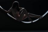
This is my #2 choice. Maybe #1. I love it! Again, the strong triangles, the subtle curve of the body and the curved surface is great. Terrific lighting! The only thing I would experiment with is placement of the subject matter in the frame. Should there be a little more space above her head and a little less space below the curved surface?, keeping the overall width / height ration of the image the same. Know what I mean? I'm not talking too much movement here, but I'd try it and see what you guys think. Her head just seems a bit close to the top of the frame.