photo sharing and upload picture albums photo forums search pictures popular photos photography help login
ctfchallenge | all galleries >> C109 - Indoor landscapes >> c109 - Exhibition > At peace *
previous | next
30-JUN-2005 Photocat

At peace *

New Orleans


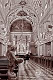
St. Peters Cathedral


IMG_1458

Canon EOS 20D ,Canon EF 24-70mm f/2.8L USM
1/50s f/8.0 at 24.0mm iso3200 full exif

other sizes: small medium original auto
comment | share
aam1234 22-Jun-2006 22:38
Sorry Cat for being honest. I meant what I said. The treatment of this photo literately make me sick. Not in an emotional sense but at a physical level. Really. Something about the PP treatment that makes my stomach turns, physically.
Canon DSLR Challenge19-Jun-2006 17:24
Thanks Rod and Techo. -Cat
ctfchallenge13-Jun-2006 16:19
Under the cirmcumstances I think this turned out pretty well. I also like the toned version a lot better than the colored one.

(*) You might wanna recompress this one to under 150kb, please :)

Thanks!

-Techo
Rod 12-Jun-2006 06:15
I like the monotone much better, so I would say you made all the right choices with this shot Cats. Well done.
ctfchallenge11-Jun-2006 13:49
Here you go Rod, -Cat
This was taken handheld, thus had to compromise on apperture to get good DOF at f/8. Like Lonnit said, I would have prefered the angel to be in focus too. Also I had to go to ISO3200 to get what I got. So had to worry about grains too.
Rod 10-Jun-2006 22:31
It's strange how I would perceive this to be busy over other shots here of cathedrals that are busier as such & I don't really know why, maybe it’s just that my eyes don’t settle anywhere. There's only two explanations that I can come up with, the first could be the monochrome treatment as my eyes don't settle on anything like a nicely coloured ceiling or the wooden seating maybe even the flags. The other could be the angel statue that on first viewing throws my eyes up to the roof area diminishing the importance of the two people walking down the isle. Not being an expert it's really hard sometimes to say why a shot is working or not working. Can you post the colour shot for a comparison?
Don't worry about Aaammm raving on, its that time of year init:-)
ctfchallenge10-Jun-2006 15:13
Thanks for looking Aam and Rod. Appreciate your feedback. -Cat
Aam, you made an interesting observation, that the PP is painful. I am intrigued by it. I am curious to know your thought process behind it, for I value your feedback. Can you elaborate which part of the PP bothers you? Is it the BW conversion or is the sepia or something else in/about this photo bothers you. What is awful part in this, apart from it being too busy? If so I can’t help it there. This is how it is, and I never had any intension to simplify it. And most of the cathedral interiors ARE ornate and busy, depends on the era they were constructed. So there should be no surprise to any viewer that a photo of a cathedral interior has too much to look at. That I think is the beauty of it that it's so busy, yet it’s so welcoming to one and all and everything is at peace. I think the “tide” you are referring to probably has some kind of understanding of the reason about the PP (may be I am wrong). And the choice of sepia was to give it an aged look.

Also what do you suggest for improving this photo, apart of shredding it? That is not a solution, is it? I don't submit photos to challenges which are worth shredding. I admit, that I am not as talented photog as you are, but none the less, I don't submit photos which are rubbish, or offensive or have no meaning. Yes, I do concepts; a lot; which are hard to understand sometimes, but this is a straight forward photo from a vantage point beyond which cameras were not allowed, and I intentionally processed it this way to remove the "yellow" of tungsten light and the multi color flags of political countries, which I believe do not belong at the place of worship. Why should place of worship be politicized?
Thus I find that comment of your to be little on the extreme side, just based on what you see in the photo, and fail to perceive why it’s done that way. If you have questions you could just ask, as to why one would have processed it this way. If I did not think the PP was an improvement over the original, I would have just posted the original. Feel free to download this copy and work with it to your taste and post it back here for us to see, how you would have done this. Because at this point it does not matter how the original was, as you find this photo awful, so let’s just talk about this.

Would welcome your take on it.

Rod, I won’t deny that it’s not busy… but I didn’t do anything special to make it that way. In fact I tried to reduce the color distraction by bringing it to monotone. I have waited long enough to have a main subject (the father and daughter walking towards the camera) and I think I have captured it well, as no matter what you try, and with so many distracting elements, I’ll bet your attention still comes back to the human subject. The main subject comes clear out of all the earthly grandeur, by turning their back on all worldly distractions. That I would say is the essence of it. Wouldn’t you call that a successful capture? I think so, even if you disagree with me.

I am proud of this photo, even if one considers it too busy and shred worthy. Especially if they cannot explain why it bothers them. If one asks, I can explain why I love it. -Cat
Rod 09-Jun-2006 22:33
Don't beat around the bush Aammm, wot do you really think of this shot:-)
I must admit there's too much for the eyes to look at here.
aam1234 09-Jun-2006 22:20
This pic is awful. It should be shredded at the earialst chance. Hate it.
Rod 09-Jun-2006 21:58
All these comments are from a different challenge six months ago, they may not be relevant for this challenge.
aam1234 09-Jun-2006 20:37
Sorry to go against the tide here. The PP is painful. It hurts the eyes just looking at it.
Canon DSLR Challenge07-Dec-2005 21:48
Wow! Well seen, well processed. If I had to be picky about it, I'd say the angel in front could have been a tad sharper, but it's not killing the shot. ~ Lonnit
ctfchallenge30-Nov-2005 17:44
Thanks for your comments Britt, RK and Rod.
RK, not much PP as such, channel mixer for BW, some spot corrections, and then some sepia tone...
Rod, Filling the frame is very easy on these kind of shots... :) Didn't have to do anything special. Key is what to fill it with, LOL -Cat
Rod 30-Nov-2005 09:47
A really nice shot & the frame is certainly filled.....................................with everything:-)
ctfchallenge29-Nov-2005 17:27
Excellent post-processing. - RK
ctfchallenge29-Nov-2005 14:53
This is gorgeous Cat! ~Britt