photo sharing and upload picture albums photo forums search pictures popular photos photography help login
Canon DSLR Challenge | all galleries >> Canon SLR Challenges - FAQ >> CSLR - Best of... >> Best of 2007 > Black Friday is not Good Friday : 4th Place
previous | next
06-DEC-2007 Kelly Bellis

Black Friday is not Good Friday : 4th Place

Ellsworth, Maine


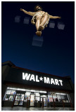
When I first heard the term "Black Friday" I wasn't sure what it meant but thought that it had some relationship to Good Friday, the day observed by Christians worldwide as the day of Christ's execution. Instead, Black Friday - at least in the U.S. since the mid-1970's - heralds in the ever increasing commercialization of Christ's birthday. And to be certain, Black Friday is not Good Friday.


other sizes: small medium original auto
share
Canon DSLR Challenge12-Dec-2007 00:11
Thank you very much for your kind remarks mlynn and Jim. - Kelly
Canon DSLR Challenge11-Dec-2007 12:27
Outstanding image. It's hard to add much that hasn't been said about it already. Very appropriate for the challenge theme and the season as well. Great job! Jim H.
Canon DSLR Challenge11-Dec-2007 01:11
Stunning image Kelly, nicely done. --mlynn
Guest 10-Dec-2007 15:33
Oo!! I like this, great concept and keeping in with the modern issues facing us.
Also pretty impressive, clean and sophisticated PS work here!
-Cat
Canon DSLR Challenge10-Dec-2007 12:08
Thank you Yuvraj for your kind words.

Olaf, thank you very much for the link to your tutorial (nicely done BTW and love the image) and for the suggestion to use the RGB model, and in particular, sRGB IEC61966-2.1 as the color space. I've also started a thread in the Canon forum that this challenge is linked to; i.e., Canon EOS 40D/30D/20D/10D, in hopes of drawing on more voices in this discussion. Let me know if you think that another forum would be a better place to have this dialog. It also seems more appropriate to talk about color models and spaces in a forum than under this image. The name in the subject field is RGB v. CMYK - here's a link to it:http://forums.dpreview.com/forums/read.asp?forum=1019&message=25965750
- Kelly
Canon DSLR Challenge09-Dec-2007 23:06
I sit, corrected. Olaf is right, the color space is not converted with Save for Web. -- Victor
Guest 09-Dec-2007 20:19
This is a superb image Kelly !! Very nicely executed.
Guest 09-Dec-2007 16:54
Huh? @ Victor's last comment. AFAIK, there is no automatic conversion to sRGB when using Save for web. There is an option to embed a color profile or not, but it will NOT convert colors. There is an option to preview what it will look like in standard Windows or standard Macintosh color but it will NOT convert the colors... In fact, I just tested it to be sure and I think Victor is misinformed... It would be natural with an option to convert to sRGB in the Save for web dialog and it is strange that it is not there - here's definitely an opportunity for Adobe to improve their software quite simply!
Canon DSLR Challenge09-Dec-2007 15:59
Kelly, If you don't care about retaining EXIF, you can just use the Save for Web... option on the File menu. This automatically converts to sRGB. Pbase retains EXIF data from the first version you upload, by the way, so save for web is a good option to use for revisions. -- Victor
Guest 09-Dec-2007 14:35
Kelly, color management _is_ a large topic, so I perfectly understand your putting it off somewhat. The good news is that for these challenges you can keep doing things the way you have been, with only one exception: when making the final, down-sized, web-version of your photograph, you'll need to _convert_ to sRGB as well. I don't know what software you are using and the 'Convert to Profile' command in Photoshop has been moved from one menu to another recently (it is now in the Edit menu, changed in CS2, I think, from Image>Mode sub-menu in earlier versions). If it's Photoshop you're using just choose "sRGB IEC61966-2.1" in the drop-down menu under 'Destination Space' and leave the other options at their default values (in the 'Convert to Profile' window). At the very bottom of this tutorial of mine, I give the steps that I go through when making web-versions of my photographs:http://www.pbase.com/olafdk/image/59756632
Canon DSLR Challenge09-Dec-2007 13:42
Thanks Traveller for the pesos - muchos gracias companero. Of course it's not Wal-Mart that severs people from Christ, but rather our unwillingness to love each other unconditionally, and boy, don't we make it difficult for ourselves! But nothing can sever us from the love of God - not even the muzak-ridden affluenzic intensities of Black Friday.

Thanks Olaf for the continued color space signals. Until now, I've paid too little attention to this aspect of the craft feeling ill-equipped and patently fatalistic toward default settings while thinking that someday, when I had an archival-quality photo printer I'd start to scratch the surface in learning color space. Guess I shouldn't wait until then. Got any links to good tutorials?

Victor and Lonnit, thank you both for your interest and comments. I appreciate you very much for making them. As for making any more stabs at this image, I'm bout burned out and I must return to my day job for the next few days, so this version will have to do.

- Kelly
Canon DSLR Challenge09-Dec-2007 11:21
What the Hell, my two Pesos worth...I know what Kelly is doing and why even...this is a political, social and artistic statement. This wouldn't be Kelly if it were in a form different than it is. Kelly simply has a lot to say and he loads his canvas with lots of information.

Nevertheless, I myself, had I Kelly's talent, I would just have the Jesus...wide and low it would be, but only the top half of the image. This would be, in classically artistic terms, all that would be necessary for a visually exciting and impactful image, (though a bit Dali-like). Taking this a step further, for the political, I would crop just below the Wal-Mart sign...I think that this would work also on obvious dual levels.

There is more than a touch of social alienation in the bottom third of the image with the emptiness and cool color cast....signifying maybe the severing of people from Christ by way of Wal-Mart being the knife and cutting agent.

There are really three pictures here, three distinct concepts....unified by...simply who Kelly is. Were I his editor, I think I'd take just the Jesus and Wal-Mart.

But I'm not his editor, and I'll vote for this as presented.

Best Wishes, Traveller


Guest 09-Dec-2007 10:38
We all agree that this is great work. Victor and I seem to have one and the same small reservation, but different ideas as how to do something about it. Victor sees two pictures and I talk about unifying and making it a whole. Victors words in the last comment dated Dec 8th were eloquent and expressed my sentiment perfectly as well.

My "cure" should be pretty clear by now. I think it helps in bringing the photograph together as a whole, but my opinion is just that - an opinion. It doesn't really matter what I think, it's what you think, Kelly, that counts. You are the artist. Like Victor put it: "If the idea is tried and doesn't work [for you], throw it out."

If you insist on hearing my opinion, I would prefer a mix of all three images you've posted: Sky and Jesus figure from the first image, building and sign from the second image in pending (ver 3) and finally interior and ground from the first image in pending (ver 2).

There is still the issue of color space. One and two are still in AdobeRGB, while three is without an embedded color profile. When I open version three in Photoshop and assign AdobeRGB, the colors are more saturated and the light from the store more golden, which I like...
Canon DSLR Challenge09-Dec-2007 04:18
Certainly it's not thrown together. Notice I said "less thrown together", and the context in which I said it was as a counterpoint to realistic. I struggled for a while with terminology, and I have to say I wasn't comfortable with the words I used (carefully placed together would have been more accurate but would have missed my point), but I couldn't think of better ones. In a previous post I used the word "pasted", which both Olaf and Kelly have acknowledged. I was trying to refer to the same thing using different words. The word "collage" also came to mind, but I wouldn't call this a collage either. The point remains, that after the original impact of the picture settles in, I see two pictures. It would be better if I saw one. Interestingly, I think the cubes match the store more than they match the figure. As such they join the two together in a way. -- Victor
ctfchallenge09-Dec-2007 03:11
Thrown together, Victor??? Really? Wow, I can't believe you feel that. To me it seems anything BUT thrown together! I thought it was well thought-out and then, learning that the boxes had to be created from scratch... well, wow! I think this is just clean and sharp and professional all the way! Again, I'm not trying to argue... I was just shocked that you thought that! Perhaps you're even a tougher crowd than I! LOL! ~ Lonnit
Canon DSLR Challenge09-Dec-2007 01:01
You guys are awesome - thanks so much for commenting - Salaam, Shalom, Peace. - Kelly
Canon DSLR Challenge08-Dec-2007 22:00
Lonnit, My suggestion was not an attempt to make the picture more pretty or more realistic but less thrown together. Having said that, I will hasten to say that the image is extremely striking on first view as originally posted. Kelly, I hope you don't take my comments as criticisms but as brainstorming for ways to possibly make the image even better. And I do mean brainstorming as it's usually used. If the idea is tried and doesn't work, throw it out. I think it's partly because the image is already so good that I feel compelled to suggest alterations. I hope that makes some sense. -- Victor
ctfchallenge08-Dec-2007 21:18
The suggestions might make it a "prettier" and "more realistic" picture, but I don't think the image is supposed to be realistic and pretty, it's supposed to be a statement. The original presentation makes the statement perfectly. The statement is not pretty - it's a sad commentary on society and its priorities, which you state perfectly. I hope I'm not sounding argumentative -that's not my intention. I'm just trying to explain my reasoning. :) ~ Lonnit
Canon DSLR Challenge08-Dec-2007 20:11
Olaf, Thank you very much for commenting and for the further explanation - your sample that you kindly prepared and emailed was way more orange than I could go with, but I have taken another crack at a warmer version and have it posted in pending:http://upload.pbase.com/image/90046643. Let me know what you think. Thanks again your suggestion.

Victor, thank you for your suggestion. I will try it out tomorrow when I have more time. Part of the reason, aside from color balance differences - natural daylight pouring in through the front doors of the church illuminating the cross and the megawatts of fluorescent from the store - the focal length of the two images are slightly different and may actually contribute more to the pasted-look that both you and Olaf acknowledge. The store was shot at 10 mm and the cross shot was at 16 mm. While the crucification scene is not orthagonal with the store, I did try to find the common vanishing point point for the vertical. Thanks again for commenting.

Kelly
Guest 08-Dec-2007 18:08
Sorry to be confusing... I think what is confusing in my comment is that I talk about a cooler white balance and warmer colors at the same time, right? The thing is, when you want warmer colors, you choose a cooler white balance setting (higher Kelvin number) in the camera or in the RAW conversion. The logic is that if the camera is set for cooler light than what is present in the scene, colors in the photograph will seem warm...

OK, so what I was suggesting, was to leave the top of the image (sky and Jesus figure) unaltered, while making the colors of the bottom of the image (from the edge of the building and down) warmer. This would be achieved by choosing a higher Kelvin value in the white balance.

After my first comment, I was too curious not to try out my suggestion. Lacking access to the RAW file, I did it with a number of solid color (yellow and orange) layers, set to different blending modes and opacities, with the top of the image masked off. I liked the result. As Victor points out, the Jesus figure seems a little pasted in - and I think it is due to the unmatched white balances. IMO, with matched white balances (warmer colors in building and ground), the photograph is more unified and believable.

One more thing: I noticed that both of your uploaded versions of this shot are in the AdobeRGB color space. If you want most people (basically, all who don't use Safari) to see the colors like you had them in your editing software, you'll need to convert to sRGB before uploading to the internet.
Canon DSLR Challenge08-Dec-2007 17:07
I don't know if I understand Olaf's suggestion either. If I were to make a change, though, it would probably be something to make Jesus look more natural -- something like adding a haze that increases with distance from the viewer. I think it would make the image look less like he was pasted into the image.

He's really not up that far, so the amount of the effect would be minimal, but I think it would help to increase the realism of the picture. Perhaps something like this (imagine Jesus to be floating in a very light fog): duplicate the Jesus layer, apply a gaussian blur with radius about 70 or so, add a mask that's a gradient from top to bottom with light on the top so the blur gets applied more to the top. Blend this layer to taste. -- Victor
Canon DSLR Challenge08-Dec-2007 16:49
Thanks Lonnit for your thoughtful comment. I doubt that I've understood Olaf completely, and while I'm not predisposed to dismiss his suggestion, I'm leaning toward leaving things as they're shown. However, I'm still interested in trying to better understand his idea and have messed around with the white balance EXAGGERATING what I initially understood him to suggest. For the time being, I've stuck it in pending -http://upload.pbase.com/image/90039766

- Kelly
ctfchallenge08-Dec-2007 16:12
Knowing, now, that you created the boxes from scratch, I am even MORE impressed!

As for Olaf's comment - I respectfully disagree: the store should be cool colors to show it is all-business and impersonal, caring only about $$$, while the Jesus figure alone has the warmth and humanity of the ultimate human sacrifice. I'd not change a thing here - this image is perfectly presented in it's total professionalism. Please, don't mess with it! ~ Lonnit
Canon DSLR Challenge08-Dec-2007 15:37
Thank you very much for commenting Victor, Olaf and Nico.

Olaf, I think I understand your comments and will try it out.

Victor, that's great news for Northcross!

- Kelly
jnconradie08-Dec-2007 12:17
Compliments on an excellent piece of work! Regards Nico
Guest 08-Dec-2007 09:08
I agree with the other comments! Would it be even better with a cooler white balance setting from the building edge and downwards, leaving the light in the sign, store and on the ground warmer and closer in tone to the jesus figure? I'm thinking that it might tie the image together better, making it more unified and stronger as a whole.
Canon DSLR Challenge08-Dec-2007 06:16
You may be interested to know that a local theater is showing "What Would Jesus Buy" with proceeds going to support the legal fund of RG4N (Responsible Growth for Northcross), a group that was formed to oppose the development of a Walmart superstore in northwest Austin. -- Victor
Canon DSLR Challenge08-Dec-2007 03:36
Thank you Dan, Lonnit, Lydia and Julie very much for your kind words and encouragement.

Lydia - yes, those floating boxes were drawn from scratch. I tried a number of different approaches including AutoCAD and SketchUp but ended up just using the pen tool to lay down some rays as I wanted to adhere to the perspective in the original photo as closely as possible. Since this vantage point is looking nearly straight up, the only vanishing point (VP) that was on the canvass - which by the way I made several times larger (almost 24" x 36" and compressed PSD nearly 112 meg to study the VPs) was the VP for the vertical (see below). The other two VPs fell off the sheet so I had to eyeball the rays from them.

After the guidelines were drawn, then again using the pen tool I traced each of the six faces of each each of the various cubes, made the selection, created a new layer and applied a gradient to the active areas after sampling (31x31) a color swatch of lighter sky. Opacity settings for each cube face varies generally between 6% and 18%. - Kelly

Julie Bird08-Dec-2007 02:46
This is a very powerful, thoughtful and well processed image Kelly. Julie
Canon DSLR Challenge08-Dec-2007 00:03
This is excellent, Kelly. And you made the boxes yourself? Wow. Well done and a clear message. ~Lydia
Canon DSLR Challenge07-Dec-2007 22:14
KELLY! This MUST go into your personal bests file for certain! Brilliant work as a statement on the commercial season. Flawlessly processed and presented. Consider yourself standing ovated!!! Kudos! ~ Lonnit
Dan Chusid07-Dec-2007 19:15
Visited there yesterday but didn't see Jesus!