I had a similar idea in mind, but it didn't work out. Yours certainly works though. I didn't have the elements in place (color and line) to carry it off without focus. It is rather like a painting. --Melanie
Guest
08-Oct-2007 13:27
K2, thanks.
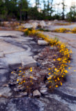
The OOF image is much better than the in focus image because the yellow of the flowers gets much more emphasis. The swoop does become a significant compositional element. It's not in the in focus version. And as you pointed out the distracting details are gone.
Nice Swoosh. You really like hosting, don't you? The hint of pinkish/purple is very Armstrong'ish too - or so I think, having 'studied' the matter on Internet ;) I believe this looks even better out-of-focus than it would if IN focus btw. In a focused version, there would probably be very many distracting details struggling for attention here. OOF'ing it tames the structure, gives a broader brush to paint with, making it easier for the viewer to immediately perceive the general flow of the image.
-k2