Thank you Traveller! I think part of the problem may be the upper part of the image fades into the background a little. Maybe if I had put a border around it, it would have looked more separate from the stylesheet. Matted and framed, it would have a different look also. X
I've looked at this a lot and let me tell you what I think the problem is. The thumbnail is just fine...but at full screen there is an undue emphasis on the upper right corner...yet, were this printed and displayed in any fashion it would apprear as the Thumnail does, compete and perfect unto itself.
This reminds me that screen viewing and wall viewing are very different things...accept my apologizes if I caused any concern in you over this image, which I like very much.
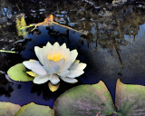
I think that you've done a wonderful treatment here...a true homage to Impressionalism.
If I were to criticize, and I understand that this was completely out of your control, I would have prefered to see a little more of the green as in an additional lily pad in the upper right quadrant.
On the other hand that does nicely balance against the green bottom border.