photo sharing and upload picture albums photo forums search pictures popular photos photography help login
Canon DSLR Challenge | all galleries >> Challenge 69: Greyscale (host: Jim Harrison) >> Exhibition > 6th Place
black framed in white
by Arn
previous | next
25-MAR-2005 Arn

6th Place
black framed in white
by Arn

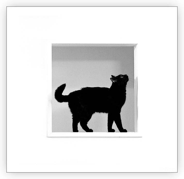
A tidbit of info: Did you know that at one time in the Middle Ages, they used to routinely destroy black cats? They say that's why it's hard to find a cat that is _completely_ black these days. If the cat had even a few white hairs, it could be spared as that was a sign that the cat was not an envoy of evil / witch / demon / what ever... This one's got a few white hairs too.
--
Note: as you read the comment lines below, I'm sure that you might think what I did: these challenges can be (at their best) a real education! Participating carefully in one of the challenges feels like it sometimes compares to taking a university course in photography. :) It's the exchanging of views and opinions that I like.

Canon EOS 20D
1/60s f/2.0 at 50.0mm iso800 full exif

other sizes: small medium original auto
share
Canon DSLR Challenge13-Jun-2006 22:28
No analysis from me. I just like it - a lot :) Jim H.
Canon DSLR Challenge05-Jun-2006 23:00
Just purrrfect! Purrrrr -Cat
Guest 05-Jun-2006 14:15
Maybe what they tried in the Middle Ages was to spare us the hassle of taking pictures with that much contrast :-).
Excellent shot. Square framing works really well. Bogdan
jnconradie05-Jun-2006 13:25
I have already complimented the photograph itself and now just wanted to add the new crop also appears IMHO more pleasing to the eye (well, mine at least.) Well done. ~jnconradie
Arn05-Jun-2006 12:43
:) Lonnit, open the pic in Photoshop and see that the composition is central in relation to the frame around the cat - give or take a few pixels..! Of course, some VERY perceptive people may be bothered about that few pixel margin ;) Naturally, the perspective created by the frame around the cat "fools" the eye and for some people "central" composition might mean a different framing than for others. -Arn
Canon DSLR Challenge05-Jun-2006 00:45
Ut-oh... I didn't see your comment first! LOL! And no, you don't have to please the audience first - not unless you're doing some commercial work and you've got to give the client what he wants. Other than that, you've got to please your artistic heart first. Well, sometimes not if you want to win a challenge! LOL! When I'm really pleasing myself and getting edgy, the voters run! LOL! ;) ~ Lonnit
Canon DSLR Challenge05-Jun-2006 00:40
Fabulous! Makes all the difference in the world! Dare I say it's not centered to the moulding? LOL! I don't care though, well done. :) ~ Lonnit
Guest 04-Jun-2006 23:35
Much better. Square inside a square is brilliant.
Arn04-Jun-2006 23:12
Ok. I cropped the image so, that the composition is now central. I first updated the image so that there was more room on the below and made the composition match the perspective more accurately. That didn't create much of perceivable difference, so (after some gritting of teeth) I opted for the central composition, because that seems to be most atractive composition for the audience anyway. After all, I have to try and please the audience, don't I? :D Hope you like the new framing better! Ps. I will hunt down the first person to say that the composition is "a bit off"! ;) -Arn
Guest 04-Jun-2006 19:19
Love this shot - agree that the crop should either be centered or purposefully "off".
Canon DSLR Challenge04-Jun-2006 14:43
I will mention that I felt uneasy by the crop here - it's too close to centered to look dileberately off. If you've got 3 equal sides, you'd better do something way off base if you're not going to make that 4th side even. It feels unbalanced. I would be very much at ease and feeling right about a centered square image here. Lust lop off the left to even it all up and it will be a nice, pleasing image. BTW, I do like it - just busting your horns with the 'think outside the box' comment out of obligation to a cat shot. ;) lol! ~ Lonnit
jnconradie04-Jun-2006 14:39
In one of the previous challenges, there were many comments about cats in frames. I could not help smiling when I saw this entry. Superb use of black and white. Compliments from a cat-lover! ~jnconradie
Guest 04-Jun-2006 13:12
Arn, I agree about your observations on the perspective. What I dislike about the current crop is that the white around the square 'window' is equal on three sides. Also, I don't care that much for the aspect ratio of the whole frame - too close to a square without being one. If you take the perspective part literally, the lower left corner of the 'window' should be very close to the middle of the frame. I've tried all kinds of crops now and the best I could come up with was like this:

Excluding the shadowed frame, make the canvas 500 pixels wide and 700 pixels tall, then place the square 'window' so that its upper right corner is 52 pixels down and 31 pixels to the left from the upper right corner of the 500x700 px canvas. I did this by feel and afterwards found that it left the center of the cat's body very close to the golden section, both horizontally and vertically. There is something magical about that golden section, I tell you!
Arn04-Jun-2006 09:08
Techo, like I I wrote below (in the un-signed comment) I tried adding space to the right ("room for the gaze"), but it did't work. For me the only other possible composition is central i.e. removing some space from the left. -Arn
Canon DSLR Challenge04-Jun-2006 05:48
Cats again? Think outside the box! ;) LOL! ~ Lonnit
Canon DSLR Challenge04-Jun-2006 03:50
If you want to go for a non central crop. Perhaps adding more extra space to the right rather than left, since the cat is looking more interested on what's happening on the right side of the frame and not just looking straight at us.

-Techo
Arn03-Jun-2006 23:18
ps. I thought that if I had this pic framed on a _wall_, might go for the central framing. But for some reason I prefer it like this on the monitor. Go figure...
Hell, maybe you got me brainwashed and convinced - if it starts to bug me, I might as well change the framing to central. But I'll let is stew for a few days. :)
Canon DSLR Challenge03-Jun-2006 23:08
Thanks guys. About the composition: I did try various crops. Techo, the central composition didn't work for my eyes. Olaf: possibly you were thinking about cropping so, that there would be more room for the cat's gaze? That didn't work for me either... Probably this composition works best for me, because the frame around the cat suggests that the viewer is a little to the left and down in relation to the cat and thus possibly the mind (at least MY mind) expects there to more room where the the object (wall) is closest to the eye. The perspective of the frame clearly suggests it to be so. When I tried adding a little more empty space on the left (or down) that didn't seem to improve either... so I stuck with this composition. But you guys are free to try what you had in mind and see if it improves the image in your eyes (and tell me the result of the experiment!). I'm happy to see ways of improving my images.

Victor: it's a 50% chance.
Canon DSLR Challenge03-Jun-2006 16:47
Awesome framing! :)
Though I wouldn't mind a perfectly centered composition for this one.
-Techo
Canon DSLR Challenge03-Jun-2006 13:43
Is this Schroedinger's cat? -- Victor
Guest 03-Jun-2006 11:56
I like it a lot. I would experiment some more with the aspect ratio and placement of the square within the frame...
Canon DSLR Challenge02-Jun-2006 18:15
Love it! :) Cindy