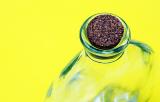
Phil, normally, yes, but in this case, there was so much "distracting" yellow on the left, that it keeps grabbing my eye, making this a "poor composition" for a normal shot of the bottle, but an excellent composition, one that forces the concentration on the yellow. I couldn't help but think YELLOW when I opened it up. Topic demands that color be the first thought in the viewer's head. For me, there was no doubt about that. I then glanced over to the cork, wandered over the bottle, but my eyes kept being pulled back to the right. This is one of those rule breakers that works. ~ Lonnit
I'm afraid I'm going to disagree with Lonnit. By her terms elsewhere, I don't believe this *is* on topic - otherwise we'd all be shooting against strong coloured walls.
It's a shame you couldn't have found a paler coloured cork as that would have been closer to yellow and more on-topic, though perhaps less striking as an image.
Despite the cork, my eyes keep getting sucked back over to the big yellow color field. Now, you sure wouldn't want that happening anywhere else but here, and here it makes the image smack dab on target! Very nice. ~ Lonnit