Better :) Did you lighten the face though? I see the mouth where I didn't before - or didn't notice. It looks kind of odd to have the teeth showing so you might want to darken that area up. The sig looks good and again would be good as a poster w/ the musician's name. :) Nice job! ~ Lonnit
Guest
28-Aug-2005 18:22
I wasn'tl ooking for any special effect with the text here, so I moved it since it detracted from the photo.
Dennis
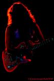
Guest
27-Aug-2005 15:51
Like this one too but the writing doesn't work on it. It worked very well in the other though. ~ Lonnit