photo sharing and upload picture albums photo forums search pictures popular photos photography help login
Canon DSLR Challenge | all galleries >> Challenge 46: Light and Shadow (hosted by Jim Harrison) >> Exhibition > Photorealism* by Grant Hamilton
previous | next
03-JUL-2005 Grant Hamilton

Photorealism* by Grant Hamilton

Chicago, IL

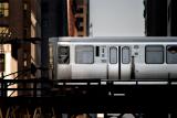
I'm interested in making images that look like the paintings of the Photorealism movement. This is my first attempt. I used a Canon 2x Teleconverter.

Is it ironic that I am trying to make a photo that looks like a painting that looks like a photo? Or just stupid?

http://en.wikipedia.org/wiki/Photorealism


http://www.artnet.com/artist/5895/Richard_Estes.html

Canon EOS 10D ,Canon EF 70-200mm f/2.8L IS USM
1/500s f/5.6 at 400.0mm iso100 full exif

other sizes: small medium original auto
share
Guest 18-Jul-2005 02:24
Was this the site?

http://www.mitchoconnell.com/

He is my cousin and an insane illustrator.
Canon DSLR Challenge17-Jul-2005 20:49
Grant!! I saw you in your Lounge Lizzard phase on TV this morning! They did a spot on the Sunday Morning show about the internet and they showed a piece of a website which had to be the one where you've been grabbing your 'self-portraits' from. It was sooo funny to see "Grant" on TV! LOL! ~ Lonnit
Guest 17-Jul-2005 01:17
Thanks Andy.
Guest 16-Jul-2005 21:32
Intriguing. Ive no idea about the photorealist movement and dont have time right now to do the research. Yes it is ironic, No it is not stupid, and to the question you didnt ask, yes you are completely mad. Having said that you have the type of madness which is related to genius. The image is full of insight as well as flawless execution and pp work. How does a city the size of chicago keep its rolling stock so clean.
jimhwy16-Jul-2005 18:27
Ok, I'm trying something new with this comment. I'm not going to read the other comments first, so here goes!

This shot has my eye literally hopping around the frame. It seems to make me jump from place to place as I focus on different points of interest. The lighting on the carriage gives it a very surreal look and that works with your idea of making a photo that looks like a painting that looks like a photo. It seems like maybe you've softened things a bit too, or at least not sharpened it much. That, too, adds to the sort of "glow" of everything and makes it more like a painting. Ok, now I'll go down and read the other comments.

I think one of the things that makes my eye jump here is the very bright illumination of the section of the building at the far left, just level with the carriage. I like that, and the reflection of it in the one window at the very front (left) end of the carriage. But I wonder if another different take on this would result if you either cropped most or all of that out or just darkened it somewhat. That bright area makes me want to squint, I guess. But maybe that's a good thing. Heck, what do I know, it might ruin it for me if you changed that at all..
Canon DSLR Challenge15-Jul-2005 23:26
His pictures are far too busy for my taste. I do really like the skating rink and the escalator though. As photographs go, they don't thrill me.... as paintings the reality blows my mind! Except for the two I mentioned, I like this image of yours better than any of those. I think the others are just flawless paintings of crummy photos! LOL!

As for Iso's desire for more detail in the shadows, I think doing that would bring this back into too detailed of a photo and lose the look you were going for. The lack of detail keeps it unreal. It also keeps the very clean look of Estes' work.

Lonnit
Guest 15-Jul-2005 22:57
Thanks guys,

This was a lot more work than it probably seems. Not just some filter! It took me a while to get it looking buttery smooth but without a loss of detail. Iso, I agree about the shadows but that was intentional. My hope was for the train to really pop off the page and make a 2 dimensional composition appear three dimensional. Did you look at Richard Estes's work?

Grant
iso320015-Jul-2005 22:18
As Lonnit said, a nice clean image. Works for me. Though the shadows seem to be devoid of any detail and they appear a bit, err, err, black I suppose. What else am I suppose to expect in a shadow challenge though I don't know ;) I just feel a bit of detail in them wouldn't go amiss. Perhaps that's the effect you were after, as the overhead lamps look a bit unnaturally black as well.
Canon DSLR Challenge15-Jul-2005 21:33
I like the softness but what blew me away was the incredible quality of the lens!!! First thing I did was race to the tech to see what it was. Yup, no shocker there! LOL!

I love the technique you used. There's something bugging me about the rotation or perspective. I think it is level but I believe you need to pull out the upper left corner to correct the perspective distortion - the buildings are leaning in ever so slightly - not enough to look intentional, only enough to look like a mistake.

The effect is so clean and beautiful, the tones of silver are gorgeous, the clarity is remarkable. Lovely job. ~ Lonnit