What a nice job you did on this! The light illuminating your face is perfect, and I assume you composited the image of the flower and bee in, but the angle is dead on. Lisafx
Olaf.dk
27-Sep-2003 19:21
Joe, thanks for your nice comment! I like your idea and agree with you that the screen image is getting a lot of weight. I will experiment with your suggestions.
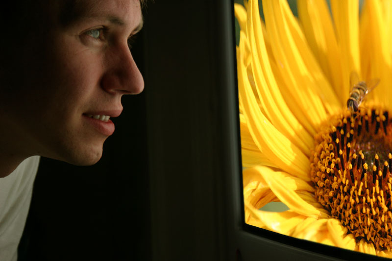
When I posted two versions of this self-portrait, it was because, in some ways I liked one over the other, and in other ways it was the other way around. I guess that fact alone should have made me realize, none of them was quite there yet.
The exposure on my face in this shot is clearer and more in balance with the brightness of the screen, but at the same time I felt it looked more fake and "pasted in" this way. The facial expression is better in this shot as well, but I do feel the other shot was more natural looking. In that shot the face gets a less important role as there is even less exposure on the face. That way the two elements of the photo are not competing as much, but as it was supposed to be a self-portrait, the emphasis is on the wrong element.
In these portraits, I chose the - in my own view - worst angle of myself: profile. Not very flattering, but that's where my concept brought me... Now when I think about it, maybe if the screen was seen even more from the side, making the screen shot take up a much smaller portion of the picture. This would allow for a correct exposure on the face (without looking fake) at the same time as putting the emphasis where it belongs in a self-portrait - the face. If I find the time, I just might experiment with that. Again, thanks for the input!
Olaf: Of the two, this is my favorite. I really like the idea, and it is well done. The one point I'd offer: The on-screen image appears sharper than your face and, thus, grabs at one's attention. I think it would balance a little better if your face appeared as sharp, perhaps sharper. Just a thought, one to experiment with. But: A terrific, and very original, entry. --Joe
I also prefer this version. It looks like an ad for a flat screen tv. great shot. -johnebones
David Goldwasser
26-Sep-2003 22:44
Great photo on the screen and nice concept and execution of the self portrait. I like this shot better than the first one for two reasons. First the lighting on your face is better on this one, and I like the pose better. You look to be admiring the flower/bee shot rather than thinking, the first one is to contemplative.
You did a good job of balancing the screen exposure with your face. I like the screen being a lot brighter, it jumps off the photo.
I guess one of the two is a mirror, what made you want to reverse it on the second one? I don't have a problem with it this way, vs. the other Im' assuming you flipped it back and forth and liked this way better.