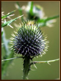
Just thistle
But as macros go, according to the class I recently took, what's wrong with this is this:
There is too much "activity" or busy - ness in the background
It is a "static" representation . . . the stem is straight up the center, no "dynamics"
There are "hot spots" in the background that detract from the central focus (hot spots are bright areas that attract the eye)
Dark spots in the b/g aren't AS distracting as bright ones
There are superfluous items in focus that are NOT the main part of the picture
And not ALL of the spikes on the central focus item are in good clear focus but should be
everything that you want people to see should be in sharp-as-a-tack focus . . .
So this is not a complaint picture of what the instructor told me
This is one where I am trying to show ya'all what I learned
Other than all that, this is a good macro
see? I listen =)))